
Flexible Pencil Illusion 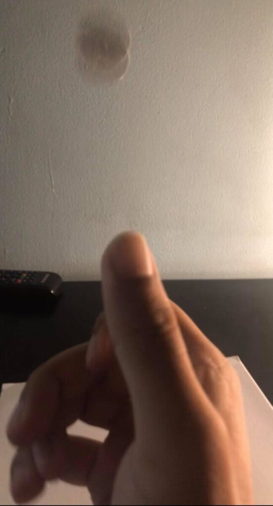
Coin Flip
Author: KeshanBrijmohan (Page 3 of 4)

Original 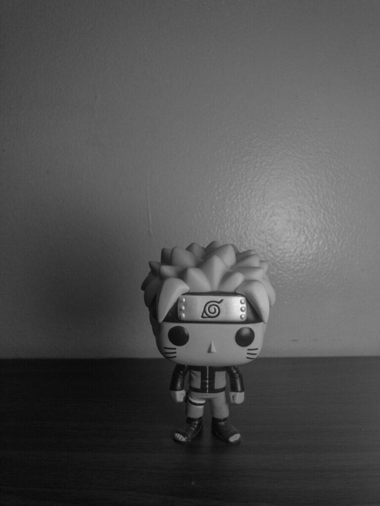
B+W Low Contrast 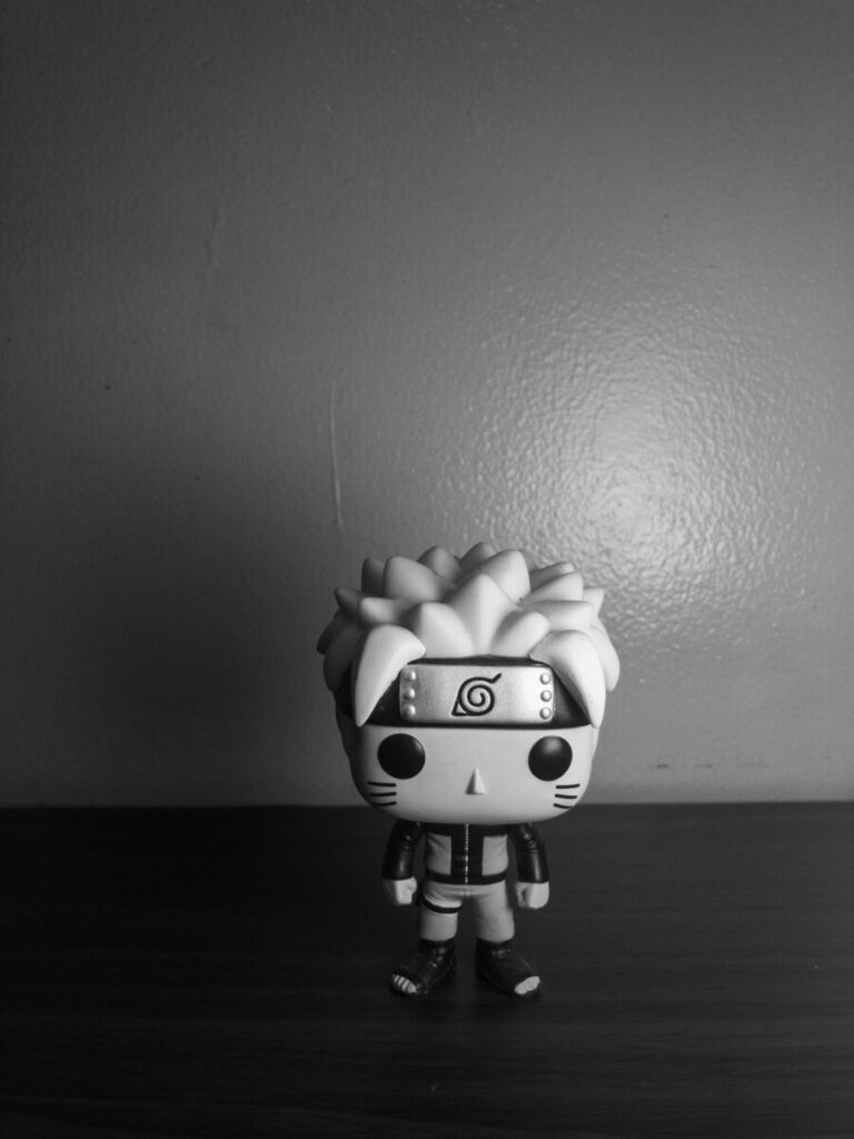
Adobe Monochrome Profile
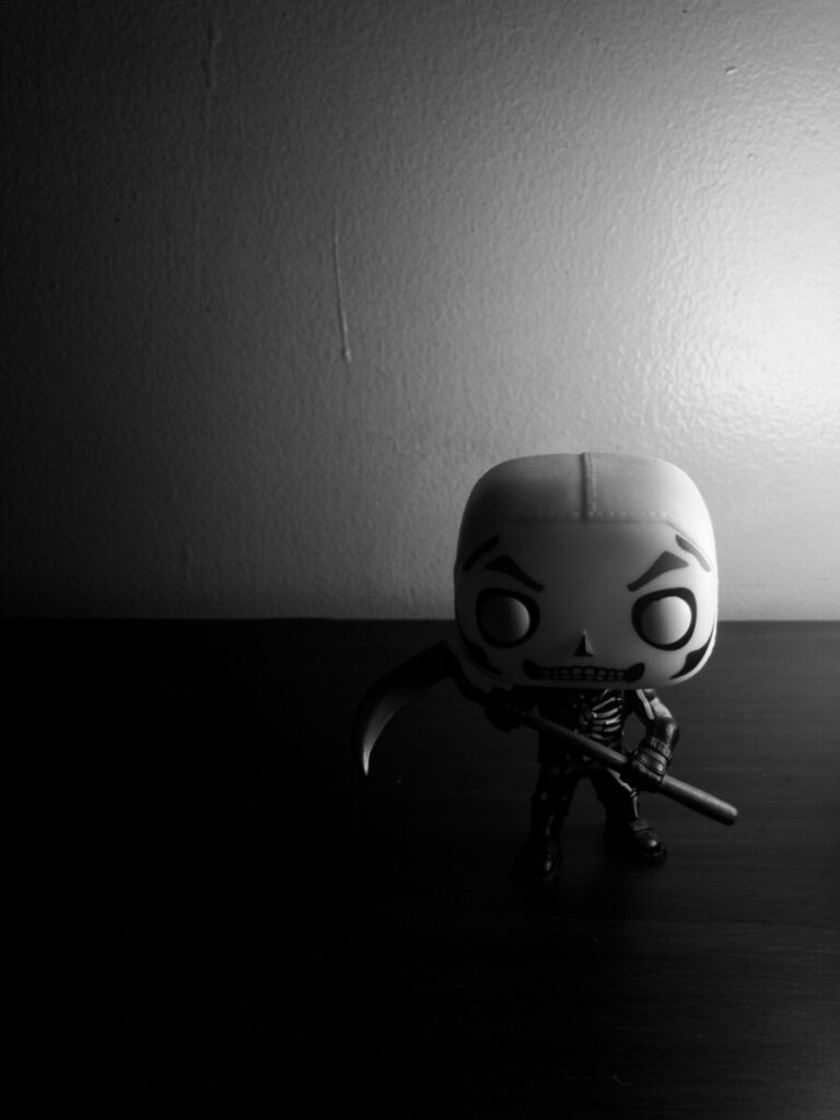
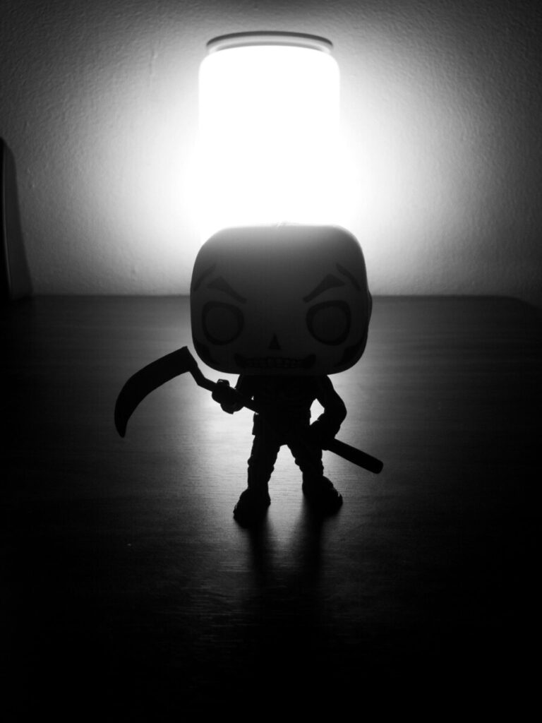
I chose this photo because I preferred how the more even lighting looked over the high contrast cast shadow one. Adding the low contrast filter helped even it out even more, while the … Read More
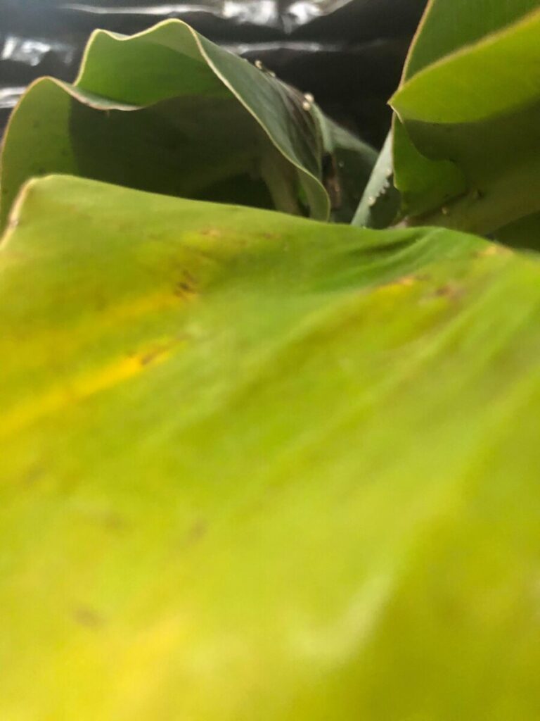
A (Automatic Exposure) 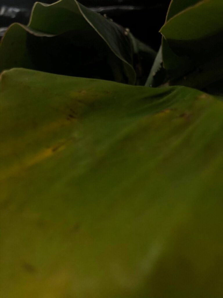
B (Low Exposure)
I chose these because I think they look the best in terms of composition and lighting. I really liked the part A more than part B. I think the low exposure definitely works better … Read More





Recent Comments