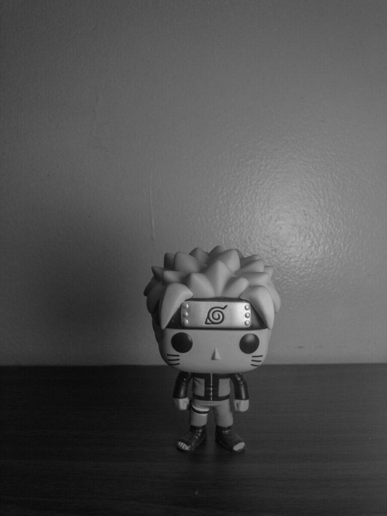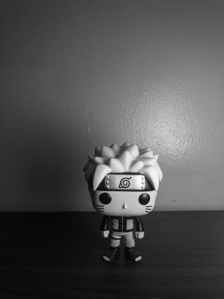
Original 
B+W Low Contrast 
Adobe Monochrome Profile
I chose this photo because I preferred how the more even lighting looked over the high contrast cast shadow one. Adding the low contrast filter helped even it out even more, while the monochrome added a lot more contrast and heightened the difference between the blacks and whites in the image.


excellent conversions. low contrast is too grey, maybe between the two conversions