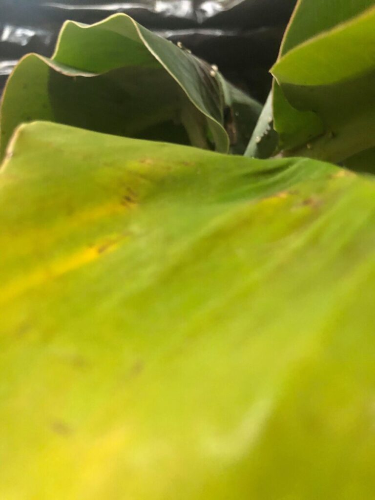
A (Automatic Exposure) 
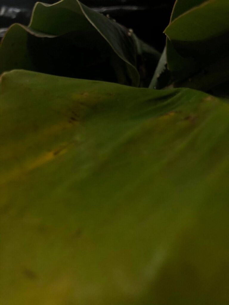
B (Low Exposure)
I chose these because I think they look the best in terms of composition and lighting. I really liked the part A more than part B. I think the low exposure definitely works better with a dark background.

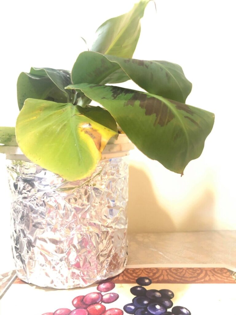
C (High Exposure) 
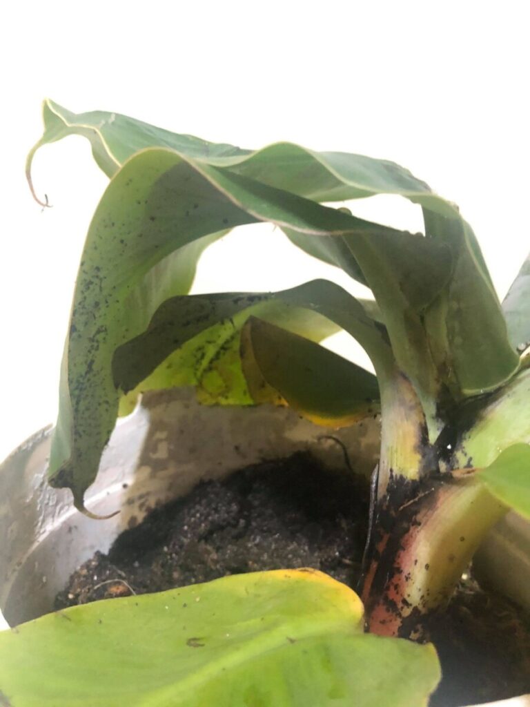
D (High Exposure)
I think the higher exposure works better with the brighter background. Seeing as the unimportant parts are whited out and the details of the plant are better emphasized.


You made good corrections, you just made them too extreme. Also high exposure too bright you made the background too white and lost the frame of the photo