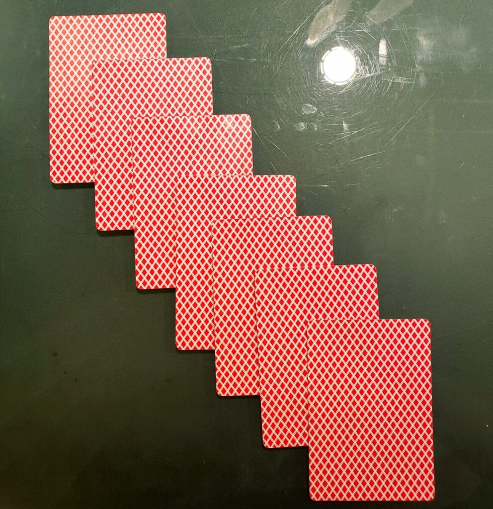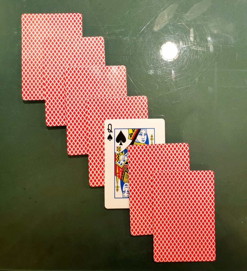
The deck of cards had a similar cover design, so i decided to line them up in a diagonal row under a darker background to help focus on the bright red cards. Then I broke the pattern by flipping one of the cards to show the opposite face and this adds another variation of color and design.


good work, light on background distracting