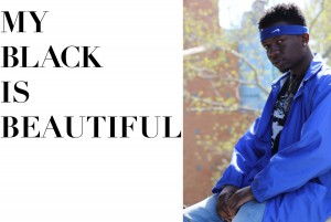
For my quote i picked my Black is Beautiful. This is do to me working on a project with the same concept for another class. I took all photos. The reason that i choice this quote was due to the movement that this phrase has started. Where the Black Community is embracing the skin that God has given them The Type that I used was Good vibes and Didot the reason for these fonts are due to the way that they complement the images. Didot was recommend by a friend for the way that is looks on the spread giving magazine type of feel and look. The image that is below is that of my friend Jamel and the large font expresses the concept of My Black is Beautiful. The image was taken in Harlem along the East Side River Drive
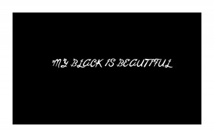
The image that is below is just the My black is Beautiful with the type face Good Vibes the type face was picked due to the curves that are in the lettering. The solid black background with the white wording express how bold and strong the quote is
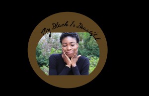
The Last image is that if my friend Jessica. The font that is used is Good vibes and this due to the curves that the letters get with each word and how they connect with the quote. The reason of putting her in the brown circle was the due the the expression that she had on her face and the the expression gives the embracing your skin feel to it and the brown enhance that. Black background makes the image stand out more with that being the only source of bright light.


