I picked two covers from the UCLA Extension Master Cover Series that had caught my interest out of all the options. I could tell what both were going for and found it interesting how they presented their designs despite the same task.
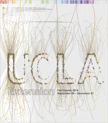
This cover was created by David Young for the Fall quarter of 2014. The first impression I got from the piece was that I was confused on the artistic choice. I stared at it more and started to interpret that the lines that formed the ‘UCLA’ were meant to be another reference to ‘extension’, as the lines spread and extended across the cover. David Young explains in his post about his design cover is that his post was “based on a data set that (anonymously) describes every student that enrolled at UCLA Extension”. Having context from that post, I can see that I wasn’t too far off, the reasons for the lines were more in touched to the project rather then what I thought
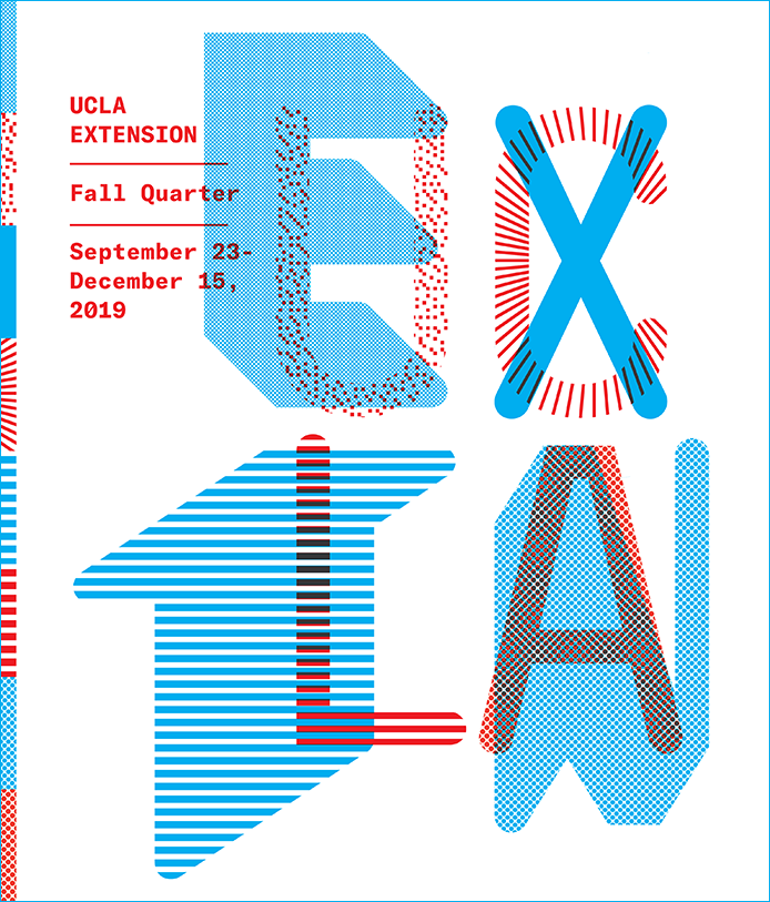
This cover was created by Jon Sueda for the Fall quarter of 2019. The first impression I got from the piece was that I had to read it twice to seperate the text and see what they did. the ‘UCLA’ and ‘ETXN’ are coded in different colors and textures, and the ‘ETXN’ is a short version for ‘extension’, lining up both words to 4 letters to make this piece come true. Looking into Jon Sueda’s post about his design cover didn’t say much, but compared to the other cover. This one is more forward.

