Author Archives: Eli Neugeboren

Review for FINAL

CDMG 1111

FALL 2016

FINAL QUIZ REVIEW

(Check the class site for individual posts relating to topics.)

Professor Eli Neugeboren

PRINTING:

Types of Printing

  • Relief/Woodcut – ink goes on a raised surface, image is reversed
  • Etching/Intaglio – ink goes in etched grooves, is wiped off surface, image is reversed
  • Lithography – ink goes on flat chemically treated surface, wiped off, image is reversed
  • Screenprint/Serigraphy – ink is pushed through porous screen, image is NOT reversed

Industrial Printing:

  • Offset Lithography
  • Standard for printing four color (CMYK) using digitally prepared plates.
  • Can print using a roll (WEB) or individual sheets (Sheetfed)
  • Extremely fast and cheap in large quantities
  • Can print with more than four colors – metallic, pantone, etc. inks
  • Digital Printing
  • Prints using 4-color (CMYK) process with NO plates
  • Cheaper for small-runs because lack of setup charges/no plates needed
  • Can simulate Pantone, Metallics, etc.
  • Both processes use halftones to cut down on the amount of ink used – this is to cut cost and increase quality
  • Letterpress – a type of relief printing that has seen a comeback because of it’s artisanal qualities and physical aesthetic appeal


BEING A PRO:

  • What is Jake Parker talking about in his “Finished, Not Perfect” video?
  • Pricing – what are different ways you can determine what to charge?
  • Graphic Artists Guild: Handbook for Pricing and Ethical Guidelines
  • Get an agent
  • Find out what other people are charging
  • Why can you can only choose two? Cheap, Fast, or Good?


COPYRIGHT

  • Can I use that picture? How do you know when it’s ok?
  • Inspiration vs Imitation vs Outright Theft
  • What is “fair use”?
  • What is the Creative Commons?


More on Animated GIFs

Animated GIFs: The Birth of a Medium (PBS)

Some inpsiration

Why More Illustrators are Embracing Motion Design

Thomas D’Anthony

Sachin Teng

Rebecca Mock

Weather

INSA

Reed+Rader

GIF Dance Party

Guy Brings Everyday Objects To Life

Pat Truby

Neil Dvorak

Toyim Odutola (PBS)

More Toyim (Giphy)

Other Software (Not Photoshop)

Motion Artist from Smith Micro

Cinemagraphs from Flixel

Giphy

AfterEffects and more…

DEMOS

Bring Your Webcomic To Life (Skillshare)

Quick Animated Illustration

How to make an animated GIF from a video file:

Step 1 — Find a good video sequence with which you want to make a GIF. This can be practically anything, but try to opt for a clip that is not too long, as longer video generally leads to a larger file size.

Step 2 — Download/upload the video clip you’ve chosen to your desktop. Trim the footage down to only the length you want the GIF to play. Two or three seconds is great, five is pushing it, and 10 or more is possible with the right chopping, but the file will be massive and hard to work with.

Step 3 — Open the video with Photoshop. To do this, just navigate to File > Import > Video Frames to Layers. Select the video file you want and Photoshop will open it as a series of still frames. You can choose to import the entire video from beginning to end, or use sliders to select a smaller portion of the clip. Limiting the frames will make the file smaller, but will also make the video more choppy.

Step 4 — Mess with the settings. You can adjust color balance and whatnot with Photoshop at this point if you’d like. When you have everything looking perfect, head to File > Save for Web. You’ll then be met with a window that looks something like this:

Gif Settings in Photoshop

All of these settings can be tweaked to make your GIF smaller. Ideally, you’ll want to make it no larger than 1MB so that it won’t take ages to load on webpages. Play with all of these until you find a sweet spot.

  • Colors: This limits the number of colors used to create the image, so the higher the better. Only drop down to 128 or lower if you must, or if your GIF doesn’t have much color to begin with
  • Dither: Dithering scatters different colored pixels in an image to make it appear as though there are intermediate colors in images with a limited color palette. Higher settings will yield better looking images, but will also make the file larger
  • Lossy: Use this setting to apply an intentional drop in quality. A lower setting is better, but some loss of quality might be necessary to make your file small enough
  • Size: Changing the dimensions of your GIF can have a huge impact on the size of the file

Step 5 — Save and share! Hit the save button to finalize your creation and save it to your folder of choice. Once that is done, you can upload it to a free image hosting site like Imgur to share it with your friends and embed it into blogs and websites.

How to make an animated GIF from still images:

Step 1 — Collect the still images that you want to sequence for your GIF and put them in a single folder. Then open File > Scripts > Load Files into Stack. From there, click Browse and select the images on your desktop that you want to string together into a GIF. Select “OK” and a new composition should open with these stills now rendered as individual layers in a single image. Arrange them accordingly; your first frame should occupy the very bottom layer and so forth.

You can also create each layer individually in Photoshop itself, rather than simply batch uploading your stills as layers. Run Photoshop and create a new image by clicking File > New and then selecting “OK.” Then, unlock the background layer by double-clicking the lock icon, create a new layer by opening Layer > New… > Layer and design each frame accordingly. Again, string your animation from the bottom up. This process works if you are using an older version of Photoshop that does not feature a “Load Files into Stack” option. Simply load your stills into Photoshop, drag them into your new project, and resize the newly created layers accordingly using Photoshop’s free transform tool (edit > free transform or Ctrl + T, then drag the corners to resize the object).

You want your end result to look like this, with each frame of the animation separated as a layer and arranged chronologically from the bottom up:
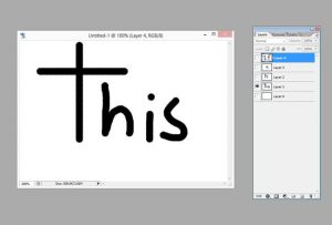
1-95-650x439

Step 2 — Now that you’ve arranged your layers accordingly, you can began sequencing your layers. Again, this process will vary depending on what version of Photoshop you are using. For Photoshop CS5 and lower, access the animation window by opening Window + Animation. Likewise, click Window + Timeline in Photoshop CS6 and Photoshop CC to access the Timeline window. For Photoshop CC, click the drop-down menu in the middle of the Timeline window and select “Create Frame Animation.”

Once you’ve opened Photoshop’s sequencing tool, click on small, right-facing arrow in the upper-right hand corner, and then select Make Frames From Layers.

You can also click on the right-facing arrow to create a new frame manually (or you can simply use the hot-key command Ctrl>Shift>Alt>F). From there, use the eye icon next to each layer to hide the layers you don’t want to appear in the frame you’ve created.
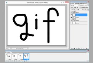
twogif-650x439

Step 3 — Congratulations! You’ve created an animated GIF using still images and now all you have to do is export it out of Photoshop using the process outlined above. For a quick recap:

Head for File > Save for Web. Remember to keep your GIF no larger than 1MB. If necessary, tweak the color, dither, loss, and size settings until your GIF has been resized accordingly. Once you’re happy, save your newly minted GIF.


 

tumblr_nxz00h0si91rjzmm7o1_400 tumblr_o3muwpklxw1qgdvlco1_500giphy

Demo via Digital Trends


Principles of Animation

Video of 12 principles, simplified.

HOW Magazine

Illusion of Life Basic Forms

12 Principles of Animation

Final Assignment: Create an animated GIF using three of the 12 principles of animation.

• Week 1:

Sketch and storyboard your idea. (Due December 6.)

• Week 2: December 6

In Class we will learn how to animate using Photoshop’s Timeline tool.

Begin to assemble and animate your GIF

Review for final Quiz

• NO CLASS DECEMBER 13

• Week 3: December 20 | LAST CLASS

Final Quiz

Have final GIFs uploaded to Eportfolio BEFORE CLASS.

SOUND

From the Mouth of Babes and other Audio Basics

Below are two youtube links we will be watching in class today.The first is a Louis Armstrong Recording of the French Song La Vie En Rose (English Translation: Life in Rosy Hues or through Rose-colored glasses). If you have not heard song before, it is a very well known song throughout France by well-known singer Edith Pilar. It was first released as a single in 1947. A 1997 version was released by Grace Jones and was an international hit and has been covered since as well.

https://youtu.be/8IJzYAda1wA

The second link is the same song as it was featured in the Disney/Pixar movie, “Wall-E”.

https://youtu.be/8aq85Yb25Pk

The third link is of a commercial made by TBWA Paris for a Supermarket chain in France, U Supermarkets. The target audience for this ad is the French consumer.

http://creativity-online.com/work/u-supermarket-la-vie-en-rose/45896

After looking at these together I’d like you to write a short paragraph about whether you thought the sound was effectively done in the commercial. Could you hear the similarities between the music in the Armstrong audio and that of the commercial? Give me at least 3 reasons why you felt it was effective or not effective. Write this paragraph as a post on your ePortfolio.

Now that we’ve focused a little bit on how sound can possibly dominate or lead a visual piece, let’s go into the science of sound. Below is a lecture on sound for you to download to your computer and view together with me.

enaudiovisual1

Sound Cannon

ePortfolio | MidTerm Goals

Your site should have, at minimum, these items:

  • CUSTOM HEADER – designed by you, not stretched or squeezed to fit
  • LOGO ESSAY
  • VISUAL QUOTES
    • 3 final visual quotes
      • Text Only
      • Text and Image/Lineart
      • Text and Photograph
    • Sketch versions/Process
  • COOPER HEWITT ESSAY
    • Reflective
    • Write about three pieces that spoke to you from the collection

Cooper Hewitt | Field Trip

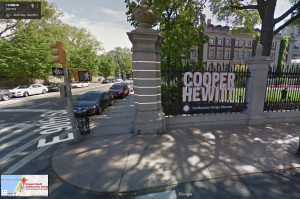
Meet by this sign at the corner of 90th Street and 5th Avenue at NOON.

Meet by this sign at the corner of 90th Street and 5th Avenue at NOON.

GETTING THERE

<iframe src=”https://www.google.com/maps/embed?pb=!1m14!1m8!1m3!1d6041.961349952999!2d-73.957855!3d40.784439!3m2!1i1024!2i768!4f13.1!3m3!1m2!1s0x89c258a2430dad87%3A0xae679017aaa7da76!2s2+E+91st+St%2C+New+York%2C+NY+10128!5e0!3m2!1sen!2sus!4v1476808322690″ width=”600″ height=”450″ frameborder=”0″ style=”border:0″ allowfullscreen></iframe>

OUR ADDRESS

2 East 91st Street
(between 5th and Madison Avenues)
New York, New York 10128

Cooper Hewitt is housed in the former residence of Andrew Carnegie, a New York City and national historic landmark.

BY BUS:

M1, M2, M3, M4 to 5th Ave. and 90th or 92nd St.
M1, M2, M3, M4 to Madison Ave. and 91st St.
M96 to Madison Ave. and 94th St.

BY SUBWAY:

4, 5, or 6 Train to 86th St. and Lexington Ave.
6 Train to 96th St. and Lexington Ave.


Copyright | It’s Complicated

Behance: Usage Settings

Flickr Commons

Gursky or Not Gursky

Lisa Congdon Controversy: Part I

Lisa Congdon Controversy: Part II

Lisa Congdon Controversy: Part III

Diran Lyons: 99 Problems but a Mitt Ain’t One (remix)

US Copyright Office: Fair Use

Hydro74: Remix Characters

Richard Prince: Instagram Gallery Show

A Book Apart: Design Is A Job (this is a must-read!) by Mike Monteiro of Mule Design

Mike Monteiro: F*ck You, Pay Me (Creative Morning SF talk)

Jessica Hische: How do you deal with ripoffers?

Jessica Hische: Inspiration vs. Imitation

http://lifehacker.com/follow-this-chart-to-know-if-you-can-use-an-image-from-1615584870

qxptplnxqtrhme965gal

via thevisualcommunicationguy.com

Being a Pro

<iframe width=”560″ height=”315″ src=”https://www.youtube.com/embed/lRtV-ugIT0k” frameborder=”0″ allowfullscreen></iframe>

“Finished, Not Perfect” by Jake Parker (Creator of Inktober and so much more.)

Illustrations of people who wanted free work.

Debbie Millman:  The Top 10 Things I Wish I Knew When I Graduated College:

http://vimeo.com/22746156

http://creativemornings.tumblr.com/post/44387843103/the-top-10-things-i-wish-i-knew-when-i-graduated

JO Applegate: Unsolicited Advice from a Professional Amateur:

http://bouncex3.tumblr.com/tagged/Bx3-Drawing-Journal

Noah Bradley: How to Become a Successful Freelance Artist

http://www.artsyshark.com/2013/04/19/successful-freelance-artist/

Jason Brubaker: Rejection and Why Everyone Needs It

http://www.remindblog.com/2013/05/01/rejection-everyone-needs-it/

Graphic Artists Guild: Handbook for Pricing and Ethical Guidelines

https://www.graphicartistsguild.org/handbook

Jessica Hische: The Dark Art of Pricing

http://jessicahische.is/thinkingthoughtsaboutpricing

Choose two, you can’t have all three.

From a blog post by designers at the firm Mat Dolphin comes this excellent post on what is possible for our clients.

“Good, fast or cheap. Pick any two.

Far from an ultimatum, this simple message conveys a few important things. Our time is one of our most valuable commodities. Our creativity is one of the reasons people choose to work with us. There may be certain compromises which have to be made on both sides of the designer/client relationship. We have a number of clients who all deserve our attention and we need a reason to allow ‘queue jumping’. Much more than a witty soundbite that allows us to charge more money (because it certainly doesn’t do that), the phrase is an incredibly useful tool in explaining the value of what we’re selling.”

http://www.matdolphin.com/blog/2011/08/04/only-two/

AIGA position on Spec Work

F*@K YOU, PAY ME

Some notes from our discussion with Fifi Jacobs and Christina Hines at the One Club on Friday February 26, 2016:

On resumes:

Your “about me” section should avoid clichés like, “hard-worker,” “self-starter,” “works well with others,” and more things that everyone always puts in that spot. It was noted that if you are writing something about yourself that every other person could write, or if you are writing something that is a basic assumption of a good employee, then you should cut it. Also, think about the opposite of some of these statements, “lazy”, for instance, and the fact that no one would ever write that.

Be uniquely yourself in this section, but not for the sake of being unique or different. Stand out by being who you really are, not standing behind boring platitudes.

Be a storyteller, and tell your own story. Who are you and what do you like to do? What are you good at? What else do you do? What else are you interested in?

On Portfolios:

If you have to explain a project on your website or in your portfolio, then take it out/off. You will not always be there to explain it and it also means that it doesn’t speak for itself, which means it is not successfully communicating what it needs to.

On Networks/Networking:

Do it! Build a network, stay in touch with people. Don’t be shy or afraid of talking to people or reaching out to them. Take advantage of the built-in network of school: peers, faculty, guest speakers, tours, etc. and build on that.
Build a network of like-minded people, people you actually are interested in. This is one area where you should not “fake it til you make it”

On Tooting your own horn:

“If you’re not going to blow your own horn, who is?” –Fifi Jacobs

“You need to be an expert about yourself.” –Christina Hines

This is truly one of the best things that they talked about. You need to be able to speak confidently and clearly about yourself and your work, because no one is going to do it for you. You need to be able to know your work better than anyone else and stand behind it.

History of Print

44880_guten_press_lg

Linoleum block printing process: John Lee

Linoleum block printing process: John Lee

tumblr_njxwy0aegn1qcl6lzo2_1280 tumblr_njxwy0aegn1qcl6lzo3_1280 tumblr_njxwy0aegn1qcl6lzo4_1280

This will cover some (not all) of print history up to contemporary practice.

MoMA: What is print? A fine art look at (mostly) non-commercial printing.

Woodcut Process

Linotype, the Film

Old Heidelberg

New Heidelberg

Heidelberg Speedmaster (full speed)

4 Color Process

Mama’s Sauce Letterpress video

Breaking the Rules of Design (on purpose)

Moo’s Do’s & Don’ts

[facebook url=”https://www.facebook.com/guttenbergarts/videos/569802659845333/” /]

[youtube https://www.youtube.com/watch?v=T0q0OFaY9uY&w=560&h=315]

QUIZ PREP | CDMG 1111

Analog vs Digital Signal


Design Process:

Pre-production


Production


Post-production


File types:

BMP


PNG


JPG


TIFF


Type formats:

Postscript

Type 1

TrueType

OpenType

Web fonts


Type Classifications

Type Foundry


Color Spaces:

Bitmap


Grayscale


RGB


CMYK


What are they measured in?

What is Gamut?