On March 2013, I visited the AIGA (American Institute for Graphic Arts) where I viewed their current exhibit. We the Designers: Re framing Political Issues in the Obama Era was an exhibit which displayed the work of designers inspired by their own political views. These graphic designers did an excellent job with their work and were truly creative. The following are the three designs that captivated me the most.
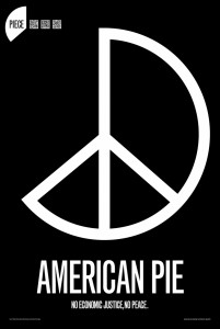
Piece: If not now then when (2011) by Garland Kirkpatrick
I thought this design was very creative. I thought the idea of a piece missing from the peace sign was very interesting and gets the viewer thinking. Under the design it read “No economic justice, no peace.” So clearly this design is about our economy and how in order to have peace in the country we need to fix the economy. This was my favorite design and I thought it did a great job communicating the message to the viewer. The design was simple, using an all caps sans serif typeface and the colors black and white which created contrast.
Nuclear Energy (2010) by Mirko Ilick and Daniel Young
I thought the use of the skull in the atom on this design was a great idea since it’s talking about harmful radioactive wastes. The skull represents death which is a great way of making the viewer think about the harm of the nuclear power plants. Under the atom, typed using a sans serif typeface, it reads “Radioactive waste from nuclear power plants stays radioactive and deadly for hundreds of thousands of years.” In a smaller size font right under this statement it reads “We can generate electricity in safer ways.” I think the colors black and yellow work well with the design and the simple imagery used was highly effective.
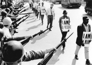
Birth Certificate (2011) by Thomas Starr, photograph by Ernest Withers.
I thought this photograph was great. Originally taken by Ernest Withers in 1968, this photograph shows men of color walking in a line with a sign which reads “I am man” and soldiers lined up with their guns pointing at them on the side. This photograph is very powerful and does a good job showing us how badly people were treated based on their skin color years ago. One of the men in the line has a sign which has been edited by Thomas Starr from “I am man” to “I am president.” This is clearly showing us how far we’ve come since we now have a president of color. It shows how unfair the society can be and that even the oppressed will someday rise above. It shows us how a once racist nation has changed and become better and now we all have the same opportunities.
A graphic designer’s job is to captivate an audience and communicate a message to them. This is why they are very much needed by politicians and nearly everyone else. In order to have people listen to what we have to say we must capture their attention first to later capture their minds and heart. This exhibit was a great example of this and shows how powerful art really is.


