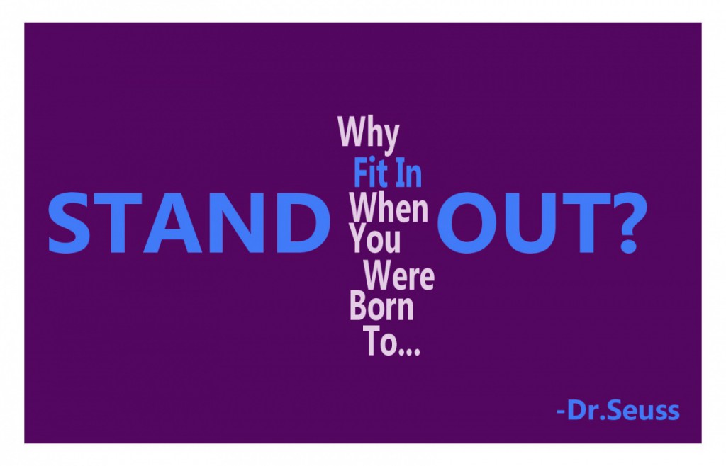
My first design is a very simple one. I used a sans serif typeface which is easiest to read and the colors purple, blue and grey which I thought fit well together. The words “Stand out” are set in a larger font so it literary stands out on this design. “Fit in” and “Stand out” are in blue. They are the opposite of each other and I wanted to bring attention to them.
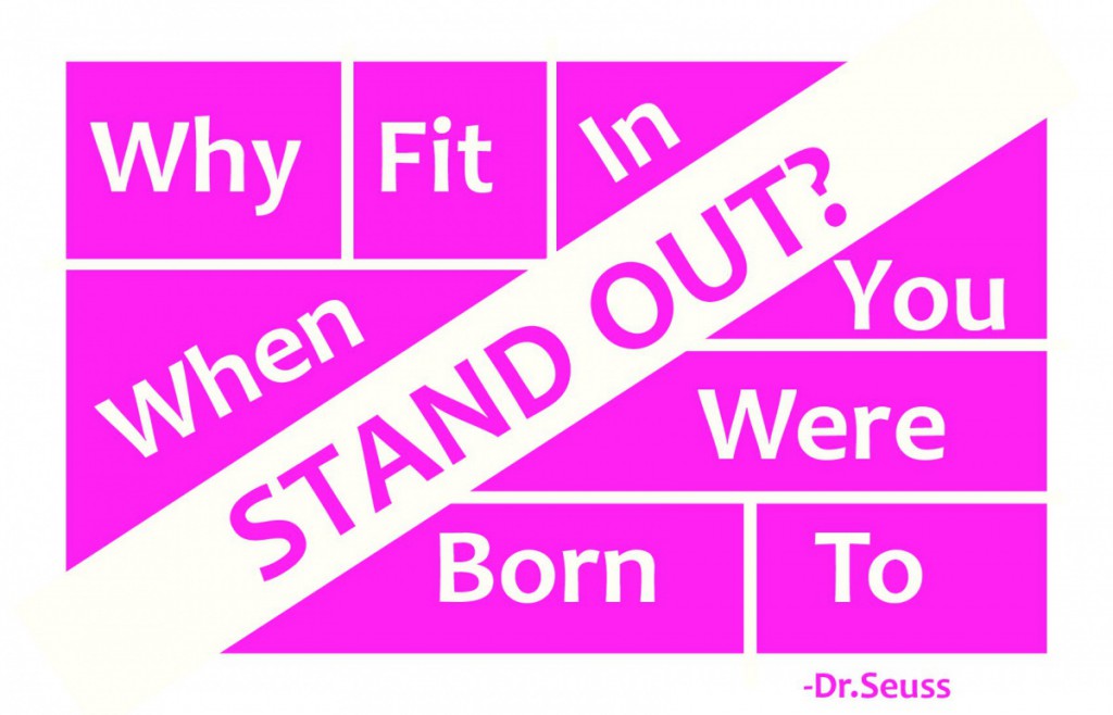
This design is more playful than the other two. I used white and a bright pink color and the design itself is a bit more complicated. Each word from my quote is inside a shape except “Stand out.” This is supposed to show how “Stand out”cannot be boxed in like the rest. It’s also the first thing you notice on this design.
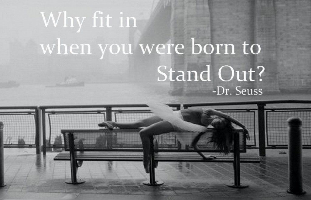
On this design I used a photograph taken by Dane Shitagi. It’s a picture of a ballerina stretching on a bench by a bridge. She stands out from the rest of the picture because a ballerina doesn’t really fit with the background on this photograph. Despite not fitting in with her surroundings, she appears confident and so I thought this photograph matched perfectly with my quote


