For this assignment we were asked to design a poster about a concerning issue. The issue I chose was fatherlessness. It’s strange that I can say that I’m fortunate enough to have my father as an active participant in my life. But often times I wonder who I would be without his guidance. The poster imitates a child’s drawing because fatherlessness is most detrimental to a child’s development. The child does not have a face because he does not know his father and in turn, does not know himself.
For this assignment I chose to do a timelapse of me drawing space. I created the banner for my e-portfolio using a similar method. Space has special meaning to me. It is terrifying in it’s emptiness, mysterious, and yet beautiful.
https://drive.google.com/open?id=1fj9jymhMWYj80AY2BydoPszVTbLBLwgN
For this assignment we were asked to research a designer of interest. I chose Aaron Douglas.
For this assignment we ere asked to select a logo of a well-known company that we considered particularly effective and investigate the history of that logo.
I chose the logo for the PlayStation gaming brand.
Colored.
Black and White.
I chose a moth as my logo simply because I like moths. There isn’t any profound meaning behind this choice. And I don’t think there needs to be. Ironically, the colors I chose do. They’re colors I associate with VHS cassette tapes. They evoke a feeling of nostalgia. A yearning for a simpler time which is reflected in the minimalistic design. The letter D is mirrored in the middle, representing my initials, DD, and maintaining balance.
Space.
I chose space for my banner simply because I like space. There isn’t any profound meaning behind this choice. And I don’t think there needs to be. The chaos compliments the simplicity of my logo.
My name is Dorian Douglas.
I don’t like writing about myself. I’m never sure what to say.
I was born September 29, 1996. I live with my grandmother, mother and brother in Brooklyn, NY. I am an undergraduate attending the New York City College of Technology and pursuing a Bachelor’s in Communication Design. I want to be a character designer/animator.
I’ve been drawing since I was very young. Mostly anime, manga and comics. I’ve always liked immersing myself in these new worlds. I also appreciate their ability to explore complex ideas despite predominately being targeted towards children. As I’ve grown, so have my sensibilities as an artist. And I’ve discovered that I enjoy drawing people.
Drawing makes me happy. There’s an indescribable feeling. And my hope is to share that feeling with people through my art.
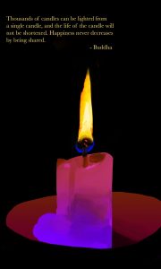
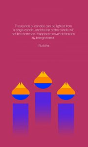
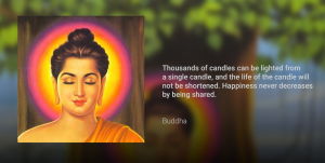
Thousands of candles can be lighted from a single candle, and the life of the candle will not be shortened. Happiness never decreases by being shared.
Buddha
The quote evokes the imagery of candelight and candles, so I illustrate a semi-realistic candle in photoshop. The black background emphasizes the light of the fire. And the palette I chose, magenta and purple, are based on colors that personally make me happy. The typeface used here is Baskerville Regular, flush left.
This second design directly follows the first, borrowing the subject matter and palette yet very minimal. The typeface used is Helvetica Neue Ultra Light, justified with the last line aligned to center.
This last design deviates from the previous ones and is much more contemporary. I made it to imitate YouTube Topic videos. I knew I wanted at least one image with the Buddha. In this instance the quote is the title of the song and the artist is simply “Buddha”. The typefaces used are Roboto Medium and Roboto Light.
This is the first post on your Learning Blog. Edit or delete it, then start blogging!
The ePortfolio is both a Learning Blog and an Academic Career Portfolio. Use the Learning Blog to document your learning experiences and class assignments each semester. As time goes by, add content to the Academics and Career sections to show your department, graduate institutions, or future employers how well prepared you are for your chosen career.
NOTE: Remember to add appropriate Categories and Tags to your posts. This will help your professors and other visitors find the content they are looking for. The Categories “Coursework” and “Field Trips” and the Tags “OpenLab” and “City Tech” have already been applied to this post. Feel free to make changes!
