![]()
Colored.
![]()
Black and White.
I chose a moth as my logo simply because I like moths. There isn’t any profound meaning behind this choice. And I don’t think there needs to be. Ironically, the colors I chose do. They’re colors I associate with VHS cassette tapes. They evoke a feeling of nostalgia. A yearning for a simpler time which is reflected in the minimalistic design. The letter D is mirrored in the middle, representing my initials, DD, and maintaining balance.
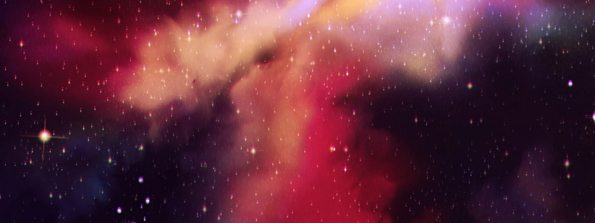
Space.
I chose space for my banner simply because I like space. There isn’t any profound meaning behind this choice. And I don’t think there needs to be. The chaos compliments the simplicity of my logo.

