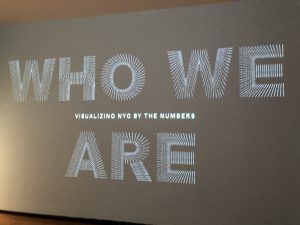
After seeing the Visualizing NYC exhibition at the Museum of the City of New York, I would name it as one of the most interesting exhibitions I’ve seen. Using collected data and statistics, it highlights NYC’s unique history and its peoples. There is a reason why this city is known as a melting pot.
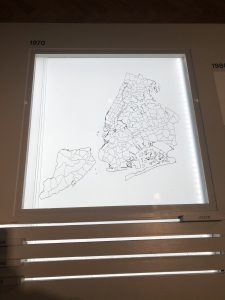
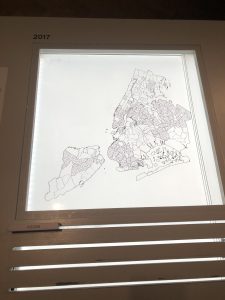
One of the works that caught my attention was an interactive display that showed the migration of 4 different racial groups between 1970 and 2017. It was particularly interesting because my neighborhood’s (Bath Beach) population, in particular, was predominantly Italian-American historically. It was only until the 2000s when it became more ethnically diverse. There was a rapid growth of Asian residents and the maps here showed exactly that.
Another display at the exhibition was the Languages of NYC by Jill Hubley which graphs the predominant languages spoken within the 5 boroughs. Naturally, I was curious about Chinese. It was really interesting to be able to isolate the data on where Chinese is spoken most from the others. I was not surprised to see my own neighborhood to be highlighted here. 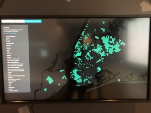
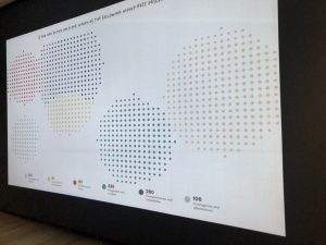
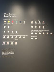
The other display I found most interesting is not hard to miss. Unlike all the other displays, the exhibition created and is collecting their own set of data by inviting all visitors to answer a series of personal questions. These answers are then visually represented on a projection on the wall. Interactivity will always catch my attention and it was compelling to see how your response compared to the hundreds of people that participated.
