Author: Win Myint Aung (Page 2 of 3)
The connection is the key to developing cities. The connection can be a bridge system, a transportation system, and can be as simple as a road system. The connection allows trading and stabilizes or improves the economy. The two important transportation system in NYC is The Grant Central Terminal and The Penn Station.
Grant Central Terminal is a busy place. In order to avoid crowded traffic, some of the roads are lifted above the ground to avoid congestion. We can also see the difference in level inside the terminal where there is a ramp leading to the bottom floor. The way the terminal is built makes it possible for many tarins to come in, not just the metro north, but also subways. The subway lines are on the top and metro north on the bottom. I feel very welcome as I walk into the terminal, maybe because of the material and lighting that was used inside the terminal. The open space in the terminal reminds me of the England train station, where metal arches are starching above and sheltering the station.
The Penn Station is very different from The Grant Central Terminal. I can feel the crowdedness in the station. I feel very contain because of the ceiling height, and bright light is shining across the station, making it hard to calm down the mood. Penn Station looks modern to me. There are many electronic screens and escalators, whereas in The Grant Central there are stairs and info boots.
Both transportation systems have a unique place. I prefer Grant Central Terminal more because Penn Station represents a busy city life for me. I don’t like the fast pace that everyone is moving.
Landmark buildings are a reminder of our history. The buildings often have a unique characteristic that makes them famous. With the help of urban composition, some landmark buildings such as the Custom House and the trinity church amplified their popularity.
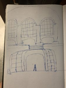
The US Customs House is positioned directly facing the public space and manhattan. The details on the façade and the sculptures of the building are very big. It is almost implying that people should view this building from far away instead of close up. The arch on the entrance is very big and tall, with a tall staircase leading into the building, making it very dramatic. These elements make it looks like a stage set. The street leading to the building is curving instead of straight. It gives the visitor a surprise effect when they go around the street and see the façade of the building facing them, presenting them with a stage.
The Trinity Church is placed at the end of wall street, greeting all the people walking along the wall street. It is just like the arch in Washington square park where fifth avenue end. Two buildings on the side frame the church and make it very visible to the visitors. The distinguish masonry and shapes of the church also make it stand out among the surrounding buildings. The streets are laid with stones and we can still see the marks of the original wall, where the Dutch built the wall to protect themselves to the wilderness.
Landmark buildings are one of a kind in their way. With the help of urban composition, the buildings can be more famous.
Art museums have many forms; some of the museums shaped like a house, some museums were an imitation of Greek buildings and some museums took the modern approach. All of the museums have the same goal of showcasing the history, but some of them do it differently.
Henry Clay Frick became rich because of his relationship between coal (coke) and steel plants. Because of his collection of many paintings, he decided to turn his house into a museum after his deceased. In one of the rooms, we can see a fireplace and a large living room. It is quite confusing to move around the space because each room is connected to another. We sometimes forget or miss a room as we walk freely in the space. It almost feels like letting all the sheep loose on the field without a herding dog. There is no circulation path leading the people. Some of the floorings are made out of wood and we can even hear the squicking sound as we step on it. It makes me appreciate that people are preserving the museum.
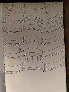
On the other hand, the Guggenheim museum was designed purposefully for showcasing art. It took four years to get the permit because of its form. the building has spirals leading from the bottom to the top, where the top is bigger than the bottom, making it top-heavy. It was made out of reinforced concrete; the building looks strong and steady. It has a glass oculus on the top, like The Pantheon. As we enter the museum, we have to follow the circular path that was created. Frank Lloyd Wright intended for people to take the elevators to the top and walk down the circular path, following the direction of the gravity. There is an intended route applied in the Guggenheim museum, unlike the Frick museum.
Both museums are great in their own way and it is good to see different variations. The differences between the museums enhance the uniqueness of each museum.
When visiting Washington sq. park, I always visit Greenwich Village and Soho. The walk shows the difference between the old architecture style and the new style. The difference between the two neighborhoods always amazes me and makes me appreciate it.
Upon realizing that Washington sq. park is a burial site for poor people back in the day, it makes me ponder that any place can become famous in the future. As we walk away from the park and enter Greenwich Village, we see the dramatic changes in architecture compare to other places in Manhattan. Many houses are Italian revival style with many emphases on the door. Some of the houses look the same, which makes me believe that they are own by the same developer back in the day. There is a lot of ironwork at the front, most of them are decorative. Many houses have stairs that raise to the first floor of the building. Some of the buildings also have rustic brick on the lower level of the house. The library and the church Victorian gothic building, but they are modified. The flying buttresses become part of the building instead of just support. They are weights on the top of the buttresses to hold the wall from falling. Those weights are also decorated. The streets are narrow and some of them are lay with stones like the mews in the NYU campus.
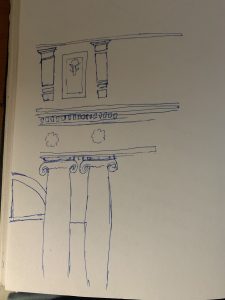
When we left Greenwich and entered Soho, we are greeted with a different vibe. This place is a heavily commercial focus place. Back then Soho was an entertainment place, but people abandon this area. It is not until the development of elevators, that many big companies start to move in. There is a hand full of buildings that are made out of cast iron, but not many because when cast iron crack, it can be very dangerous. The façade of the buildings is very repetitive. This makes me believe that the materials are pre-fabricated and assembled on the site. Some of the castiron is painted white to imitate the ironic column. The streets are bigger and more crowded.
Each neighborhood is unique and we should preserve the landmarks. There are many stories to be told and the best way to learn it is to visit and observe it.



Recent Comments