Professor Montgomery

Author: Julia (Page 2 of 2)

Assignment 6

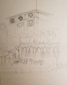
Walking up to the Frick Museum on a rainy day felt like an absolute chore that I wanted no part of. It was a long walk from the station that had forced me to purchase an umbrella, but as I was plodding along the tall brick boundary of the house, I hadn’t realized that this would become my eventual destination. I bounded up the stairs, to be greeted by one of my classmates. It was a challenge simply walking the museum; the doorway was much too small for a pair to enter at once, let alone with umbrellas, and visitors exiting the building at the same time from the same entrance.
Entering the lobby felt hectic; you could tell it wasn’t designed to be a lobby. Your path was guided by well-placed desks and velvet ropes. After the claustrophobic fiasco that is entering the museum, the class met in a central garden, atrium, plaza that is in the center of the house. I couldn’t exactly fathom this existing in someone’s home; I kept thinking, “What would you put in here?” “What do people do in this space?” “Is there WIFI here?” granted, the last question is unrelated to the topic, but I’m sure it made someone exhale through the nose. Walking through each gallery and admiring the art, it was clearly as claustrophobic as the entryway. I spent a lot of time trying to decode the building; “What room was this?” “Where is the kitchen?” Every time I walk into a dark room with a green rug and a fireplace, I say “Yes, this is the living room!” Only to be proven wrong by the next room.

In contrast, the Guggenheim museum only proved as a great design. There was a separation between entrance and exit; there was much more space in the atrium, and felt more like the architecture itself is guiding you to the ticket booth. What I admire about it is the clear line of movement through the art; the single ramp that guides you down the atrium; you don’t get lost, like in some other museums.
Assignment 5

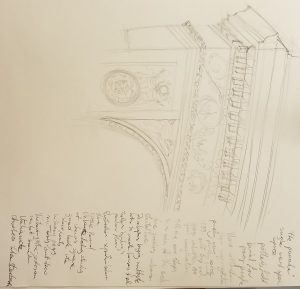
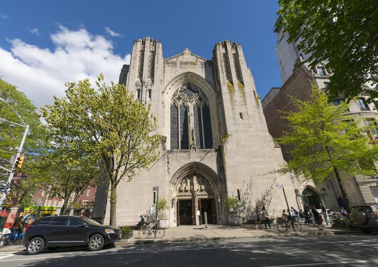
Washington Square park being an ancient burial ground for low income families seems like a fact that should be more known to the citizens of the city of New York. The simple idea of knowing that the park used to be a cemetery, gives the area an entire different type of feeling; I can imagine the city as previously small village huts that had one collective graveyard that every family who lived there, who knew each person living there, was married. Or maybe it was just the annex where the poorer families ended up.   Either way, what stood out to me is that in the Greenwich area, churches are as abundant as Starbucks. The architecture and the church type ranges in a wide variety, from Greek revival to Gothic.  The surrounding buildings are residential, most of which give hints to land owners congregating the land and developing it to quickly sell it off at high prices. As the shift of the class moves into Soho, we began to see much more commercial spaces, regular and famous, and obviously the center of luxury shopping. It is no surprise that this was known as the street of entertainment in this area, as you see many people congregating to shop and to spend leisure time in SOHO. As of today, the streets are packed with stores, and ornate facades are decorating the street-side of the buildings.


Week 10 Assignment

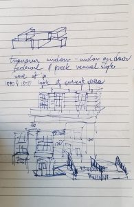
The lever house’s ‘exterior skin’ is one of the most magnificent buildings that we had stumbled upon in this class. The subject that stood out the most to me was relief of the facade between the lower level, and the tower; right where the outdoor space is located, for the users of the building. The attempt at separating the building uses through this slight setback of elevation had been stuck in my mind, and the urge to implement it into my current design class has been strong. Not only is this a fantastic spectacle of exhibiting an attenuate cantilever; but its a fantastic way to compose a high rise building. Knowing that this was during the times that architects were trying to rationalize the massing of high rise buildings, I’m rather fond of the Lever House for how the design was approached.
The Lever house is confronted  by the Seagram Building, and to a bystander, I don’t think one would be able to pick apart all of the minute details that set these cor-rivals apart. Yes, they do differ in color palettes; The green glass and almost white curtain wall mullions of the Lever House are quite opposite on the color spectrum from the orange tinted glass and matte black mullions of the Seagram building; but those aren’t the only differences. stepping closer, you realize that the Lever house is not on center; it is off balance from the columns. In the meanwhile, every single detail, up to the position of the interior light at the Seagram buildings are exactly on point and symmetrical.

Mid-19th Century Civic Improvement: Central Park – Assignment 4

The concept for Central Park arose from a 1840s newspaper editor, that said the city required more parks in order to be a livable city. From that point on, there became a movement to convince the state of New York to create a park in 1850; this was approved in 1853, and a  competition was held in 1857 to try to figure out the best design for the people who will leisure in it.

Of all the designs, the one that won was by Frederick Law Olmsted and Calvert Vaux. What gave them the winner’s medal, was the integration of the city streets with the park, which other competitors hadn’t included, but in a way that was almost ingenious. When walking inside of the park, it inst easily noticeable that you are walking next to one of the fast-paced Manhattan streets that run through the park. The architects had created a small greenery escape in the center of the city, that allowed people to stroll, ride bareback, and ride in horse pulled carriages through the lanes. The architects looked to English parks for inspiration, and even took England’s love for animals and the land into consideration. Sheep’s meadow, originally contained grazing sheep that gave the effect of being in the country, with the Dairy providing fresh sheeps milk. What wasn’t included in the original schematic was any play place for children; as this was a park meant for the wealthy adults.

What i think is a decent design element of the park, was the usage of benches, and how they span down each pathway with little to no separation between them. I can imagine people being able to interact with one another with great ease, on a beautiful spring day. Each one of the paths isn’t covered with benches, but that immediately tells you the different program for this path. The use of man made landscape and tunnels through bridges also creates a fairy tale feeling, like traveling through a secret arch into adventure.

New York City Housing Crisis

Manhattan, being the new up and coming city of the 19th century, became a hip and popular spot for people to move to. The major reason for this was the Depression of 1894. People began to move to the city to find jobs, bring some money back to their families, and simply survive. But the first thing a person needs is housing – a place to rest. And this vast spike in population created a demand for housing.

Yet, another type of person in Manhattan were the ones seeking profit from this demand. Landowners and people with a large sum of capitol began to quickly develop housing. Homeowners began to rent out their homes, their apartments, and even single rooms. One family brownstones became multi-family homes, and charged for high profit. Landlords wanted money, income, and efficiency. Housing was being stuffed with people like sardines in a can, completely disregarding the safety and health of the people living there.

These homes were not meant for this scale of people living there. With no codes, there was no rules on the health and safety of the people. One toilet in a household could be used by twenties of people. Majority of the time, sewage lines were not maintained, or weren’t even connected to the city sewers. Cesspools were created in back yards for the tenants, and they remained as they were built. This led to epidemics of disease.

The lack of building code led to people becoming infected with tuberculosis.
On a specific block, the disease got so out of hand, it got the title the Lung Block. This was caused by the development of buildings with no light or air circulation. The entire block was demolished, and a plan to create a new housing design was petitioned. The major issue with this is that the newer designs didn’t help; what actually solved the problem, was returning to the original building designs that were much shallower, and allowed more light and air circulation.

Comparing Early New York and Brooklyn Architecture

To the common man, the fact that the architecture across the Hudson River is so vast and different may come as a surprise. Manhattan; a land overbuilt with factories and skyscrapers, known for its congested amount of people, versus Brooklyn; a rather quiet land, with more residential buildings, and only recently beginning to build up to towers. The reason for this is quite simple; the topography. Manhattan’s shoreline is perfect for trade ships, traveling not only between the boroughs, but the states and even over the Atlantic – hence the large amount of manufacturing, and lack of residential. Brooklyn’s terrain is higher from the water level, filled with hills and marshes, which isn’t the best option for traveling boats, and lugging items off and onto them. Even so, the two worked together in synchrony to create the Boroughs we know today.

Brooklyn’s land at first was deemed as cheap and were auctioned, even gifted to people as grants. It served as fruitful land, perfect for farming and quiet quaint living. The high hills overlooked the rapid development across the river, with the advantage of no noise or other pollution in their vicinity. As more people saw the benefits of Brooklyn, the land itself became very expensive, and the neighborhoods of Brooklyn Heights began to develop. Wealthy families of high regard names began to move in, and the area from that point on became quite luxurious and expensive to reside in. Land was bought in bulk to build housing for those who didn’t want to start from scratch, creating entire streets with the same architecture. Brown stone homes, brick houses and huge attention to detail, whether it was laying brick in a specific pattern of the Federal homes, or the addition of Greek architecture to their front doors.

In contrast, Manhattan’s buildings were quite obviously meant for a completely different use. Standing on the edge of the water, brick and stone buildings stood with huge entrances and windows for cargo. Thick trusses stick out from the unfinished ceilings, combined with cast iron and tough materials resistant to the salt spray coming from the water’s edge.

Assignment 1

Manahatta began in the history books as land roamed by the Natives of the Americas, and its indigenous animal species. It became transformed by the Dutch who came to colonize the land in order to find an easier path into Asia, laying claim to New Amsterdam. Fugitives of the United Kingdom later traveled to this land, with their ideas of owning land, and making money, and resulting in the pollution of sacred indigenous land. Manahatta became Manhattan; losing its original name and transforming into the new center of trade, manufacturing and commerce. As more people traveled into the new-found land, the surrounding land was slowly taken over as well. Brooklyn became another trading post, but mostly being used as farmland by the Dutch, therefore founding New Utrecht, and the surrounding neighborhoods. The difference between the two (now Boroughs) lie in their layout; Manhattan became organized according to a grid, a grid that was only later implemented into Brooklyn once the need for farming had been pushed out by the necessity of housing and land. Once looking at the grid of Manhattan, urban planners came to realize that open space is essential to city living; this created newer open spaces in the lots on the map, but it initiated the creation of Central Park itself. In a way, I would describe Brooklyn’s layout as an effect to the grid being created in Manhattan. As the designers of Central park were tasked with designing Central park, Brooklyn had realized that they would most likely require one as well, seeing as residential became more and more demanded. Looking at the map of Brooklyn and seeing the shape of Prospect Park adds to the idea that Brooklyn wasn’t exactly created as a grid just like Manhattan; the blocks and lots were just an afterthought.

Newer posts »