Professor Montgomery

Author: aleksandar (Page 2 of 4)

Aleksandar Dekic: 20th Century Planning Experiments in the City

20th Century Planning Experiments in the City

Because of the suburbanization of the city and change in architectural style, new urban challenges made city officials to consider different planning in the city development. That is how the urban renewal movement was started. All the planning was concentrated around the increasing car industry and development of the road grid. This made city officials accept planner projects to demolish vast neighborhoods, large enough to reshape the block and street pattern. The obvious example is Lincoln’s Center and its neighborhood.

At the place where we have a Lincoln center today, was an area called San Juan Hill. It was destroyed and thousands of families were displaced, and most of the people in the city do not even know that San Juan Hill ever existed. Robert Moses named this area slum and area for redevelopment, all in the name of urban renewal. This transformation of San Juan Hill neighborhood is an early example of urban gentrification where we have a creation of superblock with higher middle-class housing while removing multi-ethnic lower-income families, and creating a space for today’s Lincoln center.

Moses was trying to create an elite cultural venue. And he succeeded. It is consisting of several buildings which include Metropolitan Opera, NY Philharmonic and NY Ballet. The place is built on a model of Italian rationalism, where architects create smooth minimal modernist buildings of concrete, steel, and glass, but they also retained admiration for ancient classical elements like columns, pediments, porticos, domes, and arches. At the Lincoln center, we can see these elements in a carefully organized grid of buildings with reliefs and massive outside columns spreading from the ground all away to the top of the building. Lincoln Center also consists of the big open space in-between the buildings, filled with water fountain and sculptural elements. We can see also elements of brutalism, with the use of massive and monolithic appearance. Overall, the structure was used as a dominant element and also as a part of ornamentation, which gives this aspect of brutalism.

Buildings that surround Lincoln center were built in a tic tac shape with a lot of open space which was used for car parking space. Also, this tic tac layout creates the disappearance of the original city grid with the small shops, clearly defined lot and block size, and the existence of city tumult. It is attempted to create suburban conditions in the center of the city, and it failed. It is not what the city represents, which would be a pedestrian-friendly city with a grid of easy approachable streets and avenues.

Even though we get this priceless cultural area with elite venues, on which any city in the world would envy, the creation of the Lincoln center and neighborhood around it have created several “dislikes” in a form of architectural planning of the city. We have a concentration of cultural venues in one place which brings revenues just to this area instead of spreading it out and creating several smaller areas with cultural events. Also, the architecture of this place creates a filling that this area does not belong in the city like is it an independent island in the ocean, end everything that is happening in the city can’t co-exist within this place.


Aleksandar Dekic: Corporate and Institutional Modern Architecture

Mid-Town Modernism: Corporate and Institutional Modern Architecture

Post-war architecture represents step forward in new architectural evolution where these new buildings are linked to the American corporate culture. These new towers are reimagined into office buildings through massing, proportion, use of outdoor materials and their relationship toward the ground plane around them. Examples of modernism can be seen in exterior skin and massing strategies at Lever House, Seagram Building, and Lipstick building.

All these buildings represent the image of the corporation and show the boom of the economy and development. Lever house uses a spandrel beam as a base for the building. It has a one-way concrete slap system visible only at the lower levels. For the articulation of the façade of the building are used materials like white marble, black granite, stainless steel and aluminum façade sticks with window walls which are in the same line with the outer walls. Corners of the courtyard walls are finished with the small stainless-steel sticks and left with the unoccupied recesses like they are taken out as a part of the outside column. Lower lever is transparent, without tenants or offices, and with that, it looks like it is part of the outer garden that surrounds the building. Lever House has a cantilever element that relief the building from the ground floor and makes it looks like it is independently built construction. Columns are off-centered which makes ordinary people think about the purpose of it.

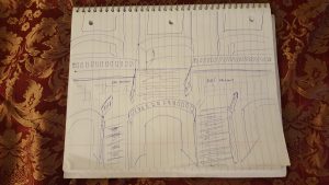
On the other hand, the Seagram building is very proportional building with center beams, and transparent facade. Ludwig Mies moto was less is more, and he defined the modern architecture with this way of construction. Proportion is very important in this building where everything lines up, with centered outer black beams, made from bronze, which represents the model in modern ornamentation. He made relief at the bottom of this building and all the articulation is at the top.  We can see that he uses a rectilinear concept at constructing this building. Also, on the ground floor, which is completely transparent, he uses the travertine stone for the elevator shaft in a proportional and centric way.

Lipstick building represents a post-modern architectural style. They use stainless steel frames and imperial granite for the façade. They build in a modern way but use elements from Greek architecture as a model for parts of this building, like columns that look like Doric style ones with equinox top and with the round shape. This building is not concentric, but rather oval, mostly because of the shape of the lot. With an oval shape, they manage to make a relief at the ground floor. Articulation on this building is managed with the two seatbacks which gave this building a unique shape of lipstick stick.

     Modern architectural style brings the use of new technologies and materials like glass, steel, and concrete. It also defines the rejection of old traditional styles like neo-classical and Beaux-Arts. But inside of modern style, it is visible change from domination by rectangular building forms with an emphasis placed on bold, straight lines like Seagram building, toward more free-flowing and organic designs like Lipstick building.

Aleksandar Dekic; The Classic Skyline: 1920s and 1930s New York   


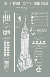
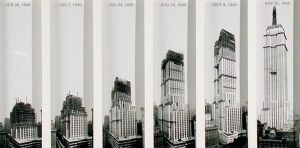
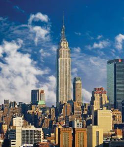
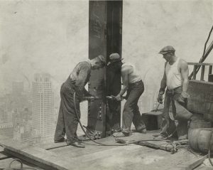
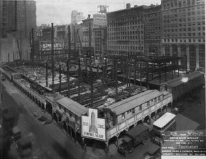
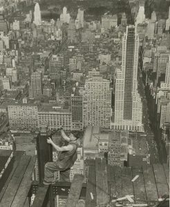
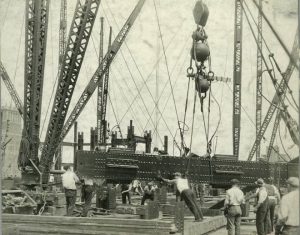
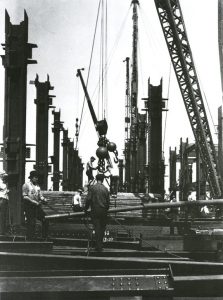
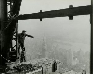
Both the Empire State Building and Chrysler building are built as a part of the New York City 1920s building boom. Both of them represent the power and prestige of the automobile industry companies. They were both build-in art deco style. Both buildings were constructed using a frame of steel, very modern and lasting material. But even though these two buildings are so similar they have so many differences.

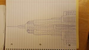
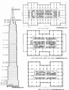
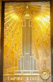
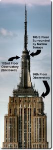
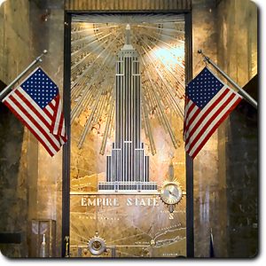
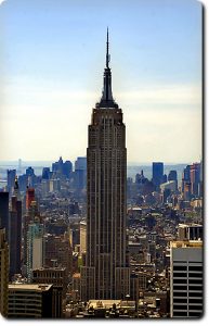
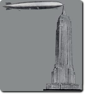
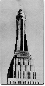
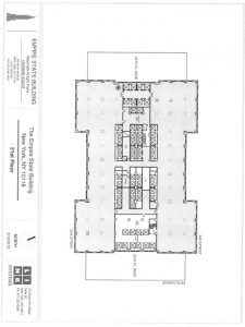
The exterior of Empire State building is covered in limestone and granite, accented with aluminum. This combination of materials was very common in Art Deco and promoted an aesthetic that was industrial and modern yet refined. Empire state building does not have a whole lot of extra ornamentation because the focus is on the structure itself. The most important element of this design is its height. At its tip, the Empire State Building is 1,454 feet tall, holds over 2 million square feet frame of steel of office space, and covers two acres of land. The most notable art deco style elements are in the lobby of this building. The Empire State Building design featured one major setback and several smaller ones. The top of the building is made of glass, steel, and aluminum.

Chrysler building has less seatback then Empire State building, but more ornamentation at exterior. Materials used for the exterior facade is black granite and white marble, especially at the ground floors. On higher floors, we can see the use of brick elements and at the top of the building uniquely decorated hubcaps, and car hood ornaments. We can see eagles and gargoyles as a decoration on the corners of the buildings, helping in a smoother transition between seatbacks. The crown and the spire are made of stainless steel, unique for that time. Also, the corners of the building are made in a unique style with black wired walls next to the windows which give windows visual extension from outside.

Both buildings represent the golden age of the American car industry and step forward into the modern world and new designs. Without each other, both will not exist in this form of beauty and heights. And, also both represent an inspiration for the architects worldwide.

Aleksandar Dekic: 20th Century Civic Infrastructure

With the city expanded beyond the borders of Manhattan, and with the rapid progress in transportation networks all over the country, New York City needed to make better transportation infrastructure. Development of Grand Central Terminal and Penn Station was the answer to the growing city and regional needs for civic train network. To enrich the area of the city with these two stations, the city also builds the New York Public Library.

The importance of civic infrastructure development in a city like New York is crucial how for the people who live in New York City, but also to the people who are visiting the city. Without proper and adequate transportation infrastructure the city will collapse. That is why the development of Grand Central Terminal and Penn Station was something that helps the city to further develop in one of the biggest cities in the world. Architects also pay attention to other details, like economic activity of the stations which will allow sustainability and long-term maintenance of these civic assets. They also put effort to make these places to be built in a unique style, using neo classic style as a base for the Art Deco architectural style. They used iron and glass for the windows, and Tennessee limestone with the marble for the inside of the buildings.

To make Penn Station, Grand Central, and New York Public library as one whole part of the civic architectural and cultural wonder of the city, city officials, private partners, and architects made very complex buildings using symmetry and thermal windows which bring extra lights in the buildings. They made interior composition very profound with several levels of steps and ceilings that intercept on multi-levels. In Grand Central, we have a beautiful ceiling with astrological signs with the lights that represent starts which gives the building that profound complexity and uniqueness. Outdoor space for each building is projected to find a contrast from busy streets. An example of that is the terrace that surrounds the library and the Bryant Park behind the New York Public Library.

Without these three buildings, the city will not be just in a collapse with public transportation, but also this city will lose the enrich quality of life which these buildings provide. There will be lost of economic activity, tourism benefits and loss of public interest in this area. We can see that on the example of old Penn Station building which was demolished and instead of that we have cold and ugly buildings in this area which reflects on less economic, cultural and touristic interest in the area.

Aleksandar Dekic: Lower Manhattan: The Emerging Metropolis

Aleksandar Dekic

Lower Manhattan: The Emerging Metropolis

With the invention of elevator safety brake, and with the constructing the Brooklyn Bridge, the new era for the New York City begins, as a growing commercial power. In this period, we have building construction boom, with several examples that we visit it during the last class, that represents step forward from large scale houses built for wealthiest New Yorkers to high-rise landmark buildings like US Custom House, Federal Hall and New York Stock exchange building, Trinity church, Equitable building, Woolworth building, and Brooklyn bridge as a sign of unification of Brooklyn and Manhattan.

Some of these buildings are made in quoting languages of architecture, like Federal Hall and New York Stock exchange buildings. Both mimic the Pantheon in Rome. The federal building has portico with the freezes that contain triglyphs over the Doric columns of the façade with the domed ceiling inside and a steep step in front. New York Stock Exchange building has portico that includes pediment filled with pictures like it was in Parthenon in Athens. All this is supported by six Corinthian columns to give a building look like a very stable construction. Both buildings are built in the Greek revival style. Also, Trinity church is built in quoting architectural language, in the Gothic revival style.

On the other hand, the US Customs House is built as a part of the Beaux-Art style. This is the use of classical art as a base for the creation of a new style and it is part of developing language in architecture. We have a big building with high steps in front and beautiful columns that are radiating from the building with its 3 quarters. We have four sculptures in the front of the building at the enormous pedestals that show us that this building is not Greek revival but Beaux-Art style, something that is added as a unique American with details that represent this country.

Equitable building and Woolworth building represent modern architectural language. The first one represents all the bad in modern architecture, while the second one was representing an organic way of constructing. The Equitable building was created as a monster building to bring the most possible revenue for the owner, without thinking for space and organization. It is a very anemic and cold building, that occupies every square inch of the lot. On the other hand, the Woolworth building was built in cascades, allowing the airflow and sun to reach in and around the building. They use steel and terra cotta for faster construction, but they still made it in Art Deco style using neo-gothic elements on the façade. A lower level of the facade is made of limestone, and we have a greater integration of styles from bottom to top. We can see outside of the building how vertical lines on the façade make the connection from bottom to the top. The architectural language was implemented for the building itself.

This was an excellent way to see evolving in architecture in Lower Manhattan and how certain inventions provide the critical missing pieces for developing tall buildings. All this provides an opportunity to invent new architectural typology and a new image of the city.

« Older posts Newer posts »