Architects imitate each other. Architects take ideas from old classical buildings, modern buildings, and sometimes even from their old projects. Consistent use of an idea, building elements or materials makes it easy to define an architect and an architectural period. The Guggenheim museum is one of Frank Lloyd Wright’s famous projects, and it has many characteristics of Wright’s signature design, such as organic form and cantilevers.
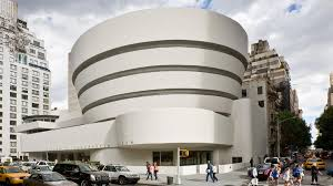
Fig. 1 View of the museum from 5th Ave and 88 street, 2008
The Guggenheim Museum, also known as Solomon Robert Guggenheim museum, is located in NYC on 5th Ave and 88th st. The construction is dated back to 1945 and it was built during the Modern Architectural period. The museum opened to the public on October 21, 1959. During the Modern period, many architectures aimed for clean lines, basic shapes, geometric forms, open interior floor plans, and many glass windows. Unlike other modern architecture, the Guggenheim Museum has more emphasis on the concrete form rather than a light and transparent approach using glass and steel. The decision of using concrete for the project is related to cantilevers. He loves to use reinforced concrete on his projects, such as The Fallingwater and Unity Temple. The combination of the tensile strength of re-bars and the compression strength of concretes makes it possible for cantilevers to extrude out.
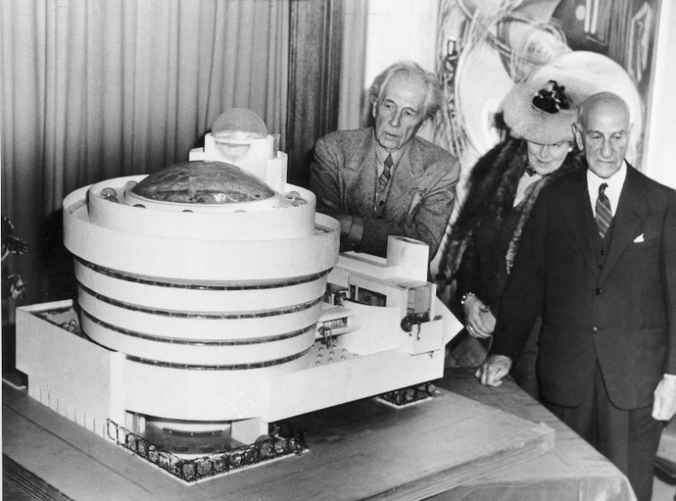
Fig. 2 Frank Lloyd Wright, Hilla Rebay, and Solomon R. Guggenheim at the unveiling of the museum model, Plaza Hotel, New York, September 30, 1945
The building massing is mainly circular and rectangular, but the construction of the simple shapes was very complicated at the time. It took 4 years for the initial submission of plans to get approved because the drawings contravened thirty-two buildings regulations.[1] It would be surprising if a one of a kind project got permitted to build on the first submission. The form of the museum amazed many people. It has a spiral shape and as it goes up, the radius of the circle gets larger. The spiral shape gives the illusion of the museum growing upward toward the sky. When we envision a spiral building, most of the time we think the base of the building is bigger than the top of the building. This way of thinking makes sense because the base of the building can support the small structure on the top. Guggenheim Museum is the opposite, with the top being heavier than the bottom, thus making it more astonishing. The skylight and the light coming in from the dome on the museum is a reflection of the Pantheon in Rome. The light enters and shines the interior space of the museum following the sun path. The dome has an interesting function. The pressure of the building spread vertically downward along the circular wall, in conjunction with some critical located vertical columns, allows for the museum to be free of an interior wall.[2] The open interior space makes it almost impossible for us to not look up and search for things to watch. It is similar to people raising their heads and looking at beautiful highrise buildings, but in our case, we are judging the interior of a building. How are the spaces functional, are they safe to occupy and how are the colors, lightings, and materials decorate an interior space?
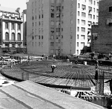
Fig. 3 Workers lay the foundation of the main gallery, Solomon R. Guggenheim Museum, New York, ca. 1957
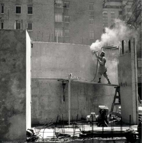
Fig. 4 A Construction worker grinds walls to remove form marks, ca. 1958
Wright was exploring organic architecture since the early 1900, especially under the guidance of Louis Sullivan. Wright’s envisioning of the continuous spiral design derived from concepts tied within the principal of the organic architecture. The structural engineer and the builders were faced with many challenges because the old methodology could not work on an alien-like building at that time. Wright decided to use structural steel and reinforced concrete as the structural shell of the museum. Plywood panels were used to form the shapes, and concrete was sprayed into the plywood formwork, rather than poured. This is known as Gunite. It uses dry, fine- aggregate cement, forced by compressed air through a hose to a nozzle where it was hydrated and shot out at high velocity onto a surface where it set or hardened.[3] The tensile strength from re-bars and the compressive strength from concrete made it possible for the cantilevering spiral ramps to extrude away from the wall without falling apart. The surface of the concrete can be smoothed out after the gunite is cured. The use of reinforced-concrete can be seen in many of Wright’s projects that have cantilevers, especially in The Fallingwater.
The color of the concrete finish was carefully selected. The museum was built after WWII and it had a big impact on many people. The white/ivory color finished has a symbolic meaning. It represents purity and hope. It gave people positive energy and thoughts. The color as a whole makes people feel good. The spirals look like many halos stacking on top of one another. Since the spirals are growing toward the sky, it makes it looks like the people who died during WWII were heading to heaven. The symbolic meaning of the museum is comparable to that of the Oculus by Santiago Calatrava. The white steel ribs give us warm and comfort, sheltering the people who got affected by the terrorist attack. The building is shaped like a bird that is getting ready to fly, which symbolized freedom and hope.

Fig. 5 Gordon Strong Automobile Objective and Planetarium (unbuilt), Sugarloaf Mountain, Maryland, 1924-25. Aerial perspective. Graphite on paper. Frank Lloyd Wright Foundation, Scottsdale, Arizona 2505.023
Wright designed a building with characteristics similar to the Guggenheim Museum before, such as the Gordon Strong Automobile Objective. The project was never fully developed, but the central concept of this building has a strong relationship to the Guggenheim Museum. The spiral ramps are clearly emphasized on the sketch. Unlike the museum, this building has a bigger spiral base and a smaller top. Wright exhibited interest in geometry since he started working for Louis Sullivan. He did not limit himself to the two-dimension world of geometry. He tried to find a way to break the box and add three-dimension/ vertical emphasis to the project. He typically adds different shapes of flat roofs, different projections, and levels of height to create a three-dimensional space.[4] His exploration of the possibilities of the spiral concept started during his later years. The spiral is continuous with a beginning and an end, qualities to a linear path. It also exists in three-dimension. The spiral gives a feeling of depth and perspective. It defines space without strictly containing it and it has powerful connotations of movement. [5] The spiral creates movement, it gives us a sense of direction, a starting point or an ending point. The spiral can be used in buildings and create livable space. It also fits the criteria of organic architecture.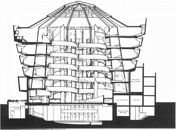
Fig. 6 Frank Lloyd Wright, Solomon R. Guggenheim Museum, New York, 1943-59. Final section (copy, original lost). Frank Lloyd Wright Foundation, Scottsdale, Arizona 4305.750
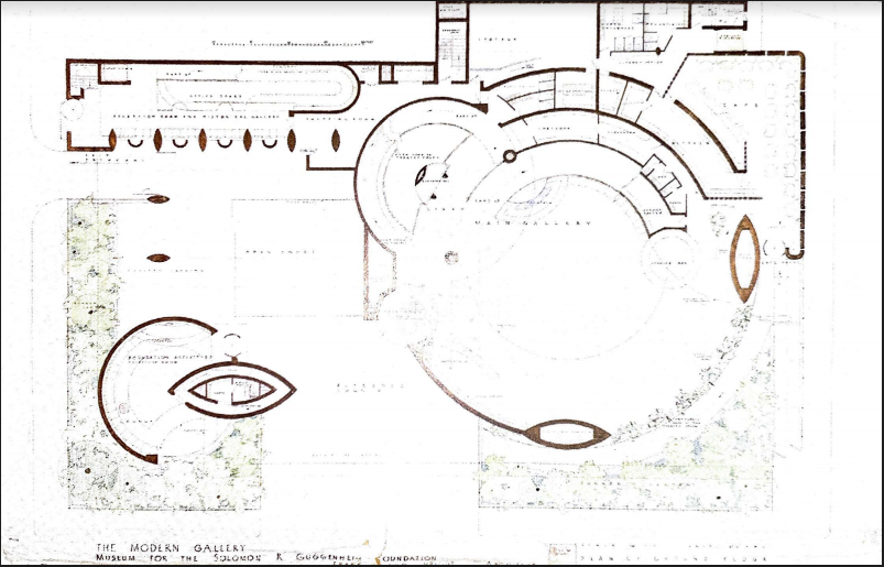
Fig. 7 Solomon R. Guggenheim Museum, New York, 1943-59. Plan (presentation drawing). Graphite, colored pencil, and sepia on tracing paper. Frank Llyod Wright Foundation, Scottsdale, Arizona 4305.049
Circulation is a big component of the museum. As the exterior suggested, the interior looks similar to the façade of the building. Wright likes to expose the materials internally as well as externally.[6] There is a spiral ramp going around the wall and cantilevering away from the wall. We can see clearly where the columns and cantilevers meet and how they intercept. Wight doesn’t want to hide the columns. Wright’s intention is to let people take the elevator to the top and then walk down the spiral ramp following the motion of gravity. We can stop and observe the movement of the people and watch how they occupy the space. It is a form of art within the museum that is not displayed in a traditional sense. It is a piece of performance art where the museum is the stage and people are centers of the subject. From first glance, the interior of the museum gives an illusion of a circular slide that children play in the playground. The circular ramp is the slide and people are the children, riding on the slide and enjoying a wonderful moment. Or a blender that is blending all the things and people represent the motion of the blended objects circulating within the blender.
Wright’s love toward the Guggenheim Museum is beyond his other projects. He started calling it the Archeseum, rather than a museum. He borrows the word from a book on Egypt in which Rameses’ tomb-temple was referred to as a Rameseum.[7] He is implying that the Guggenheim Museum will be a holy place dedicated to architecture. Wright didn’t design the museum just to house a few abstract canvases of paintings and art, but to be a manifesto of organic architecture which could be studied by architects and historians.[8] His desire for architecture becoming the focal point of the museum rather than the art has come true. Nowadays many people visit the museum simply to enjoy the architecture and the interior experience that the architecture provides. Although there are also a good amount of people that visit the place purely for the art shows.
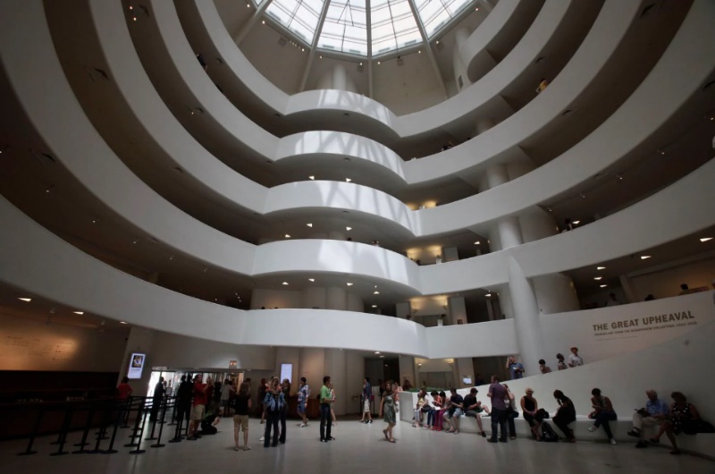
Fig 8 The interior of the Guggenheim Museum in New York 2011. Kathy Willens/ AP)
There is one group of people who objected to the building of the Guggenheim museum. Twenty-one artists published an open letter accusing Wright of this inappropriate emphasis on the art museum. Sloping ramps with outward-leading walls are not suitable to hang and admire the paintings. Wright got portraited as an arrogant man. Wright defended himself by saying that they know too little of the nature of mother art: architecture. The paintings are exhibiting on the slope and they are lit from behind and above, making it a dark spot for paintings to display.[9] This makes people wonder if Wright dislikes art. In Falling Water, many walls are replaced with glass windows and uneven rock columns. There are not many places to hang paintings. If there is a place to hang paintings, the light will not shine toward that place to give a clear view of the painting. Not that he dislikes art, he tends to put more priority on architecture rather than on art. He also received an objection from the director of the museum, Hilla Rebay. She didn’t question the quality of the architecture, but she expressed her concerns that Wright’s design will not be functional or negatively impact the power of the paintings on display. They preferred the old standard housing for the paintings like the Frick Museum. It is hard to imagine Wright designing a building base on the Frick Museum, where there is no control of flow or circulation. Everyone is out of place and scattered around the building. Whereas a singular path gives strong directional control.
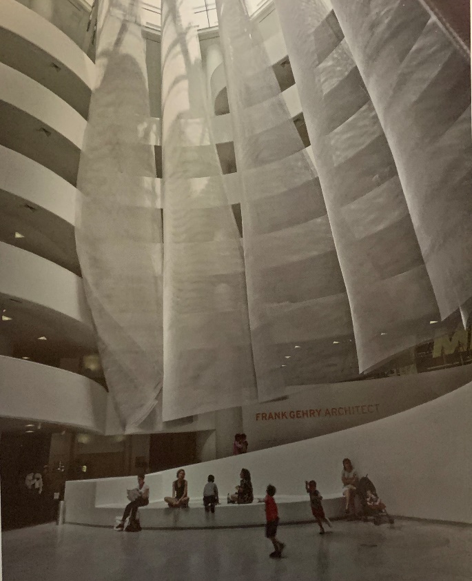
Fig. 9 Installation views of metal-mesh sculpture designed for Frank O. Gehry & Associates for the Solomon R. Guggenheim Museum for the exhibition Frank Gehry, Architect, 2001
Wright had issues with lighting the paintings inside the museum, but his lighting choices on an architectural point of view is very thoughtful. The lighting on the base of the exterior wall is lit in such a way to trick our eyes to think that the building is floating in the air. The lighting strategy gives a sense of weightlessness to the building. Unlike the Guggenheim Museum, the Unity Temple looks robust and heavy. In fact, The Guggenheim Museum is much bigger than The Unity Temple. The museum can house many arts and paintings and allow many occupants to enter at once. The light entering from the dome act similarly to that of the Pantheon. Casting light from one section to another and circulating throughout the building. Suddenly the sun travel path becomes part of the circulation, a part of the performance art without notice.
When it comes to building, Wright’s first concern is the context and site. The second is to provide interior space that is functional and yet sensually and intellectually satisfying.[10] The Guggenheim Museum does have a functional interior space condition and it does provide wonderful satisfaction. The settlement of the location of the museum stands out a lot from the contextual buildings. The museum doesn’t blend in with the surroundings. The buildings along the 5th Ave are rectangular, vertical, and decorated with bits of ornamentations, the Guggenheim counters this regularity with its purely sculptural façade.[11] Wright breaks the rectangular form of the neighborhood by choosing a circular form. He describes Manhattan as a “vast prison with glass fronts,” his dislike of the rectilinear glass windows can be clearly seen on the elevation of the building. He doesn’t have any glass windows on the main rotunda other than the dome and there are some circular glass windows on the second rotunda to the left. Lighting was used between the gaps of the spiral. The lighting gives an illusion of depth tracking our minds into thinking that the inside of the building is exposed to the weather trough the gaps.
The entrance of the Museum is not flush with the exterior wall. In order to get to the entrance of the museum, one would need to walk under the shelter of a ceiling. The ceiling extended beyond the entrance, framing and limiting the views. As one walks pass the ceiling, they are surprised by the amazing interior space. It almost gives a feeling of walking through the frame of a painting. It gives a chance to explore what is beyond the limits of the frame. Being an art museum and having this symbolic meaning makes one want to visit the museum over and over again.
Guggenheim Museum is a one of a kind building and it is on the top list of important architecture. New York is a busy city but Guggenheim Museum gives a good reason for people to stop by and enjoy the architecture and art.
Works Cited
Board, Editorial. “The Guggenheim Caves to Threats – and Squashes Free Expression.” The Washington Post, WP Company, 1 Oct. 2017 www.washingtonpost.com/opinions/the- guggenheim-caves-into-threats–and-squashes-free-expression/2017/10/01/2b64e6a2-a486- 11e7-8cfe-d5b912fabc99_story.html
Joseph M. Siry. “Seamless Continuity versus the Nature of Materials: Gunite and Frank Lloyd Wright’s Guggenheim Museum.” Journal of the Society of Architectural Historians, vol. 71, no. 1, 2012, pp. 78–108. JSTOR, www.jstor.org/stable/10.1525/jsah.2012.71.1.78.
Quinan, Jack. “Frank Lloyd Wright’s Guggenheim Museum: A Historian’s Report.” Journal of the Society of Architectural Historians, vol. 52, no. 4, 1993, pp. 466–482. JSTOR, www.jstor.org/stable/990869.
Watkin, David. “FRANK LLOYD WRIGHT & THE GUGGENHEIM MUSEUM.” AA Files, no. 21, 1991, pp. 40–48. JSTOR, www.jstor.org/stable/29543729.
Sutton, Ian. “Western Architecture: from Ancient Greece to the Present.” Thames and Hudson Ltd., 2004.
“The Guggenheim Museum from the Outside.” Guggenheim, 17 Nov. 2016, https://www.guggenheim.org/arts-curriculum/topic/guggenheim-from-the-outside.
- Watkin, David. “FRANK LLOYD WRIGHT & THE GUGGENHEIM MUSEUM.” Page 43 ↑
- Sutton, Ian. Western Architecture: from Ancient Greece to the Present. Page 18 ↑
- Joseph M. Siry. “Seamless Continuity versus the Nature of Materials: Gunite and Frank Lloyd Wright’s Guggenheim Museum. Page 78-79 ↑
- Quinan, Jack. “Frank Lloyd Wright’s Guggenheim Museum: A Historian’s Report.” Page 473 ↑
- Quinan, Jack. “Frank Lloyd Wright’s Guggenheim Museum: A Historian’s Report.” Page 475 ↑
- Sutton, Ian. Western Architecture: from Ancient Greece to the Present. Page 303 ↑
- Watkin, David. “FRANK LLOYD WRIGHT & THE GUGGENHEIM MUSEUM.” Page 43 ↑
- Watkin, David. “FRANK LLOYD WRIGHT & THE GUGGENHEIM MUSEUM.” Page 43 ↑
- Watkin, David. “FRANK LLOYD WRIGHT & THE GUGGENHEIM MUSEUM.” Page 44 ↑
- Sutton, Ian. Western Architecture: from Ancient Greece to the Present. Page 349 ↑
- “The Guggenheim Museum from the Outside.” ↑


Leave a Reply