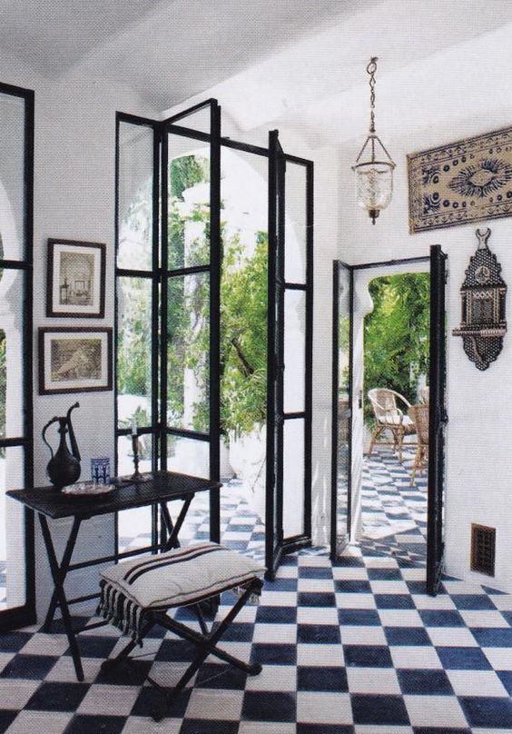
This felt like a residential interior space than a modern interior space. Although the two doors adjacent to each was pretty interesting. It made me question they’re purpose to why they designed the doors to be a various size, and why did they have to be right next to each other. By doing so, although they were in the same area they’re meant to be used as a framing unit. Looking through these door, I was able to have two different experiences. Since they’re facing two different directions they’re also giving the occupants a choice to choose a path. If the tiles didn’t stay constant beyond the boundaries within the wall, then it’ll change the entire aspects of this interior space. Although the sense of circulation was pretty clear, and the placement of the furniture helped signify the space.
Category Archives: Assignment submission Links
Jernel Williams – Interior 2
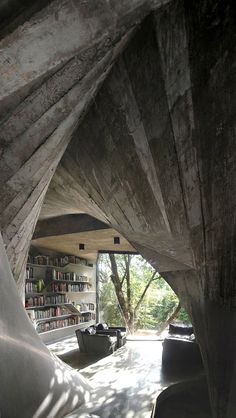
In this interior space the first thing that stood out to me is how enclosed this space was. I compared it to the opening within a tree bark in which little animals such as squirrels and birds hibernate in. Therefore I believe that this interior space is meant for private uses, despite the large window. Although due to that massive window creating transparency, the ending result was to let natural sunlight in. Which created shadows that looked like a configured pattern upon the plain surface of the structure. Also not only does the curve structure signify enclosure but it’s also used to frame the room. Such as what it’s doing in the photo above it frames parts of the room, therefore showing the bookshelves, placement of chairs and outdoors. This space is portrayed to be relaxing and silent. While creating an outdoor experience to enhance readings.

![REN [Converted]](https://openlab.citytech.cuny.edu/montgomeryarch2310sp2016/files/2016/03/REN-Converted-300x225.png)
