Monthly Archives: June 2016
Assignment I- Plan Drawings
Assignment H- Digital Model Development
Library Research
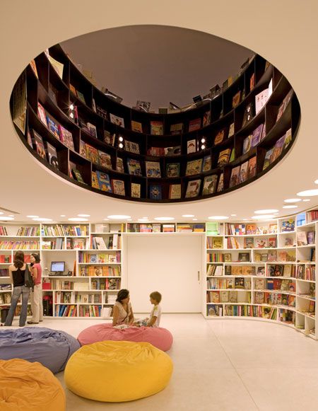
Livraria de Vila by Isay Weinfeld Arquitecto
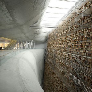
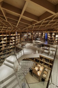
- Having the opening in the middle is a great asset to have in a library providing a center vocal view. By the look of this images the space seems to be meant more for kids in the level shown and the above floor meant more for adults. Having the bookshelves attached to the wall give this library a great aspect of the use of space.
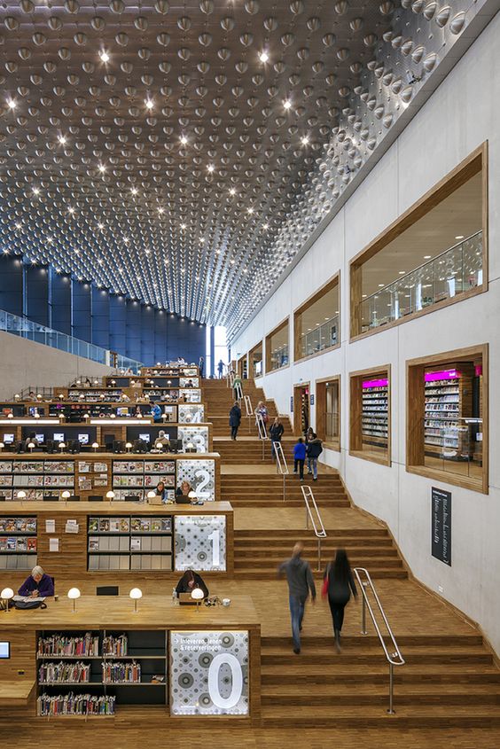
Culture House Eemhuis / Neutelings Riedijk Architects
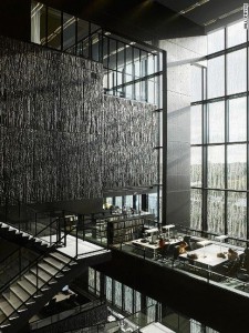
- The intriguing part of this image was how the architect formed the staircases with each floor and connected them together as one union. Also having the ability to see the interior spaces from a distance is great when coming up to the staircase. Accompanied along with the different numbers on each level signifying different categories/sections.
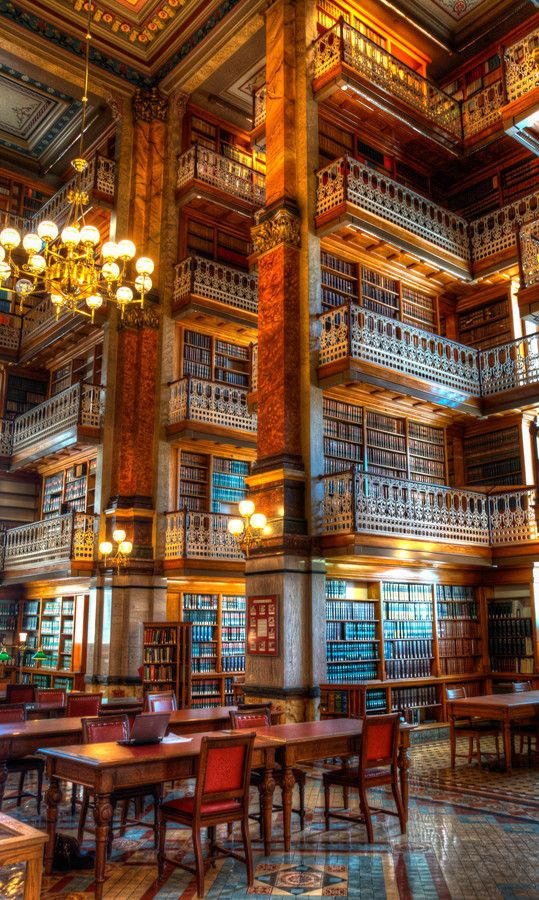
Law Library Iowa
- What caught my attention in this image was that each floor wasn’t a solid floor, what I mean by that is that instead of closing off each floor with a solid plane the architect did many mezzanines to show more of a visual design when approaching the library.
Library Research – Ashley Amador
Library 1:
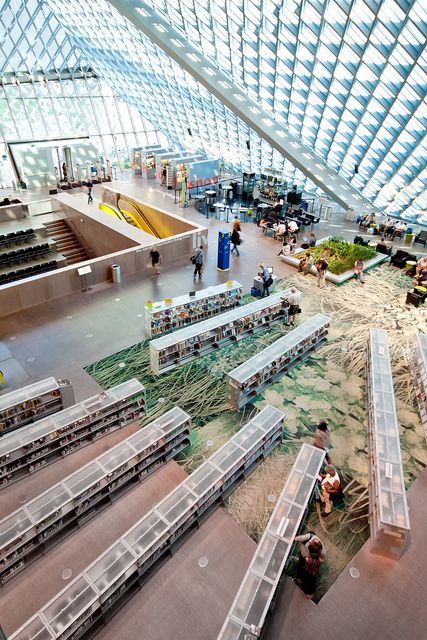
What I like about Seattle Public Library is the visibility that is has through the roof. I feel that I would have a sense of extreme height if I were to inhabit this space.
Library 2:
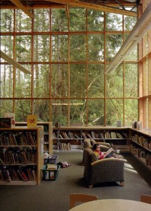
In this second library I enjoy the connection to nature that it has because the facades are made up entirely by windows.
Library 3:
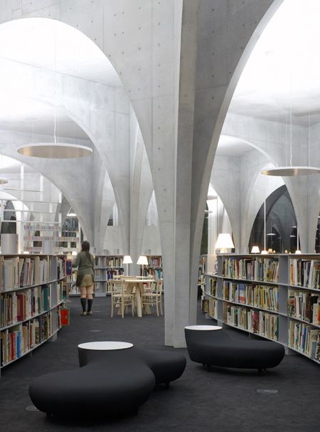
In this third library called Tama Art University Museum I liked that it shows its structure by having the columns inside.
Library assignment
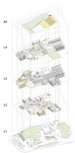
This image is a exploded drawing of a library. It has capture my eyes because it allows me to see how much space there is on each floor plan and how the furnitures have been placed.
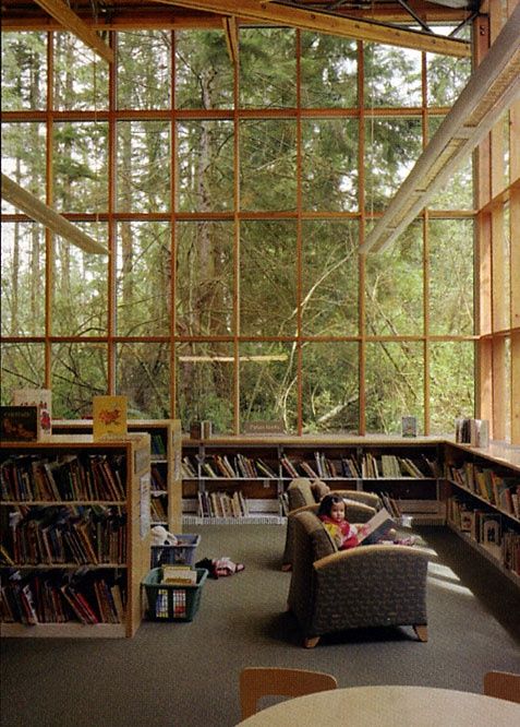
this library has caught my eyes because through this image i am able to see that it is located where there is a lot of trees .the glazing bring lights
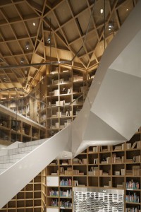
Hyundai card travel library has capture my eyes because of the contrast between the stairs, the roof and the bookshelf. it gives me a sense of curiosity.
Library Selection
Library Research
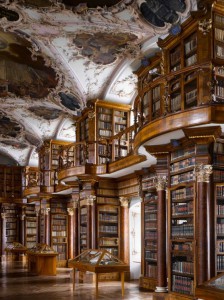
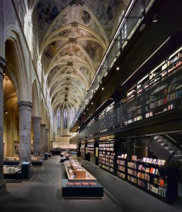
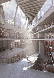
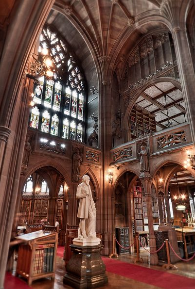
The first image of this specific library is very unique because it has Gothic architecture incorporated. There are high ceilings that are creating hierarchy and there is a lot detail on the columns.
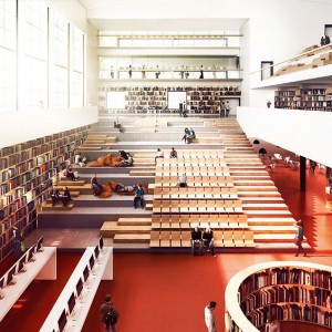
The second image is my favorite image because of how the design is created. The inside of this library looks a little bit like a modern house. Everything inside is mainly white and the only color that is being shown is from the book bindings that are inside of the book shelves located on the wall. Also there is a lot of overlooking from the indoor terracing created.
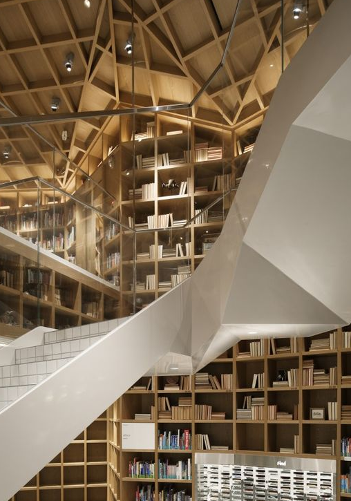
Finally, this last image is very abstract because of how the stair case is created and also the wood framing that is going on between the walls and the ceilings. You can see the geometry that is being used to create this type of design.
Library research by liwei
Bibliothèque Nationale de France – Richelieu
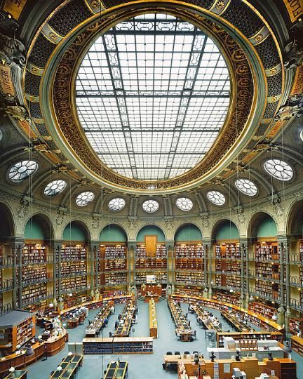
This library has a large windows space on the center of the top. It using the natural energy to support whole library. And all books are in the shade that created by wall, so the shade will protect books from sunlight.
Seattle Public Library
Similar idea with first library, but it using facade to control sunlight.
Shiba Ryotaro Memorial Museum
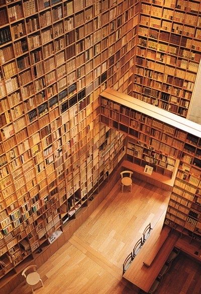
super large wall for book, and use wood color materials inside building. This color makes people’s eyes feel more confortable.

