Faculty: This example post demonstrates how you can provide information about each class for your students. It uses the category “Classes” and can be found under Activities > Classes in the site menu. Use the suggested outline below to structure your class posts.
Class Info
- Date: Add date
- Meeting Info: Add online details or in-person location
Topic
- Intro to project 3 | Part 1. Posters Series and Social Media Posts
- Visual Hierarchy: Giving levels of importance to the difference elements that are part of a design.
- Examine this PDF with Visual Hierarchy Progression. Every page uses the exact same text, but the hierarchy changes once we start applying different principles (For example a basic change in type size can make a difference in the way the viewer looks at the design)
Objectives
- Learn about visual hierarchy and how these design principles can improve or change the way we see and read.
- space
- type size
- spacial zones
- color/reverse
- alignment
- added elements (lines)
- variations in type (bold)
- dynamic compositions (diagonals)
- others
Activities
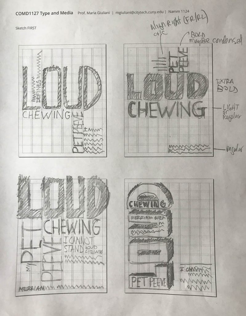
- Sketch> When sketching consider the following:
- Use type only
- TWO typefaces max. (but with extensive families ok)
- Black and White
- Follow the grid
- Emphasize your visual hierarchy
- Emphasize contrast with scale (something must be BIG, something must be small)
- Must consider and apply what was previously covered in class: Type selection and variations, alignment, word and letter spacing, line height, expression, etc.
- Look at sample below
- Content:
- The words: My Pet Peeve Exhibit
- Title of your Pet Peeve (different for everybody)
- Your personal text: One to Three sentences explaining your pet peeve
- Content:

To-Do After Class
- Complete sketches started during class
- Sketch. Here is a PDF with the printed grid. It will help you to determine where and how to place content. As well as to start thinking about typographical style.
- See Example

- DUE Next class Bring completed sketches (as jpegs) and post as instructed


Leave a Reply