Monrovia Ndiaye UCLA cover commentary
- 1990 summer – Bradbury Thompson
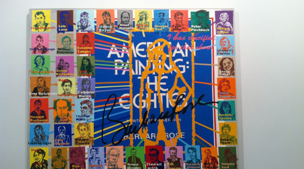
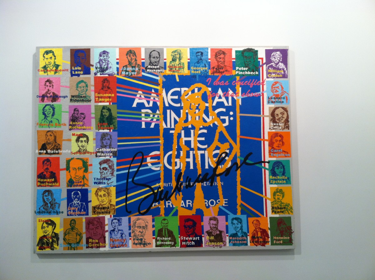
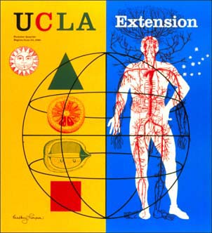 I like this cover for many reasons, first the imagery used is both interesting and strange. The creative use of the primary colors also catches the eye. Despite the clear division in the compositions the artist manages to unify it with the use of the colors red and white on both sides , this also causes the eye of the viewer to move through the piece. The circular frame placed over the elements also brings unity to the piece. Also the hue of yellow chosen compliments the blue used and they are both tertiary colors. Type legibility is accomplished very well with the use of dark font colors against the lighter background , and the use of a lighter color against a darker background, another great thing about the type colors chosen is the fact the colors used were already used in a other places in the piece.
- 1992 summer – Milton Glaser
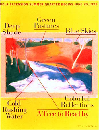 This piece definitely evokes the feeling of summer with the vibrant color choices. Here however subtle the the use of primary colors occurs again, as well as the use of the complimentary colors red and green. My favorite part of the the composition is the fact that the different aspects of the focal point are labeled with various aspects that correspond with summer. The arrows pointing from the aspects corresponding with the labels are red a color that contrasts well with the colors underneath. The only drawback of this cover is the type legibility. The type used for the labels is clear and easy to read, but the type used for the summer quarter information is perhaps too small, and the red color used for it makes it hard to read.
- 1994 spring – Michael Vanderbyl
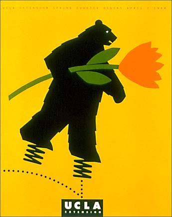 Out of all the covers i chose this one is definitely the most simple but perhaps it is the most effective. Without much ambiguity , and without seeing the quarter this was created i was able to tell that i was for the spring. The imagery of the bear with springs on his feet while holding a flower is comical but combine identifiable spring components. The color scheme though simple is very effective. the black against the yellow background, and the green against the black contrast well. The use of the use of the black and the hint of white as eye of the bear accompanied with the use of white and black for ucla logo bring the composition together.