Pixar is responsible for creating and animating many of the films I enjoyed when I was younger and still enjoy today. The Cooper Hewitt museum currently has one of the greatest and most influential exhibitions I’ve been to. The exhibit contained several different conceptual pieces all created for the many different movies they’ve made. The artwork gives the audience a better understanding of all the work that was put into a single film work they otherwise would never see as some of it never made it to the final film.
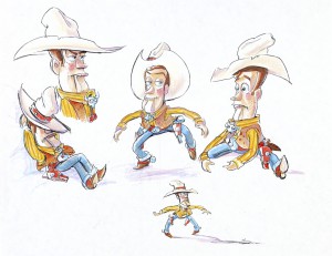
When you first walk into the museum you are given a digital pen to collect whatever piece into your collection to observe from home. This pen is very useful and extends the experience to your home to show family and friends what to expect when they choose to visit. With this pen I had chosen many different pieces that I found interesting and one of the first things to get my attention is the concept artwork done for Woody the cowboy from the Pixar film Toy Story.
The specific piece, as there were several, I’m referring to is labeled as Study, Woody, Toy Story, 1995. Bud Luckey did this piece on 8.5×11 paper in pencil. The museum only has this piece for a limited amount of time. The piece actually got my attention because as I observed it I realized how much thought went into the characters design. This design can be distinguished as its own character apart from Woody because of how different it seems. The color scheme is the same but the form and actions seem to pull away from the character. You can tell they started from this and slowly arrived to the Woody we have today.
The simplicity of the design Woody currently has contrasts the design Buzz has. Buzz in the movie is at first a competitor for Andy, the toys owner, because of Buzz being more advanced and from space. Buzzes design has a lot more details that distinguish him and make him a more modern toy. This design actually seems to have that same feeling of being outdated but has too many features, and the body being heavier doesn’t work well with Buzz. The next piece discussed is actually concept art for the first prequel Pixar has done Monsters University.
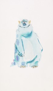
There were several different pieces that were displayed for the film but the one that got my attention was the concept art done for the character Sulley, called Concept Art, Sulley, Monsters University, 2013. At first I thought this was concept art for the first movie Monsters Inc. but then read it was actually for the prequel. The simplicity of this concept art is what got my attention. Rickey Nierva using both ink and watercolor on 10.25×6 inch paper did this piece. As a watercolor artist I had an admiration for the piece because I saw how simple it was and how if you take away the ink you’d have an unrecognizable blob of paint. With the ink you see the professionalism this artist had when giving this character his form. However this concept art seems to drive away from the character we knew from the original film.
Sulley in the films is known to be a very talented scarer, but this depiction is supposed to give us a younger version of the character and loses the strength the character has. The concept art seems too friendly and incapable of being scary. The expression the painting shows make Sulley look clumsy, but this is not the artist’s fault because, as said in the description, the character wasn’t fully realized yet in the production of the film. The last piece I’m discussing has to do with something around the character.
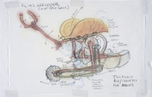
A Bugs Life was a very unique film exploring the life of insects specifically Flik. Flik was an inventor in the film whose inventions were created to help his colony. The first invention we seen in the film is the harvester. The drawing itself is labeled Concept Art, Flik’s Harvester, A Bug’s Life. Bob Pauley using markers, pencils and ink on 11×17 inch paper created the concept art in 1998. The artwork itself details how the invention works and how it was made using only nature itself. From this we can see the work and thought put into making this look possible for talking ants. The work also models the invention around the character taking into consideration the scale of the machine over Flik and giving him natural handles for him to operate the machine. The piece itself is a very rough sketch but gets the message across on the color scheme and natural feeling the invention needs to have. You can even see writing pointing out the various functions certain parts need to have.
Overall I enjoyed my experience at the Cooper Hewitt museum and enjoyed getting a second look at the pieces that interested me online. I hope to revisit the museum again before the Pixar exhibit is removed, as I would like to take the time to see each piece in person again. The exhibit made me think and respect the films I grew up with even more than they did before and make me look forward to any future work Pixar produces.
Links to artwork descriptions:
https://collection.cooperhewitt.org/visits/ncc2t/89718053/
https://collection.cooperhewitt.org/visits/ncc2t/89719893/
https://collection.cooperhewitt.org/objects/136251433/


