The video project is the last project of my semester in Digital Media Foundations. The task was to compile a list of questions to ask your fellow classmate, your question could be school related or other. I found this project the hardest due to editing, filming and finding an appropriate location for filming. Ive always have been interested in Film and the in’s and outs of it but I didn’t think it would be this tedious and time consuming . Overall, i enjoyed the conversation me Jasymn had and it was a joy talking about both of our experiences.
Author: Michaela (Page 1 of 2)
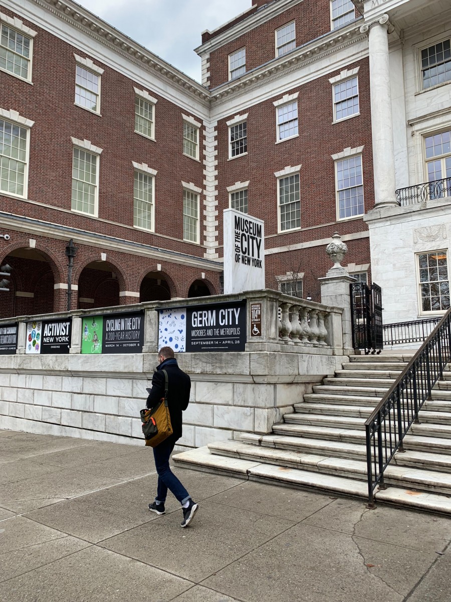
The Museum of City of New York one of the city’s most notable museums located right across the street from Central Park at 1220 Fifth Avenue @ 103rdstreet. The museum held a number of exhibits when I visited such as “City of Workers, City of Struggle”, “Cycling in the City”,” A City of Corduroy”, “In the Dugout with Jackie Robinson” those being the ones I’ve seen. The ones I enjoyed the most was City of Workers, City of Struggle and Cycling in the City.
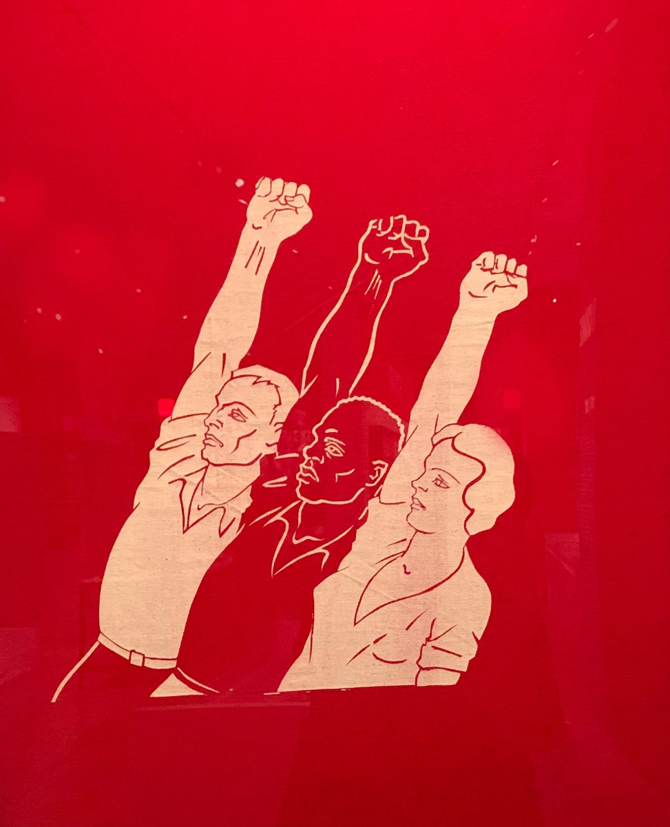
Rebel Arts Banner 1936-1939
Exhibit: City of Workers, City of Struggle
Designed by The Rebel Arts Group a Socialist Organization of young artists the banner was made for parades and marches. This banner caught my eye because of the illustration and the high contrast of the red and and off white colors. I’m unsure of the size of the composition but the actual banner was of a rectangular shape. The banner shows and gives information without having any typography, just imagery of protestors. The components of the banner are not aligned just floating in the foreground at a slant. With no text or an abundance of illustration I really liked the banner for the message it sent to groups that opposed the leftists party and overall effectiveness it had with color and imagery.
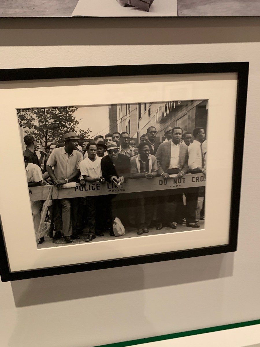
Untitled (African American man protesting hiring practices of Longshoremen’s Union, 7th Avenue near 12th Street, May 1970)
Exhibit: City of Workers, City of Struggle
Taken by David Bernstein in 1970 i really loved because of the contrast and energy it gave off. I personally like working with black and white it gives a more realistic and rich feel. The size of the picture is unknown to me. The only typography used is embedded in the image itself on the barricade. I also appreciated that Bernstein captured the frustrations that people of color went through not having jobs and training available to them.
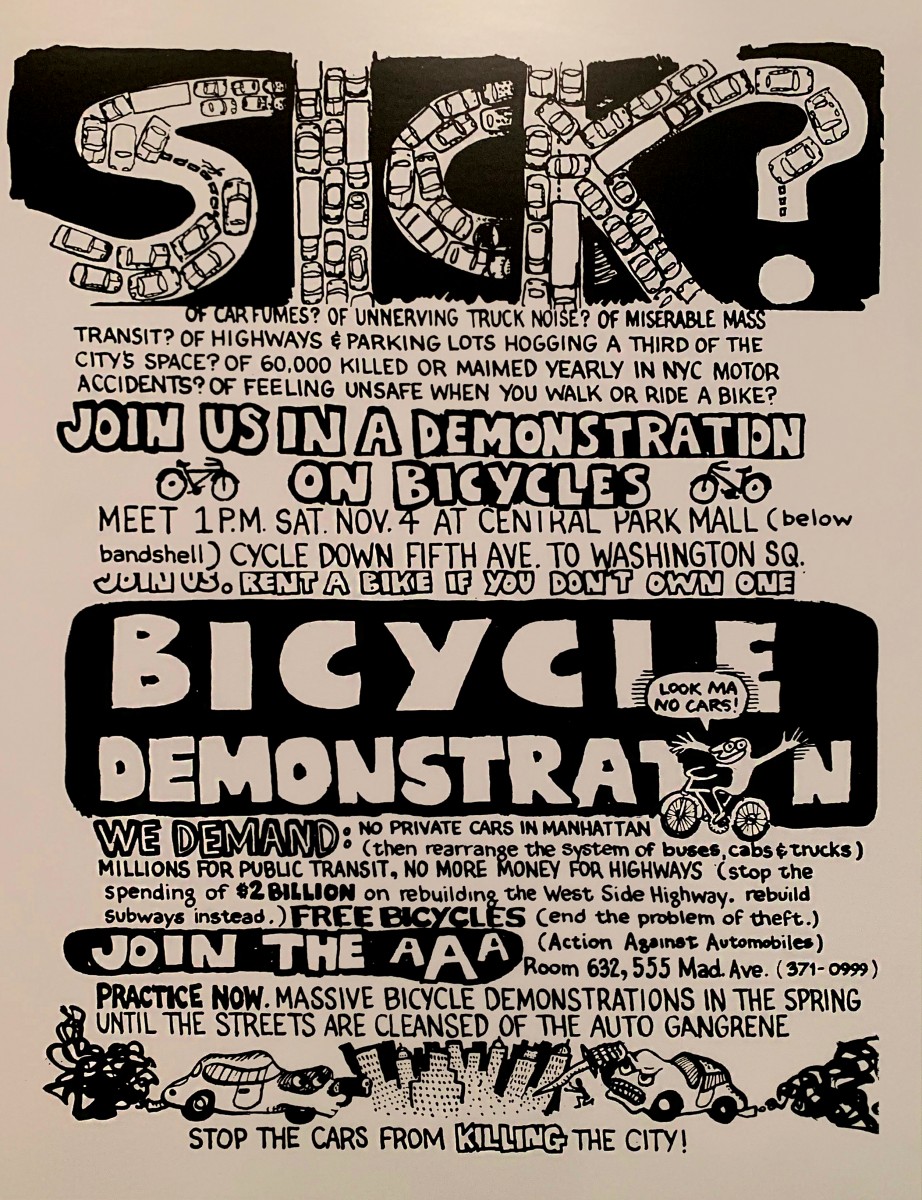
Flyer for a rally sponsored by Action Against Automobiles, 1972
Exhibit: Cycling in the City
Courtesy of David Gurlin this flyer was thought through a lot with the various typefaces and letter size. When i first looked i thought it was just this creative poster but when i looked closely there were so much details i wouldn’t have thought to create. Firstly, the title sick the way its formed you can tell it was hand drawn than the added car illustration in the word “sick” was really well done. Throughout the flyer there’s a lot going on between the contrast between blacks and whites and the drawings its however effective for that loud and busy era of New York and protest for bicycles advocation. The boldness tells you importance of issues at hand.
The video project is the last project of my semester in Digital Media Foundations. The task was to compile a list of questions to ask your fellow classmate, your question could be school related or other. I found this project the hardest due to editing, filming and finding an appropriate location for filming. Ive always have been interested in Film and the in’s and outs of it but I didn’t think it would be this tedious and time consuming . Overall, i enjoyed the conversation me Jasymn had and it was a joy talking about both of our experiences.
click below to watch!
https://www.dropbox.com/s/vodrj9mwox5d6yd/video%20project%202.mp4?dl=0
Jasmyn's Interview Questions
Do you have any insecurities when it comes to your major?
Did you always like designing?
What’s been your favorite class so far?
What’s your worst?
What is your dream when it comes to your field of work?
Who is your favorite artist, dead or living that you admire?
If you won the lottery what would be your first purchase?
Is there anything in the world that interest you that you’re scared to conquer?
What’s the funniest movie you’ve ever seen?
What’s the saddest ?
If you can master one thing what would it be?
What’s one thing you learned growing up that you wish you can unlearn?
The Museum of City of New York one of the city’s most notable museums located right across the street from Central Park at 1220 Fifth Avenue @ 103rdstreet. The museum held a number of exhibits when I visited such as “City of Workers, City of Struggle”, “Cycling in the City”,” A City of Corduroy”, “In the Dugout with Jackie Robinson” those being the ones I’ve seen. The ones I enjoyed the most was City of Workers, City of Struggle and Cycling in the City.
Rebel Arts Banner 1936-1939
Exhibit: City of Workers, City of Struggle
Designed by The Rebel Arts Group a Socialist Organization of young artists the banner was made for parades and marches. This banner caught my eye because of the illustration and the high contrast of the red and and off white colors. I’m unsure of the size of the composition but the actual banner was of a rectangular shape. The banner shows and gives information without having any typography, just imagery of protestors. The components of the banner are not aligned just floating in the foreground at a slant. With no text or an abundance of illustration I really liked the banner for the message it sent to groups that opposed the leftists party and overall effectiveness it had with color and imagery.
Untitled (African American man protesting hiring practices of Longshoremen’s Union, 7th Avenue near 12th Street, May 1970)
Exhibit: City of Workers, City of Struggle
Taken by David Bernstein in 1970 i really loved because of the contrast and energy it gave off. I personally like working with black and white it gives a more realistic and rich feel. The size of the picture is unknown to me. The only typography used is embedded in the image itself on the barricade. I also appreciated that Bernstein captured the frustrations that people of color went through not having jobs and training available to them.
Flyer for a rally sponsored by Action Against Automobiles, 1972
Exhibit: Cycling in the City
Courtesy of David Gurlin this flyer was thought through a lot with the various typefaces and letter size. When i first looked i thought it was just this creative poster but when i looked closely there were so much details i wouldn’t have thought to create. Firstly, the title sick the way its formed you can tell it was hand drawn than the added car illustration in the word “sick” was really well done. Throughout the flyer there’s a lot going on between the contrast between blacks and whites and the drawings its however effective for that loud and busy era of New York and protest for bicycles advocation. The boldness tells you importance of issues at hand.
![]()
![]()

The Paired Mixed project was a interesting assignment picking Analogous Complementary colors and making the illusion of transparency. The task was to make the colors look transparent but with each pairing, one pair had to look equally the same and one pairing looking more like one color and vice versa.
A issue I had was making the colors look like Analogous colors. For example, when I mixed them they looked like the color that needed to be made on the color chart, but when I painted them on the Bristol they eventually oxidized to a different color. The process was frustrating but I realized I should have painted in natural lighting.

For the Spots assignment our objective was to incorporate the Graphic Principles we’ve been learning about, weekly through journals we had to present. This project was hard to say the least, from picking the right spot to making all principles and certain principles work together.
I didn’t really comprehend the assignment to its fullest until it was presentation and I saw the work of my fellow classmates. I definitely would change a lot in my compositions now that understand my task more. I wouldn’t have it look so rectilinear for starters, which was a suggested and just change my spot choice.

