The Museum of City of New York one of the city’s most notable museums located right across the street from Central Park at 1220 Fifth Avenue @ 103rdstreet. The museum held a number of exhibits when I visited such as “City of Workers, City of Struggle”, “Cycling in the City”,” A City of Corduroy”, “In the Dugout with Jackie Robinson” those being the ones I’ve seen. The ones I enjoyed the most was City of Workers, City of Struggle and Cycling in the City.
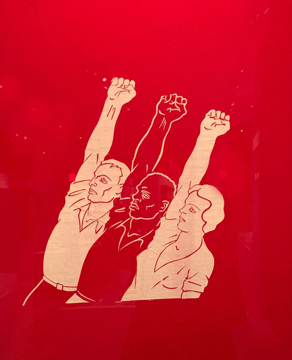
Rebel Arts Banner 1936-1939
Exhibit: City of Workers, City of Struggle
Designed by The Rebel Arts Group a Socialist Organization of young artists the banner was made for parades and marches. This banner caught my eye because of the illustration and the high contrast of the red and and off white colors. I’m unsure of the size of the composition but the actual banner was of a rectangular shape. The banner shows and gives information without having any typography, just imagery of protestors. The components of the banner are not aligned just floating in the foreground at a slant. With no text or an abundance of illustration I really liked the banner for the message it sent to groups that opposed the leftists party and overall effectiveness it had with color and imagery.
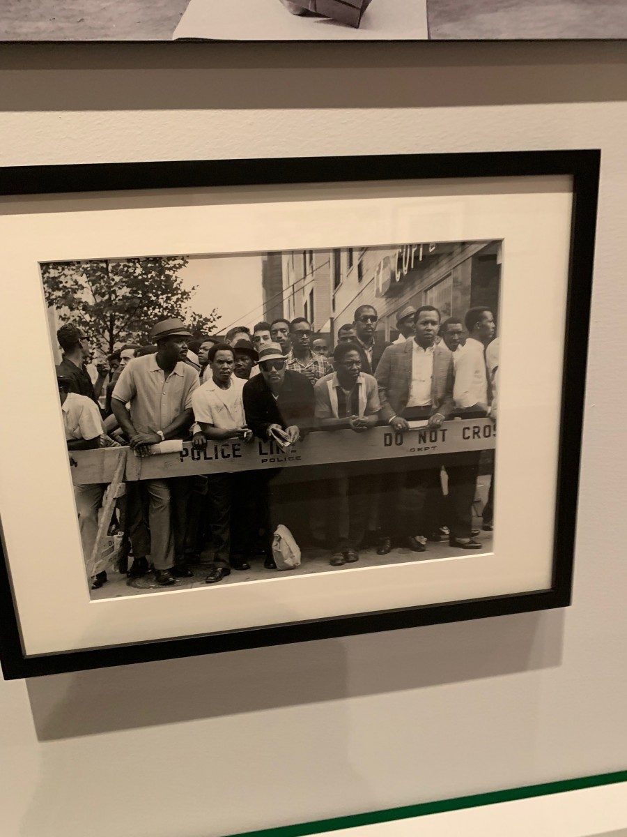
Untitled (African American man protesting hiring practices of Longshoremen’s Union, 7th Avenue near 12th Street, May 1970)
Exhibit: City of Workers, City of Struggle
Taken by David Bernstein in 1970 i really loved because of the contrast and energy it gave off. I personally like working with black and white it gives a more realistic and rich feel. The size of the picture is unknown to me. The only typography used is embedded in the image itself on the barricade. I also appreciated that Bernstein captured the frustrations that people of color went through not having jobs and training available to them.
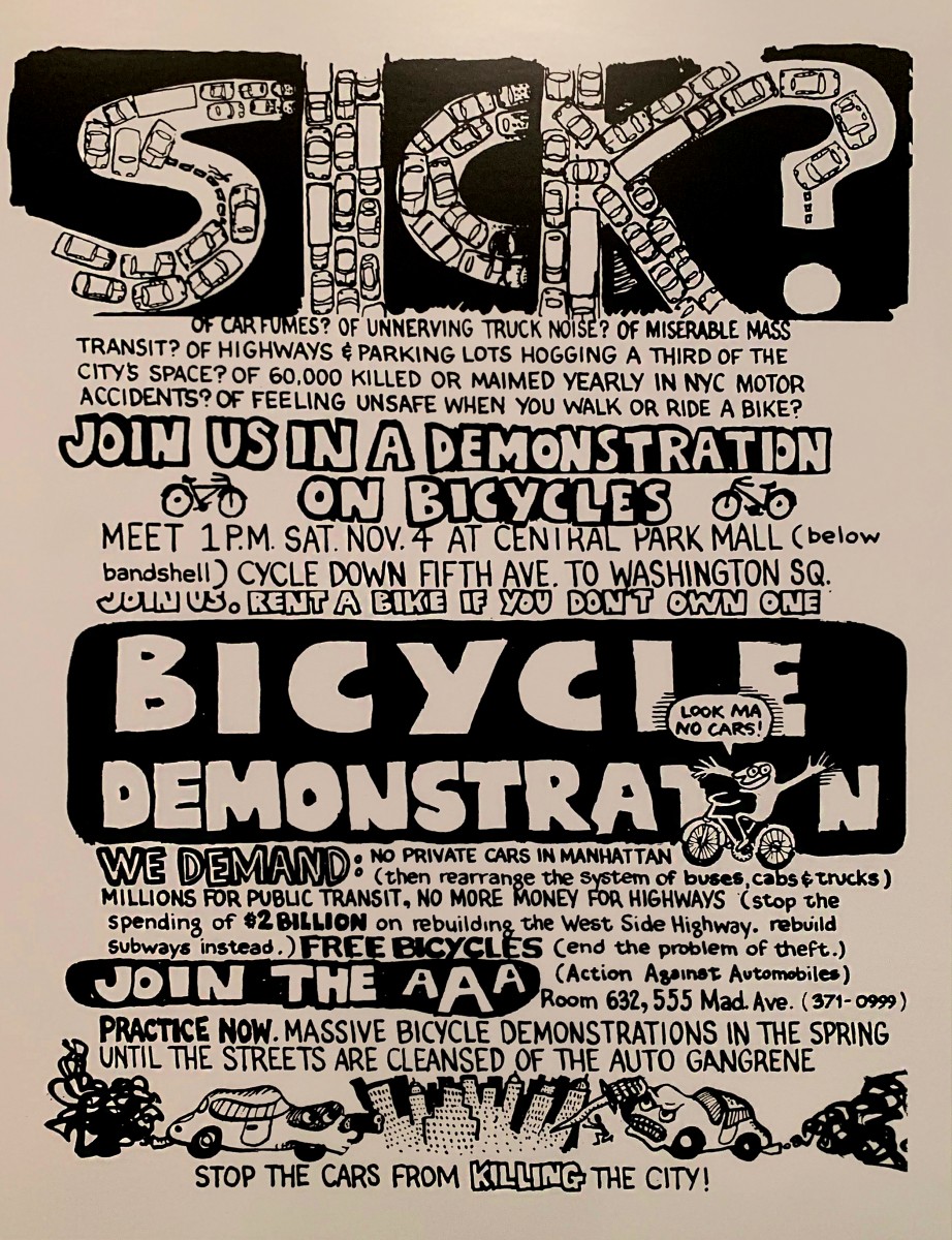
Flyer for a rally sponsored by Action Against Automobiles, 1972
Exhibit: Cycling in the City
Courtesy of David Gurlin this flyer was thought through a lot with the various typefaces and letter size. When i first looked i thought it was just this creative poster but when i looked closely there were so much details i wouldn’t have thought to create. Firstly, the title sick the way its formed you can tell it was hand drawn than the added car illustration in the word “sick” was really well done. Throughout the flyer there’s a lot going on between the contrast between blacks and whites and the drawings its however effective for that loud and busy era of New York and protest for bicycles advocation. The boldness tells you importance of issues at hand.