All posts by Marc Rodriguez

FINAL PROJECT: ART BOOK

The process towards designing my book helped me along the way. The idea for my book was to create a story between two wrestlers who are fighting each other. I created the book in a style that is similar to a comic book. The two wrestlers are named Finn Balor and Samoa Joe. The story was about how they began to fight each other on a wrestling show called NXT. Finn Balor was the NXT champion and met Samoa Joe, who was a new wrestler to NXT, but Samoa Joe betrayed him and wanted to fight him for his title. In the end, Finn Balor defeated Samoa Joe. I decided to go with this because I’m a fan of wrestling. I’ve always liked wrestling since I was kid so I wanted to do a story of two wrestlers in the form of a book.

When we went to printed matter, I saw many books that were very cool and interesting. I got inspired by some books that used monochromatic colors for each page. I found one book that used a lot of white space, and different monochromatic colors for each page. So for my book I decided to use one color for the background of each picture.

Before putting my images on the final product, I had to sketch my characters for the book first. I drew the two wrestlers as cartoon type of characters. I drew squares that represented each page, and the drawings would be inside those squares. I showed my professor the sketches of the mock book and she told me to put margins around the text and images. Then I was able to get started on the final book.

For my book I used 6×6 Bristol paper which included 10 pages. The cover had both wrestlers faces but only half of their faces could be seen. The title of the book was called Finn Balor vs Samoa Joe. I used a grid for the book which would align the text together on each page. The book is a story of how their first fight began. In the book, Samoa Joe is the villian and Finn Balor is the hero. Samoa Joe betrays Finn Balor which leads to their fight for the NXT Title. Finn gets his revenge by defeating Joe to conclude the story.

PRINTED MATTER TRIP

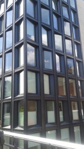
On our trip to printed matter, we stopped at the high line first. We saw buildings that had design principles that the professor showed us. The buildings had interesting shapes and designs on them. I rarely get to see things like that in New York since I don’t explore the city as much, but I’m glad that I got see some of the areas that the professor took us to.

image                    image

We we went to the store printed matter, I was interested in a lot of the books that were there. The books told stories with different design principles, numerous images, text, and different styles that were used in the books. Some of the books had really nice images along with the way they were designed.

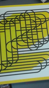
I this one book that inspired me and I thought that it would work well with how I want my book designed. The book had the same design element in each page. It had monochromatic colors on each page. I couldn’t figure out what shape was created, but it looked like oval shapes that were overlapping each other. I thought it had an interesting view. Each page had balance and I think that there was one or two colors for every page. For my book, I was thinking of having something similar to it, but I might use it as a background.

image


HELVETICA FILM

The type face, Helvetica originated from Switzerland and it was created by Max Miedinger in 1957. The original name of Helvetica was Neus Hass Grotesk typeface. However, it was changed when a company called Linotype owned it. When the type face was going to go public into the U.S., that’s when they gave it the name Helvetica.

The effect that Helvetica had on advertising and corporate identity is that it was simple to use. Many companies decided to use it because the lettering was neutral and efficient. Companies wanted to use those letters for professionalism and for how a company was characterized.

Wim Crouwel is a designer that uses grids for his typographic work. He uses layers for typographic design. Mathew Carter is a designer who used to work for Microsoft. He worked with Microsoft fonts in the mid 90’s. Erik Spiekermann is a typeface designer who uses Helvetica for most of his work. Alfred Hoffmann is another type face designer and he is the son of Max Miedinger, who created Helvetica.

Three companies that use Helvetica are American Apparel, Gap, and American Airlines. The relationship between Helvetica and swiss design style is the spacing that gives it meaning. The spacing between the letters is what gives the design a certain style. The American Airlines logo was created by Massimo Vignelli in 1966.

The type of classification Helvetica falls under is a way of life. It is a part of society and it is seen everywhere all over the world. The typeface is something that will live on for many years. It is a meaningful typeface since it tells what to do and what not to do.

BROOKLYN MUSEUM TRIP

The Brooklyn museum of modern art trip was something that I will remember. Many historical sculptures, paintings, and designs had interesting backgrounds behind them. Each exhibit had something to offer and there were so many art pieces that caught my attention. However, there were three pieces of art work that I was interested in; the harmony chair, the kanaga mask, and the blossom.

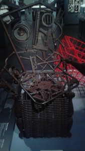
The harmony chair, which was located in the arts of Africa exhibit captured my interest. The design looked interesting and i knew that there was a strong meaning behind this art piece. The harmony chair was created by Gonçalo Mabunda who came up with the idea. The chair is designed with machine guns, handguns and bullets. The weaponary of the chair represents the end of the civil war in Mozambique which was back in 1992. The chair itself wasn’t meant for sitting. The back of the chair is very high and it meant that power and prestige was seen as dominant. This part of the design is influenced from east Africa since they had tall chairs that would represent high prestige.

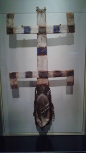
The Kanaga mask was a part of the arts of Africa exhibit. This art piece caught my attention because the creation of it looked very complex. These masks were used for a ceremony called dama, where they would pay tribute to the dead. When someone died, they would arrange the ceremony. Dogon dancers would wear the kanaga masks while dancing. The ceremony needed a dance because the Dogons believed that it created a bridge to the supernatural world. If there was no dance, then the dead would not live in peace. The dancers also imitated their god, Amma, who brought all things to life.

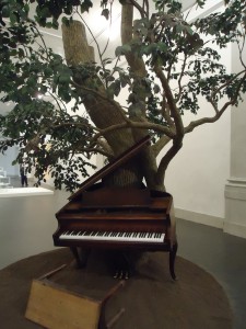
One art piece that stood out to me was Blossom, which was created by Sanfigord. When I saw this, I thought it was really cool and somehow I was interested in the concept. The tree and the piano are fused together to create a song “Strange Fruit”. The song was created by Billie holiday in the 1930s. It represented the lynching of bodies that once occurred in southern areas of the Unites States. The tree is also a representation of inspiration and interpretation. The creator of the art piece shows that Buddha once found that inspiration and enlightenment under a bohdi tree.

I really enjoyed my first time going to the Brooklyn museum. One of my friends gave me some background on some artwork from Africa so it was interesting to know some facts about African art. I’ve always wanted to visit a museum where they have historical art pieces and I’m glad that I got to witness all types of artwork from around the world.


The Blossom

The Blossom

The Harmony Chair

Harmony Chair

The Kanaga Mask

Kanaga Mask


REVIEW OF “WHAT IS GRAPHIC DESIGN?”

The article, “What is Graphic Design?”, by Juliette Cezzar explains the understanding and different types of job roles of graphic design. Designers can go for a number of different positions in the real world. Designers start from entry level positions as a junior designer. Junior designers have jobs in motion graphics, graphic design, animations, or package design. Once they have enough experience, they can move up to become senior directors, to art directors and then to creative directors. It’s useful to know that these are the types of positions that designers are in, based on their experience and how many years they’ve been in the industry. In the article, there are also people who work with designers such as project managers, coordinators or producers.

The author describes graphic design as planning ideas and experiences with a visual expression. Graphic design is used for different purposes such as education, culture, politics, and commercials. It is true that it can be for any of these purposes because we see it everyday in our lives. It communicates with us by using visual images, text, or any type of graphic form. Designers have had their design on books, magazines, posters, advertisements, and websites. The article states that environmental graphics is a combination of branding and signage. This type of graphic is on buildings. Design work was stated in the article and it is how logos, ads, and signs are put together over time, to create a certain kind of expression.

I feel like this article can give students who are interested in graphic design, an introduction on what graphic design is and how it is used in our world. Graphic design has been around before some us were born. This article covers a main understanding of how graphic design revolves around us. Any type of print, advertisement or book that has graphics that may catch our attention. An interesting part of the article, which I agree with, is that graphic design can be for political, educational, commercial, or cultural purposes. I agree with this because any design we see will make us feel a certain way. It can either be a happy mood or a sad mood. Graphic design is all about composing visual images together to express something. So who ever created the design wanted someone to have a specific emotion towards it.

Graphic Design Principals Project 1

The design process for the first project involved many steps towards the final completion. The project started off as drawing thumbnail sketches, then painting it on bristol paper, and then creating a digital form using illustrator.

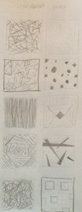
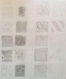
For the first phase, I came up with ideas for the design. I drew thumbnail sketches for the themes; chaos and harmony, loud and quiet, crowded and isolated. For harmony I drew curved lines that would be balanced to one another. For chaos, I drew lines that would look out of place and have a wild look. For loud, I drew shapes that would overlap each other. For quiet, I drew a shape inside of a shape while not being close to each other. For crowded, I drew squiggly lines that were overlapping each other. For isolated, I drew squiggly lines again, but this time, they were far apart from each other.

For the second phase, I got feedback from the professor after the sketches were done. The professor gave me tips on one of the thumbnail sketches that needed more work. The professor then helped me pick out the best two sketches from each theme that worked best for me. Once I chose the sketches, I made improvement on the sketch that I needed work on. Once I finished it, I showed it to the professor. She said that it looked much better than before and it had more similarity to the other sketch it was compared to.

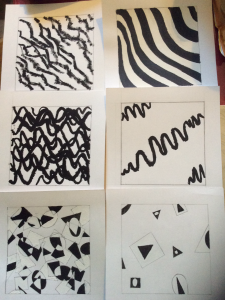
For the third phase, I used bristol paper for the sketches. The bristol paper needed to be 9×9 and needed to have a 7×7 square in the middle of the page. I used black and white gouache paint for the designs. For loud, I used black and white for the overlapping shapes. When the shapes overlapped each other, I used either white or black paint for the area of the overlapping portion. For quiet, I painted either black or white for the shapes. For harmony, I used black for a set of the waved lines and white for another set of the waved lines. For chaos, I only used black paint so it can still look chaotic and dark. For crowded, I used black paint for the squiggly lines overlapping each other. For isolated, I also used black for the squiggly lines that were far apart from each other.

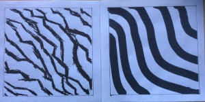
For the fourth phase, we had to choose two of the best paintings of the six themes that looked best and create a digital design for those paintings on illustrator. The professor saw the harmony and chaos painting and said that it would look best on illustrator. I agreed because those two paintings were my favorite, so I then did a digital design of them. The tools on illustrator were useful for making the designs look similar. For chaos, I used a certain type of paint brush style and it looked similar to the designs that was painted. For harmony, I used the paint brush tool to create waved lines. I then made the lines a little more thicker so that i didn’t have to create more lines to fill up the page.

image         image        image


Welcome!

This is the first post on your Learning Blog. Edit or delete it, then start blogging!

The ePortfolio is both a Learning Blog and an Academic Career Portfolio. Use the Learning Blog to document your learning experiences and class assignments each semester. As time goes by, add content to the Academics and Career sections to show your department, graduate institutions, or future employers how well prepared you are for your chosen career.

NOTE: Remember to add appropriate Categories and Tags to your posts. This will help your professors and other visitors find the content they are looking for. The Categories “Coursework” and “Field Trips” and the Tags “OpenLab” and “City Tech” have already been applied to this post. Feel free to make changes!