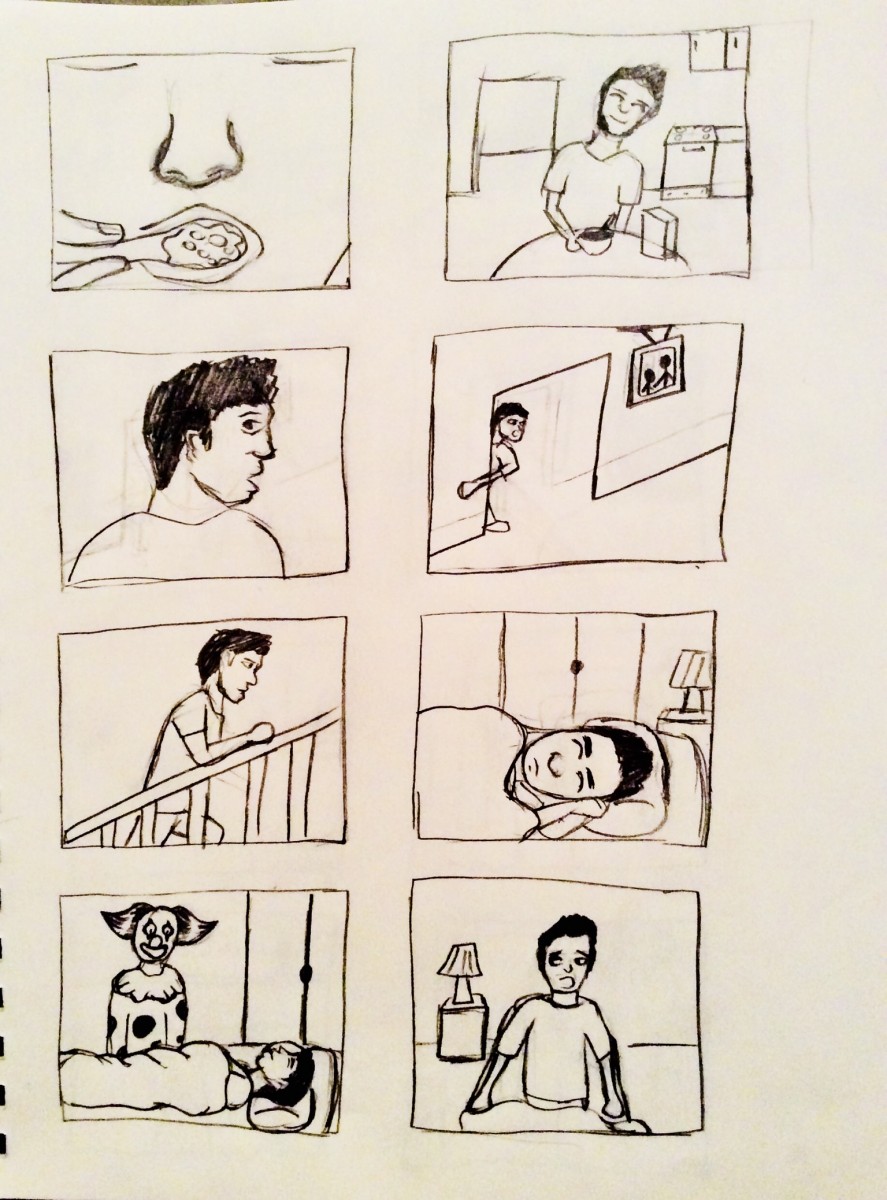

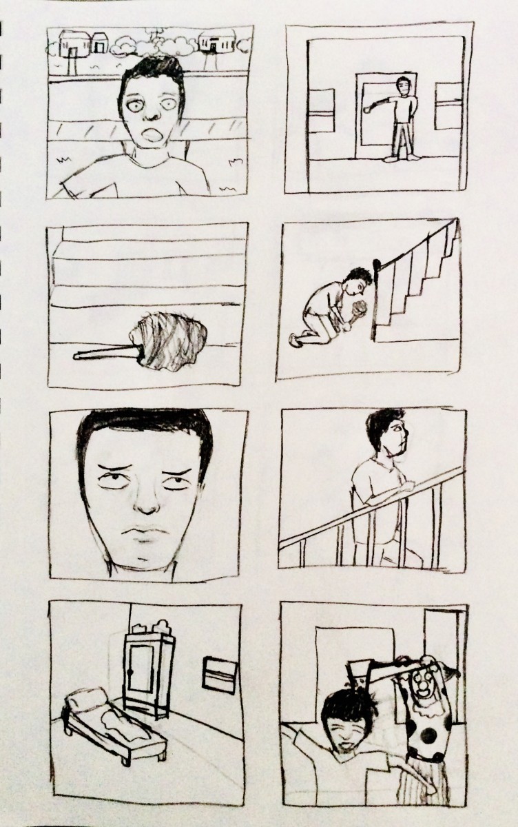
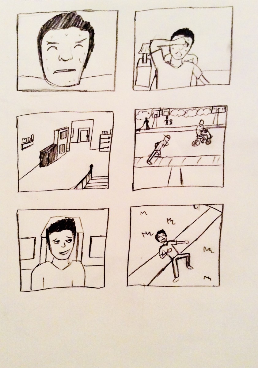
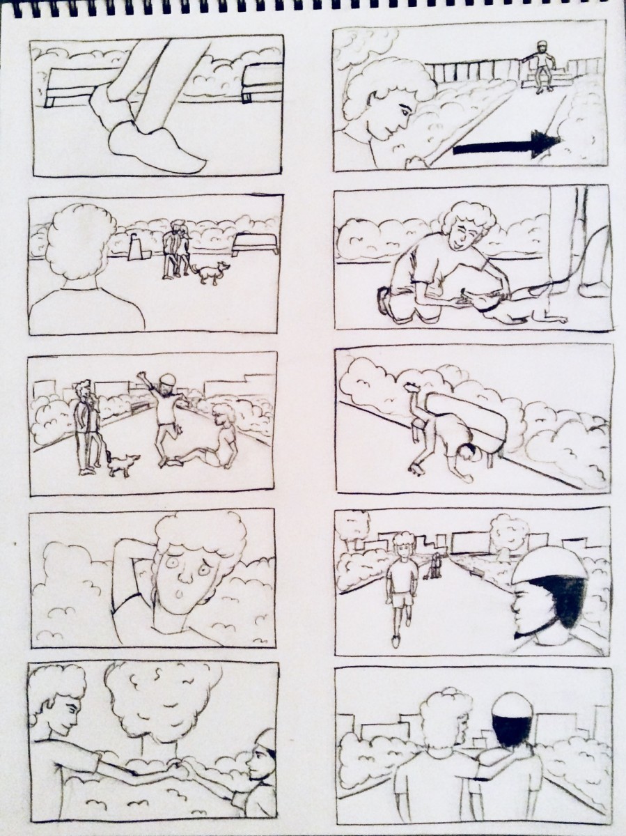

When watching the commercial, I thought the sound wasn’t effective. You couldn’t really hear the song because of the babies crying and screaming. The noises of the baby were over powering the song and it made it difficult to hear that there was a song. I felt like the noises that the babies were making could’ve been toned down a little more so you could hear the song. I think there should’ve been a equal balance between the song and the commercial.
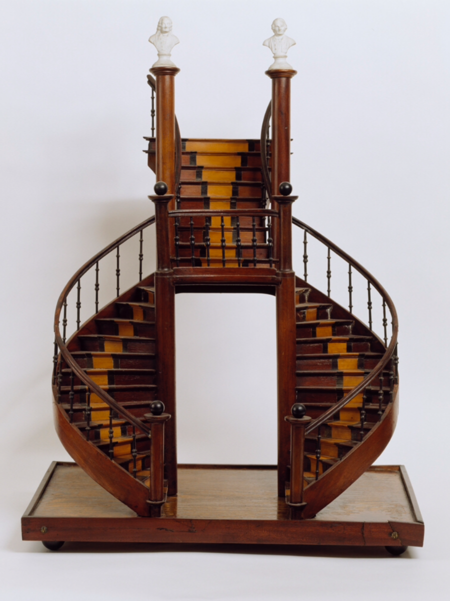
The staircase model of the early 19th century was one of my favorites. The staircase model was made out of porcelain busts, oak, inlaid Mahogany and ebony. This piece captured my attention because of the infrastructure and design of the stairs. The stairs looked very elegant. I also liked how rich colors were.
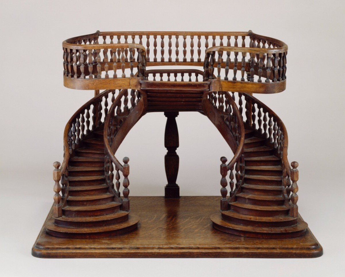
The staircase model of the late 19th century was also one of my favorites. The staircase model was made out of plained oak. The upper part of the staircase is self supportive and the railings are turned. I love the vintage look of the stairs. I also liked the how the stairs went into a different direction. The bottom stairs went towards the middle in the same direction and then the upper stairs went into the backwards direction.
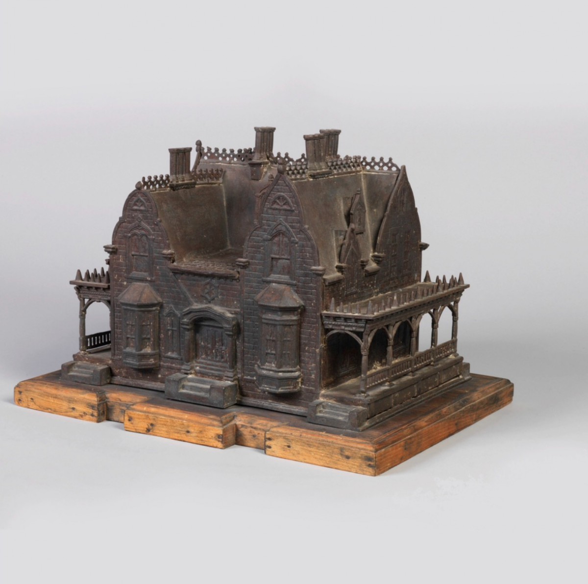
This New York Birdhouse Model was a model that got my attention. The building was made out of iron and layed upon a wooden base. When I first saw this, I was surprised that it was a birdhouse. I liked this model because of how vintage looking it is. The appearance of the house was very strange and dark looking. It’s one of those houses that I wouldn’t want to go inside and see what’s in there, but the appearance of it makes it interesting.
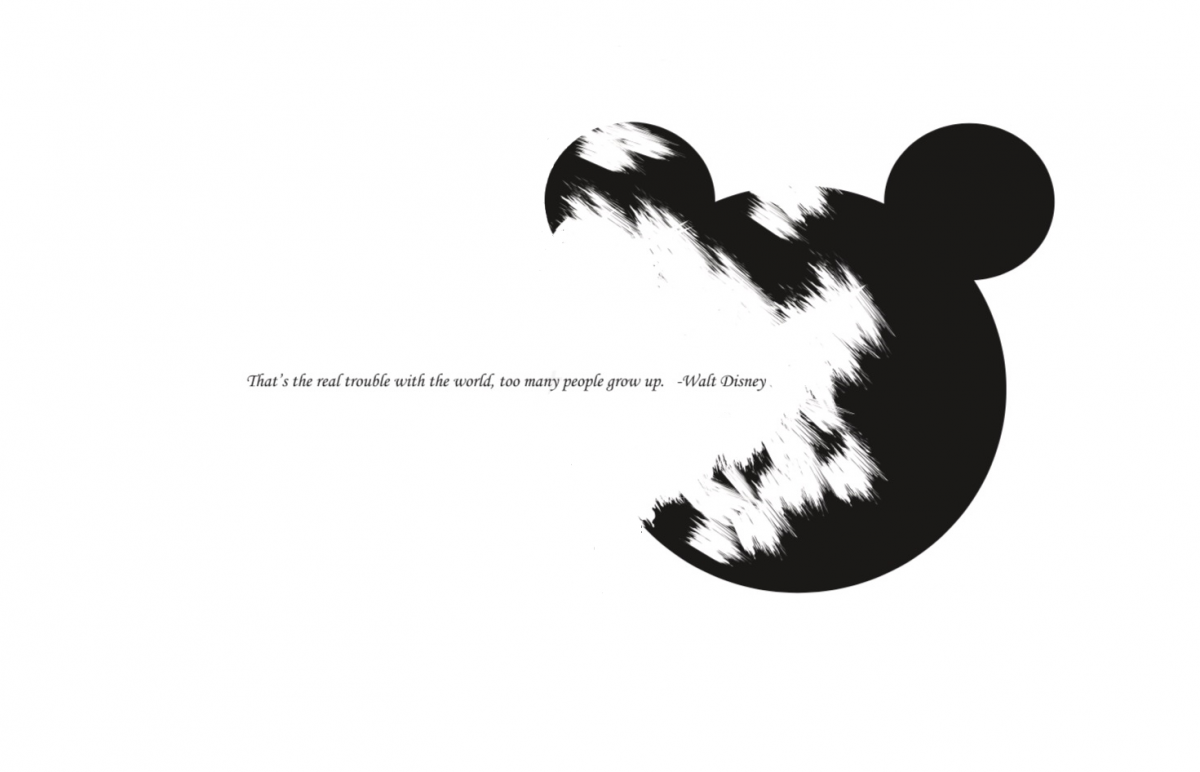
For the visual quote project, The quote I chose was, “That’s the real trouble with the world, too many people grow up”, by Walt Disney. I decided to use it because of how powerful it is. For my first concept, I decided to have the head of Mickey Mouse fading away along with half of the quote inside of his face. The reason why I wanted to fade his head away, was to show that childhood doesn’t last forever and it slowly erases overtime as we get older. I used a brush stroke that had sharp edges to it. So I faded half of his face and ears away with the brush stroke. I used black circles to create the face and the ears.
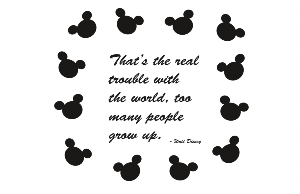
For the second concept, I decided to use images surrounding the text. I wanted this concept to have a more childish feel to it. I used a script font that would feel playful along with the Mickey Mouse faces. To create the head, I basically did the same with the first concept. I used black circles to create the ears and the face. I duplicated Mickeys Mouses face and placed them around the text. When I placed them around the text, I had them at different angles so they all didn’t look the same.
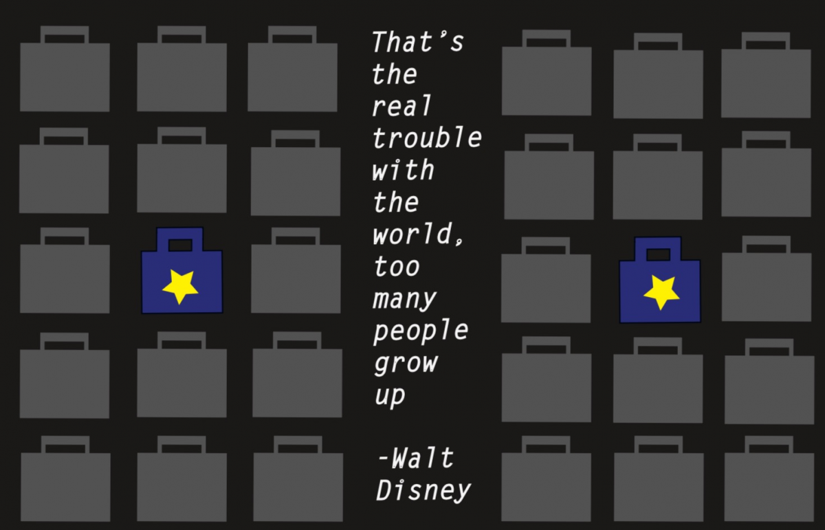
For the third concept, I designed briefcases on both sides of the document and the text was in between the briefcases. This concept was to show that the gray briefcases represented a world of adulthood such as having to get a job. The briefcases that was blue with a star on it, represented a world of childhood. Childhood to me is very colorful so I decided to go with those colors. The reason why I placed the childhood briefcases in the middle of the adulthood briefcases was to show that overtime, they will eventually grow to become a gray briefcase like an adult. I used a black background for this concept. I also made the text white and had it vertically in the middle.
Cartoon Network, which was first launched in 1992, is a well known media company that caters to young audiences who enjoy watching cartoons. Ever since their launch, they’ve become very popular over the years due to their success of original programming. Cartoon shows such as Johnny Bravo, The Looney Tunes, Tom and Jerry, Courage the Cowardly Dog and The Powerpuff Girls gained high ratings in the first couple of years of Cartoon Networks launch. Cartoon Network also introduced anime shows for older and younger audiences. The Cartoon Network block, Adult swim, is best known for adult animated cartoons and is responsible for bringing older viewers to their network.
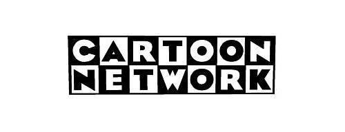
Their first logo started out as “Cartoon Network” which was first introduced in 1992. The idea for this logo was to make it seem playful and fun. The word “Cartoon” was shown on top and the word “Network” was shown below. The words were placed in a white and black checker board. Each word was placed horizontally on the checkerboard and each letter was placed in each square of the checkerboard. When a square was white, the letter would be black and when a square was white, the letter was black. The logo is a san serif typeface with heavy slab thickness.
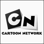
In 2004, they recreated their logo with a more simplified look. The checkerboard, colors and typeface were still the same. The only part that changed was that they only had the “C” and the “N” to represent their network. The checkerboard squares were also rotated to make movement and a shadow was casted behind them.
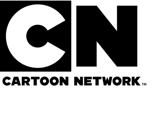
In 2010, Cartoon Network decided to create a different concept for their logo. They kept the initials of Cartoon Network, however, they made it more basic. The font that they used for the logo is CN Bold, which was created by Cartoon Network. Cartoon Network and an animation and design company called Brand New School, collaborated together to design the logo. Cartoon Network and Brand New School were able to bring a logo that would look fresh, and full of life. The logo was designed this way so that Cartoon Network can show that they can transition from animation to live action.
The first logo that was used from 1992-2004
The second logo that used from 2004-2010
The current logo for Cartoon Network
The process towards designing my book helped me along the way. The idea for my book was to create a story between two wrestlers who are fighting each other. I created the book in a style that is similar to a comic book. The two wrestlers are named Finn Balor and Samoa Joe. The story was about how they began to fight each other on a wrestling show called NXT. Finn Balor was the NXT champion and met Samoa Joe, who was a new wrestler to NXT, but Samoa Joe betrayed him and wanted to fight him for his title. In the end, Finn Balor defeated Samoa Joe. I decided to go with this because I’m a fan of wrestling. I’ve always liked wrestling since I was kid so I wanted to do a story of two wrestlers in the form of a book.
When we went to printed matter, I saw many books that were very cool and interesting. I got inspired by some books that used monochromatic colors for each page. I found one book that used a lot of white space, and different monochromatic colors for each page. So for my book I decided to use one color for the background of each picture.
Before putting my images on the final product, I had to sketch my characters for the book first. I drew the two wrestlers as cartoon type of characters. I drew squares that represented each page, and the drawings would be inside those squares. I showed my professor the sketches of the mock book and she told me to put margins around the text and images. Then I was able to get started on the final book.
For my book I used 6×6 Bristol paper which included 10 pages. The cover had both wrestlers faces but only half of their faces could be seen. The title of the book was called Finn Balor vs Samoa Joe. I used a grid for the book which would align the text together on each page. The book is a story of how their first fight began. In the book, Samoa Joe is the villian and Finn Balor is the hero. Samoa Joe betrays Finn Balor which leads to their fight for the NXT Title. Finn gets his revenge by defeating Joe to conclude the story.
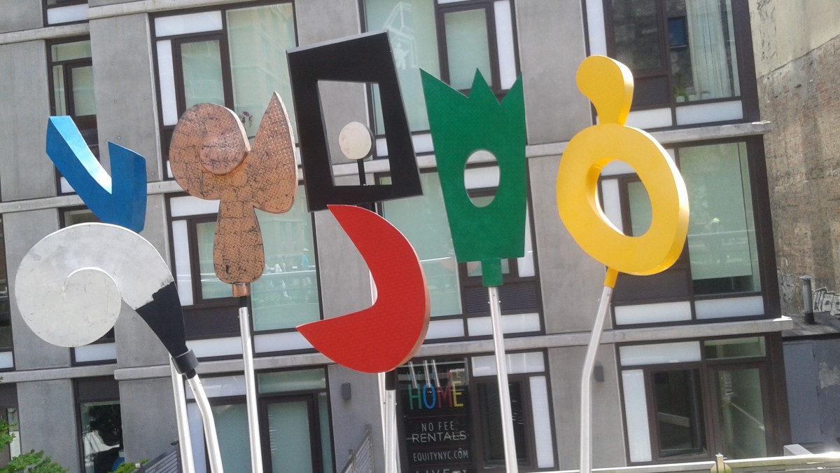
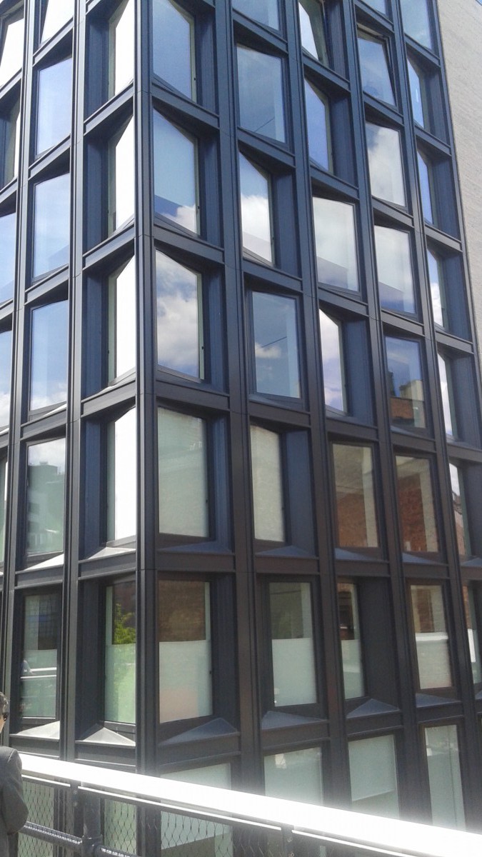
On our trip to printed matter, we stopped at the high line first. We saw buildings that had design principles that the professor showed us. The buildings had interesting shapes and designs on them. I rarely get to see things like that in New York since I don’t explore the city as much, but I’m glad that I got see some of the areas that the professor took us to.
We we went to the store printed matter, I was interested in a lot of the books that were there. The books told stories with different design principles, numerous images, text, and different styles that were used in the books. Some of the books had really nice images along with the way they were designed.
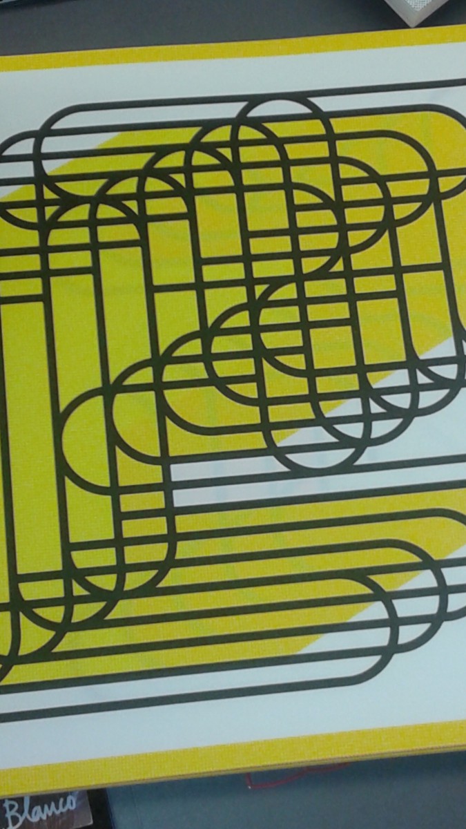
I this one book that inspired me and I thought that it would work well with how I want my book designed. The book had the same design element in each page. It had monochromatic colors on each page. I couldn’t figure out what shape was created, but it looked like oval shapes that were overlapping each other. I thought it had an interesting view. Each page had balance and I think that there was one or two colors for every page. For my book, I was thinking of having something similar to it, but I might use it as a background.
The type face, Helvetica originated from Switzerland and it was created by Max Miedinger in 1957. The original name of Helvetica was Neus Hass Grotesk typeface. However, it was changed when a company called Linotype owned it. When the type face was going to go public into the U.S., that’s when they gave it the name Helvetica.
The effect that Helvetica had on advertising and corporate identity is that it was simple to use. Many companies decided to use it because the lettering was neutral and efficient. Companies wanted to use those letters for professionalism and for how a company was characterized.
Wim Crouwel is a designer that uses grids for his typographic work. He uses layers for typographic design. Mathew Carter is a designer who used to work for Microsoft. He worked with Microsoft fonts in the mid 90’s. Erik Spiekermann is a typeface designer who uses Helvetica for most of his work. Alfred Hoffmann is another type face designer and he is the son of Max Miedinger, who created Helvetica.
Three companies that use Helvetica are American Apparel, Gap, and American Airlines. The relationship between Helvetica and swiss design style is the spacing that gives it meaning. The spacing between the letters is what gives the design a certain style. The American Airlines logo was created by Massimo Vignelli in 1966.
The type of classification Helvetica falls under is a way of life. It is a part of society and it is seen everywhere all over the world. The typeface is something that will live on for many years. It is a meaningful typeface since it tells what to do and what not to do.
The OpenLab is an open-source, digital platform designed to support teaching and learning at City Tech (New York City College of Technology), and to promote student and faculty engagement in the intellectual and social life of the college community.

