Cartoon Network, which was first launched in 1992, is a well known media company that caters to young audiences who enjoy watching cartoons. Ever since their launch, they’ve become very popular over the years due to their success of original programming. Cartoon shows such as Johnny Bravo, The Looney Tunes, Tom and Jerry, Courage the Cowardly Dog and The Powerpuff Girls gained high ratings in the first couple of years of Cartoon Networks launch. Cartoon Network also introduced anime shows for older and younger audiences. The Cartoon Network block, Adult swim, is best known for adult animated cartoons and is responsible for bringing older viewers to their network.
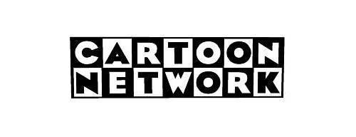
Their first logo started out as “Cartoon Network” which was first introduced in 1992. The idea for this logo was to make it seem playful and fun. The word “Cartoon” was shown on top and the word “Network” was shown below. The words were placed in a white and black checker board. Each word was placed horizontally on the checkerboard and each letter was placed in each square of the checkerboard. When a square was white, the letter would be black and when a square was white, the letter was black. The logo is a san serif typeface with heavy slab thickness.
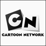
In 2004, they recreated their logo with a more simplified look. The checkerboard, colors and typeface were still the same. The only part that changed was that they only had the “C” and the “N” to represent their network. The checkerboard squares were also rotated to make movement and a shadow was casted behind them.
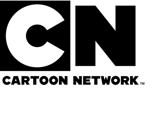
In 2010, Cartoon Network decided to create a different concept for their logo. They kept the initials of Cartoon Network, however, they made it more basic. The font that they used for the logo is CN Bold, which was created by Cartoon Network. Cartoon Network and an animation and design company called Brand New School, collaborated together to design the logo. Cartoon Network and Brand New School were able to bring a logo that would look fresh, and full of life. The logo was designed this way so that Cartoon Network can show that they can transition from animation to live action.
The first logo that was used from 1992-2004
The second logo that used from 2004-2010
The current logo for Cartoon Network