The design process for the first project involved many steps towards the final completion. The project started off as drawing thumbnail sketches, then painting it on bristol paper, and then creating a digital form using illustrator.
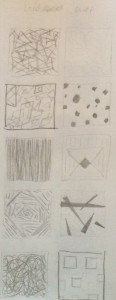
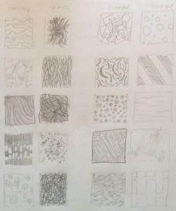
For the first phase, I came up with ideas for the design. I drew thumbnail sketches for the themes; chaos and harmony, loud and quiet, crowded and isolated. For harmony I drew curved lines that would be balanced to one another. For chaos, I drew lines that would look out of place and have a wild look. For loud, I drew shapes that would overlap each other. For quiet, I drew a shape inside of a shape while not being close to each other. For crowded, I drew squiggly lines that were overlapping each other. For isolated, I drew squiggly lines again, but this time, they were far apart from each other.
For the second phase, I got feedback from the professor after the sketches were done. The professor gave me tips on one of the thumbnail sketches that needed more work. The professor then helped me pick out the best two sketches from each theme that worked best for me. Once I chose the sketches, I made improvement on the sketch that I needed work on. Once I finished it, I showed it to the professor. She said that it looked much better than before and it had more similarity to the other sketch it was compared to.
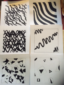
For the third phase, I used bristol paper for the sketches. The bristol paper needed to be 9×9 and needed to have a 7×7 square in the middle of the page. I used black and white gouache paint for the designs. For loud, I used black and white for the overlapping shapes. When the shapes overlapped each other, I used either white or black paint for the area of the overlapping portion. For quiet, I painted either black or white for the shapes. For harmony, I used black for a set of the waved lines and white for another set of the waved lines. For chaos, I only used black paint so it can still look chaotic and dark. For crowded, I used black paint for the squiggly lines overlapping each other. For isolated, I also used black for the squiggly lines that were far apart from each other.
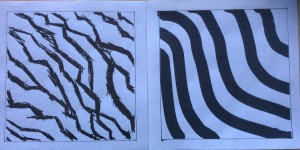
For the fourth phase, we had to choose two of the best paintings of the six themes that looked best and create a digital design for those paintings on illustrator. The professor saw the harmony and chaos painting and said that it would look best on illustrator. I agreed because those two paintings were my favorite, so I then did a digital design of them. The tools on illustrator were useful for making the designs look similar. For chaos, I used a certain type of paint brush style and it looked similar to the designs that was painted. For harmony, I used the paint brush tool to create waved lines. I then made the lines a little more thicker so that i didn’t have to create more lines to fill up the page.


