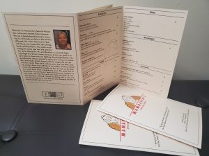
This is my Mamacita’s Special House Restaurant menu. A Panamanian gourmet restaurant very casual with affordable prices where families comes for traditional Latin food, this restaurant you can take it and go but also you can spend time with your family. The print outs are 11 by 8.5 folded in half. Includes the inside of the open menu, the menu’s back and front cover page. The front has the logo of Mamacita, address, hours and small quote in between them. The back is composed of the social media, QR code, story of the restaurant and a picture of the client’ grandmother whom she is inspired by and where the name “Mamacita” came from.
COMD3501 D236 IDENTITY DESIGN SP2020
A City Tech OpenLab Course Site


I like the front cover with the logo because it looks simple and all together. I think that the quote on the cover should be centered since everything else is centered because it would look more connected.
Thanks for your critique! I’ll keep that in mind.
I love the position of your logo on the front cover, as well as how organized the overall menu is. Great job!
I love the position of your logo on the front cover, as well as how organized the overall menu is. Great job!