Objective: The goal of this assignment is to give hands-on experience in the creative and strategic process of designing an effective Out-of-Home (OOH) billboard. Students will develop sketch design options for a billboard, considering client objectives, target audience, and design principles. This assignment aims to foster creativity, critical thinking, and practical design skills.
Instructions:
1. Client and Target Audience ( This is information you would have reseashed when
- Understand the client’s goals and objectives for the billboard.
- Identify the key characteristics of the target audience and their preferences.
2. Research and Inspiration
- Research the product, service, or message being advertised.
- Collect examples of successful OOH billboard designs for inspiration.
- Create a mood board for design references to inspire your final OOH Billboard
3. Sketch Design Options (40%)
- Develop a minimum of three distinct design options for the billboard.
- Create rough sketches for each design option, considering:
- Layout, composition, and visual hierarchy.
- Effective use of space, including message placement and imagery.
- Typography, color schemes, and any branding elements.
- Creativity and originality in design concepts.
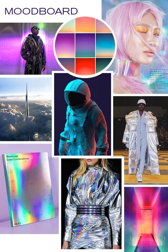
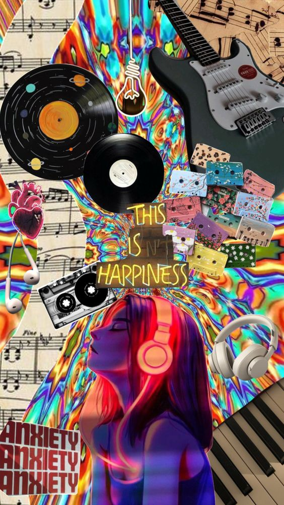
Example of Moodboards
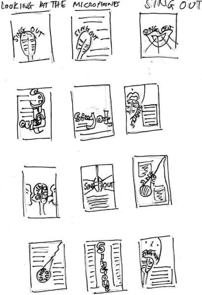
Example of OOH Sketches
Submission Guidelines:
- The assignment is due on 11/9.
- Submit OOH Sketch and mood board Via Comments of this assignment


i chose muted colors inspired by what you see in the desert. The brand i chose has very strong aesthetics so I think i will make that the main focus of the OOH.
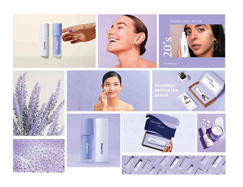
The theme that I chose for my moodboard is lavender. The brand Curology consists of a lavender colored theme.
The theme that I chose for my moodboard is lavender themed. The brand Curology consists of lavender colors.
 ” alt=”Jessica Moodboard”>
sketches:
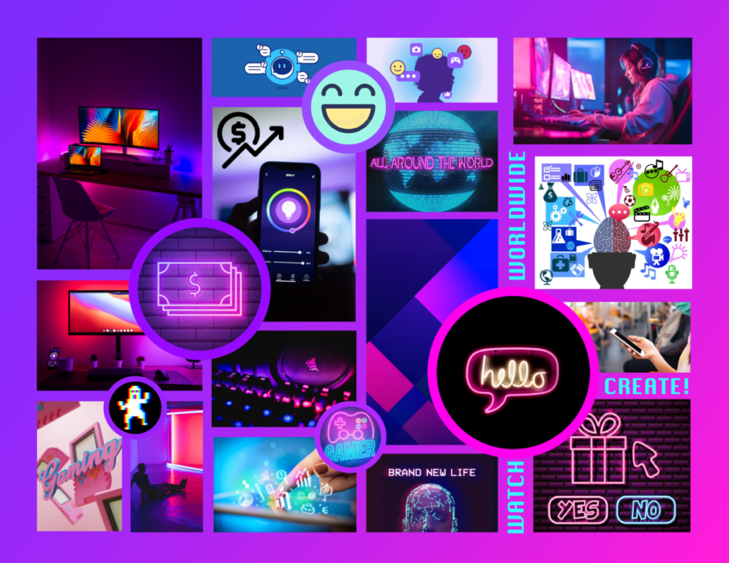
For this moodboard I decided to use neon colors to go for the typical cool colored led lights/gamer aesthetic & purple to represent twitch. As for the images, I went with what I think represents twitch.
 ” alt=”Moodboard”>
My mood board contains colorful but scary looking area, very liminal space like, and just random outside places. I’m working with Adult Swim which is why I picked the photos because majority of their ads on TV consist of random places with their logo someone obvious or hard to find. Even for real ads in the world, they do very simple ads on billboards. They also do a lot of old and nostalgic inspired things like using halftones for art or using pop art like ads.
Test