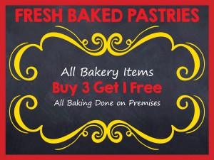
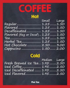
Previously in the self evaluation post, a project from Utopia Bagel was mentioned. After I designed the board, my supervisor told me that there was suppose to be an inch border around the board. She forgot to mention it, but she said it would be fine because we can just scale it down. After my supervisor made the changes to the board, she was notified that the measurements of the board would be changed. The board will be 3 feet tall instead of 2 feet tall. My supervisor decided she would fix the board and told me to work on the other boards. I worked on the coffee board and pastry board. Both of these boards are much emptier compared to the 10 feet wide board. There was much more white space and the font size could be bigger.
One of the difficulties I encountered was the pastry board. The pastry board only included a line of text. I tried to keep the font size similar to the other menu boards. If the font sizes were the same, there would be too much empty space. With just the line of text, the board looked very boring. My supervisor looked for chalk drawings and said she wanted something similar on the board. Besides searching for chalk drawings, I looked for borders. The client had chosen the pastry board with yellow border.
After this project, I learned that the designs for projects will keep changing until it is ready for print. The client will always ask for changes whether it is the color of type or the prices of the items. As of right now, the menu board design is completely different from what it first looked like. The board will continue to change until the client gives the ok to print.


