
Before Alex Steinweiss album covers were plain and dull, they were a solid color of tan or green. Steinweiss wanted albums to be more expressive and symbolic. Rather than just have portraits of the artist he wanted to captivate the audience’s attention with symbols and designs. He would fit the graphic design cover to the music and build upon the theme or artist.
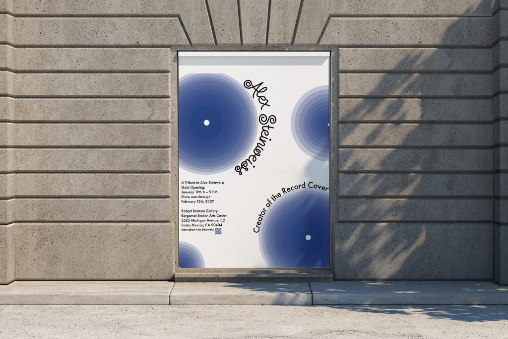
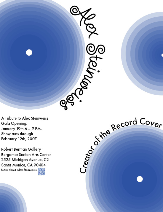
This inspired me to create a mock up poster based on Steinweiss’ style promoting a tribute to him. For this poster I used the typeface he created and based it off his cover for Prokofiev which has minimalistic colors.