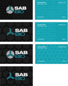
Entering the second week of my TANK Industries internship, I was introduced to my second client, a pharmaceutical company for which Jason and the firm had designed logos a few weeks earlier. On May 28, I participated in my first client meeting. My task was to observe the clients’ body language and take notes on the logos they seemed to prefer. The goal of the presentation was for the client to select a primary logo and color-way. Luckily, the result of the meeting was positive and very streamlined; the client unanimously came to a decision on their new logo.
I began my designs by gathering various assets and brand elements to support my work. To provide some background on the client, they are a “clinical-stage biopharmaceutical company dedicated to treating and preventing immune and autoimmune disorders¹”. We incorporated the shape of a polyclonal antibody, which is integral to their scientific process, into their collateral to emphasize the scientific element of their work. The use of a ‘humanistic’ type face for the logo design also contributed an organic approach to the design of the business cards and letterheads.