Author: Isaac N Maldonado (Page 1 of 2)
http://www.visual-arts-cork.com/east-asian-art/korean.htm
https://www.artelino.com/articles/japanese-prints-art-movements.asp
https://www.britannica.com/art/Japanese-art
http://www.historyofpainters.com/illuminated.htm
http://www.visual-arts-cork.com/history-of-art/medieval-manuscript-illumination.htm
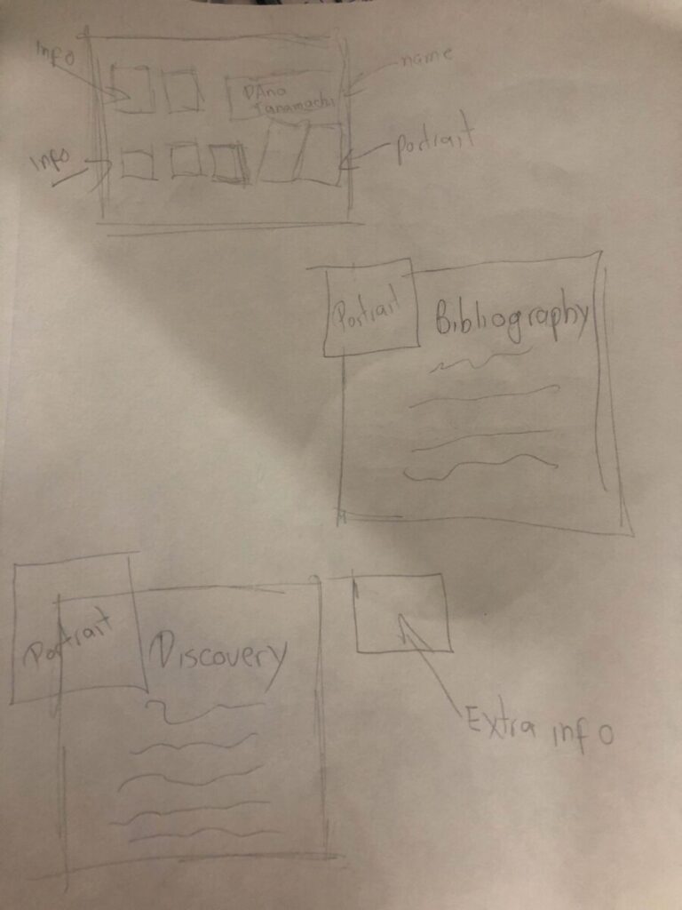
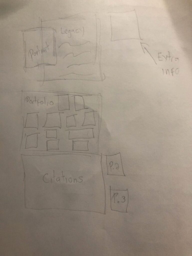
https://www.wsj.com/articles/SB10001424052970203458604577265453430025274#:~:text=Dana%20Tanamachi%20is%20a%20Brooklyn,she%20appreciates%20their%20ephemeral%20nature.
http://www.tanamachistudio.com/about-1
http://thegreatdiscontent.com/interview/dana-tanamachi


Marshall McLuhan’s Understanding Media: The Extension of man. In the introductions of the chapters that were assigned in this week, it can be interpretated as humans been using the technology to goes beyond of the limits that the nature imposed over it. Almost every action that human does carries a meaning, a message. A sound, a pose, a gesture, a look, a movement, all that can transmit a message to any receptor that is in the sphere of that message. And it this message that is transmitted beyond the humans limits that is enhanced by the tools.
The real impact that the medium has, it goes alongside with the occasional impact that the communication and content have. An example of this is one of the daily use technologies that is so popular that little by little, it feels destinated to ends in the hands of every human in the planet, the cellphone. Then, why is this piece of hardware and software is being so widely accepted. The reason is one of the pillars and objective of every technology created by humans. It is to be an extension or enhancement of the different organs and functions, and parts of the body. It means the axe is an extension of the fist, the telescope is an extension of the eye, the megaphone is an extension of the voice, etc. The cellphone is that widely popular because is a condensed of multiples enhancements for the human being. This technology allows us to be transported instantly around the globe to see what is happening thousands of miles away from us. Let us see the past with recordings, increase the memory to remember everything that is need to. Let us hear loud and clear the best musicians around the planet, read book for us. Basically, it expands the human possibilities a lot in case of this extensions could be used properly. This tool uncapped abilities beyond the human limits.
The author of the book states “The Medium is the message”. It means the medium chose by us to be the transmitter hold the same or even a superior worth than that is transmitting.
In these 3 articles, we can see 3 systems where the designers rule under 3 different styles. This is a direct response to that part particularly. Josef Muller-Brockmann rules his work under the laws of universal validity, the use of the grid in the process of creation is a must be. The grid allows the work to be constructive, oriented, and organize. Those characteristics give a clear view which will be the objective of the project while is being built. The best example of that, it is “the morphological box of the typogram” developed and explained in his “In Grid and Design Philosophy”
As for Karl Gerstener, the system that he created to bring the extraordinary set of works that he did during his life. He started a path that almost all designers of our time are transiting. In which, we combine the arts with science. He was able to adapt amazingly the ever-evolving field of computer programming to what we called design. He translates topics like blueprints, outlines, and grids into the programming language, he used similar guidelines in both environments, and that allowed him to translate his work from one environment to the other with the maximum fidelity. This uncapped the possibility of creating drafts on paper. Where he can decide the color, appearance, thickness, and even place where the typefaces will be integrated into a project.
Jan Tschichold rules under a system where the clarity and order are the primordial bases of his designs. He claimed that in the past, the typography design was centered in a sole form of central arrangement and beauty. This put great limitations on the possibilities of the designer to express through the typography itself. In the “New Typography,” Tschichold stated the view of bringing forth an unambiguous form of communication with your audience. He emphasizes the appreciation of simplicity. You must be able to not using unnecessaries elements or too many ornaments. And you can fill the eyes. But not overwhelm the eyes of our audience.


Recent Comments