COMD3504 - Section OL01 - Fall 2020

Author: Ashley Leon (Page 1 of 2)

Assignment 12

Bibliography:

  • “Tschichold’s New Typography.” Graphic Design History, 2011, www.designhistory.org/Avant_Garde_pages/DieNeueType.html.
  • “Jan Tschichold, Master Typographer of the 20th Century.” Creativepro, 2018, creativepro.com/jan-tschichold-master-typographer-of-the-20th-century.
  • “Experimental Jetset – About.” Experimental Jetset, 2020, www.experimentaljetset.nl/about.
  • —. “Jan Tschichold: The Father of Modern Typography in His Own Words – TypeRoom.” Typeroom, 2020, www.typeroom.eu/jan-tschichold-the-father-of-modern-typography-in-his-own-words.
  • andy butler I designboom. “Experimental Jetset Interview.” Designboom | Architecture & Design Magazine, 12 Jan. 2014, www.designboom.com/design/experimental-jetset-interview.
  • Legêne, By Meike, et al. “Archive: Experimental Jetset | Designblog.” DesignBlog, 2020, designblog.rietveldacademie.nl/?tag=experimental-jetset.
  • Milosevic, Nikola. “Jan Tschichold | Widewalls.” Widewalls, 2013, www.widewalls.ch/artists/jan-tschichold.
  • “Experimental Jetset | MoMA.” The Museum of Modern Art, 2020, www.moma.org/artists/32472.
Assignment 11

Mainstream now is what is capturing the audience’s (us) attention from behind the screen or device but yet make us believe that the ‘industry’ is something so fascinating. Whereas, underground is basically the complete opposite. It’s is called underground for a reason because it is not ‘well-known/popular’ or better yet ‘not out in the public’. These terms are usually known when talking about music or anything apart of ‘the industry’, whether art/design or music. Not many are familiar with ‘underground’ but according to Steven Heller’s article, she mentions “Mass marketers steal ideas from visionaries, alter them in slightly if at all, then reissue them to the public as new products”. Basically, it is taking their visionary concepts then changing them around to then publicize them as their own. In comparison to contemporary design, I feel that it is mainstream because designs now still give a look of futurism. 

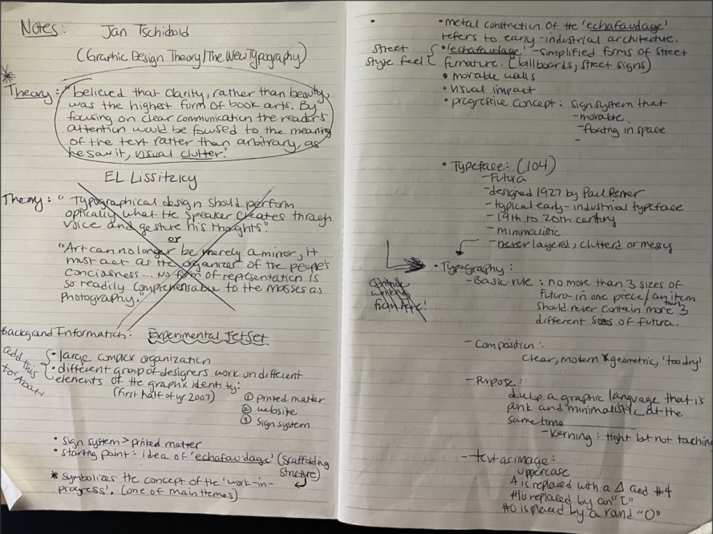
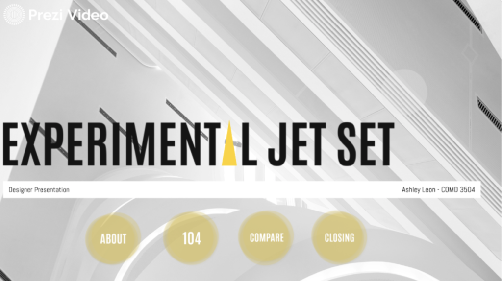
For my presentation, I speak about The Experimental Jetset in comparison with JanTschichold and how his ‘New Typography’ too inspiration into Jetset’s graphic identity with the 104 Manual and other designs. First, explaining who the Experimental Jetset is in a Prezi presentation with the following slide introducing the 104 Manual with sub slides giving a description of their graphic identity which includes, text, color, etc. Following with an intro of Jan Tschichold then comparison and contrast of their work, explaining what theories are in relation to their concept of work.

Sources:

https://wpmu.mah.se/nmict141group2/2014/03/13/mainstream-vs-underground-music/

https://www.experimentaljetset.nl/about

Assignment 4

Type is continuously progressing, and diverse textual styles tell a diverse story to the composition and photography is boundless, so the composition of the two brings a perpetual sum of thoughts, styles, and accounts. It also comes in contact with photo/photography where not only textually but visually see the story. Typography played an important role in the founding of the Bauhaus. It contributed to the ‘New-Typography’ through teachers such as Laszlo, Bayer, and Tschichold. Each played a particular role in their forms of type and communication to the audience using their own concept. This has much played a role in 21st-century art and design— before the digital age, typography was specialized associated with books, magazines. Fast forward to the modern-day, typography, and even photography is mostly associated with both the digital and print.

Assignment 8 – Ashley Leon


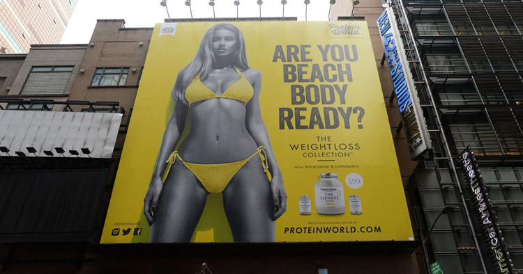
Beach body ad campaign by health supplement supplier Protein World. Released in 2015 across London and New York billboards.

The idea was to promote their supplements to users who wanted the perfect beach body for summer. However, the ad quickly received plenty of backlash via social media. The problem with this ad campaign was the fact that it promoted “body shaming”. Many feminist groups noted that the wording of the ad insinuates that the body in the picture is the only “acceptable” beach body. This means that any other body type not like the one in the picture is “unready”.


Dove Ad – 2017

The advert showed a black woman removing her top to reveal a white woman underneath after using Dove’s body lotion. The controversy caused by the advert is as clear as day. Not only is the advert racist, but it’s also insulting to viewers. The campaign was instantly removed from Facebook while the owners of the brand released a statement apologizing for the advert. The scary thing about this advert is that it must have been approved at some point during the marketing process, which makes it worrying that nobody thought it would cause offense.


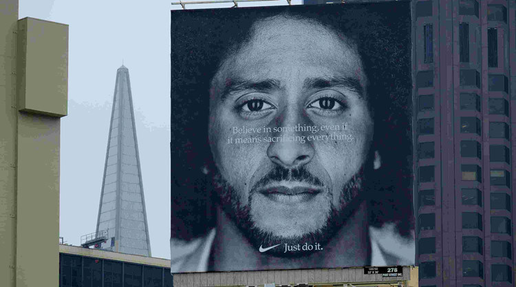
Nike Ad Colin Kaepernick – 2018

The ad was plastered on billboards all over America with the tagline “Believe in something. Even if it means sacrificing everything”. The line is a nod to Kaepernick’s previous actions of not standing for the national anthem in protest over the treatment of ethnic minorities. After Kaepernick refused to stand for the national anthem, many viewers became angry at him and viewed him as anti-American. The fact that Nike was using him in their ads made many people believe Nike was also anti-American. This sparked a lot of controversies online with many social media users posting pictures of themselves destroying Nike products, along with the hashtag #JustBurnIt.

Assignment 7 – Ashley Leon

According to Marshall McCluhan in Chapter 1, ‘The Medium is The Message’ I can say that it talks about how media, specifically electric communication has changed society and how we view things. From the reading, I have gathered that he means it’s the way that we receive information that is more important than the message itself. It also shows us that he was ahead of his time and that it’s something that we can relate to in today’s world. 

The forms of receiving and communicating messages to one another have evolved and it’s not the technology itself that is the problem because it’s okay to use it as long as we are in control of it and not the other way around. It’s more of how we use it and for what purposes we use it. Aside from that, he briefly talks about how machines are creating jobs but at the same time, it’s eliminating them as well. This is something that we’ve seen throughout the years and it’s something that we continue to encounter. When technology evolves it will always have its pros and cons.

 Throughout the reading, he mostly talks about media and the way that it’s changing us and how we look at things. The message that we are receiving from these media has influenced us and often misleads us to what is really important. From when television was first introduced we were once the consumers consuming information by this new technology. Whereas now we are not only the consumers but also we have become the producers by creating information as well.

Assignment 6 – Ashley Leon

According to the three articles, each designer uses their own systematic ways by using different design elements when creating their own work. Josef Muller-Brockmann preferred working within the grid system which meant submitting to the laws of universal validity. His design elements were subjective, irrational, and chaotic. The use of the grid was a system that shows a designer and their work to be constructive and oriented. As for the designer’s work, it should have a clear objective, the functional and aesthetic quality of Mathematical thinking. As for Karl Gerstner, he went for a rational, systemic approach. He developed a comprehensive system that is capable of generating a broad range of design solutions related to computer programming. There was a grid included that was the ‘typographic grid’. It is a proportional regulator for composition, tables, etc. It worked well when creating but hard to find the balance and conformity to a rule with maximum freedom. Lastly, Jan Tschichold was a typographer that was influenced by the Bauhaus Exhibition. He then began his book ‘The New Typography’ which gave an essence of clarity. He was very big on asymmetry which gives an unlimited score for variation and also expresses the diversity of modern life apart from variations of the typeface.

« Older posts