Author: Monica Jeune
Bilbography FINAL MONICA
Monica J. Dec 2
“Long Live Modernism: Massimo Vignelli Reaffirms His Faith in Form and Function.” AIGA, https://www.aiga.org/inspiration-massimo-vignelli-long-live-modernism
Massimo Vignelli, Acclaimed Modernist Architect and Graphic Designer, Dies at 83.” Archinect, https://archinect.com/news/gallery/100517642/2/massimo-vignelli-acclaimed-modernist-architect-and-graphic-designer-dies-at-83.
Martin, Douglas. “Massimo Vignelli, Visionary Designer Who Untangled the Subway, Dies at 83.” The New York Times, The New York Times, 27 May 2014, https://www.nytimes.com/2014/05/28/business/massimo-vignelli-a-modernist-graphic-designer-dies-at-83.html.
Staff, Creative Bloq. “What Massimo Vignelli Can Teach Designers Today.” Creative Bloq, Creative Bloq, 6 June 2014, https://www.creativebloq.com/graphic-design/massimo-vignelli-61411897.
Monica J November 25
Quotes- essay-pdf
Monica Jeune Nov 4th
Race/Gender
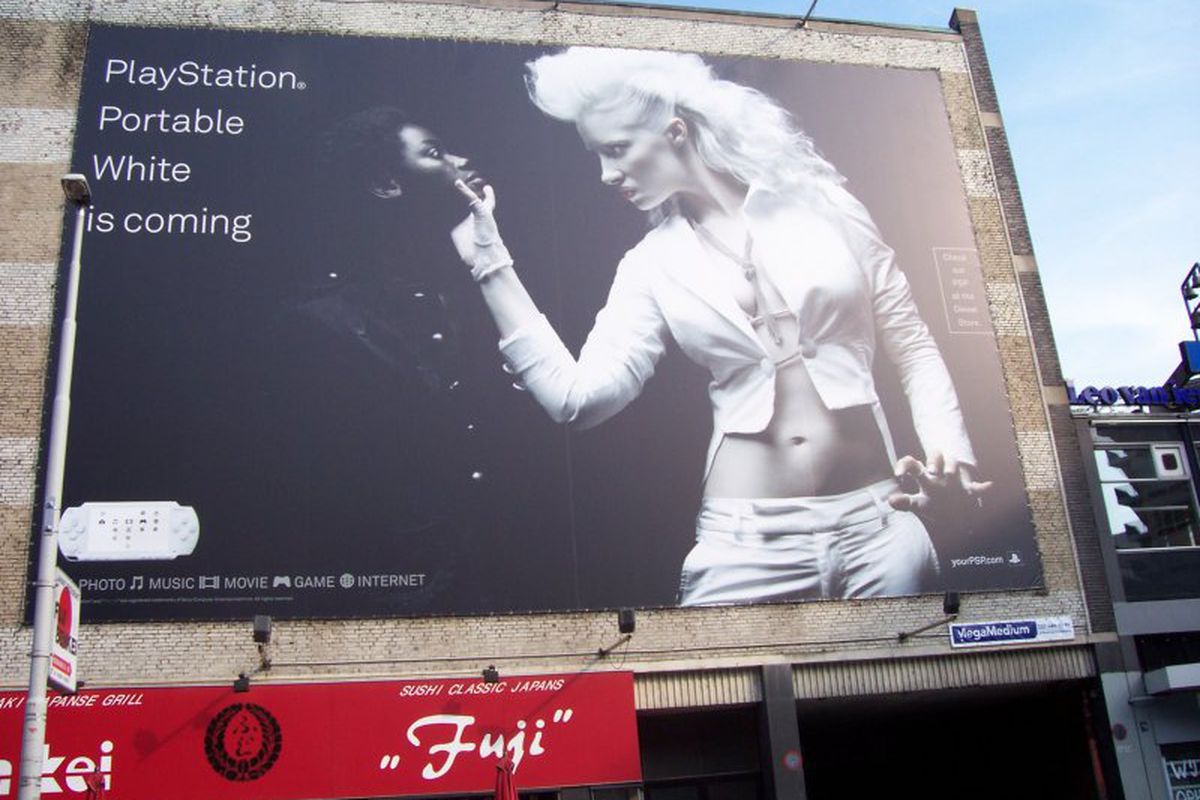
A racial motivated ad by Sony for the release of their white PlayStation. The color white dominates over black. Its cleaner, sleeker, more fierce and stands out. A white alternatively dressed women presses and grabs the chin of a black woman forcing her down on her knees. The one in white grabs attention and power. The image portrayed is of subordination, and to stand out (her outfit says it all) the one in black wears a black button shirts as if to imply conformity. I have also noticed , the image above isn’t a standard black and white image , each women is colored to most saturated extremes, pure black and white. If it weren’t for the lighting on the darker side of the side the woman would blend in seamlessly. White stands out! I do also note the fact it’s women, as if to imply white women are “better” and have a more alluring appeal.
Cultural Identity
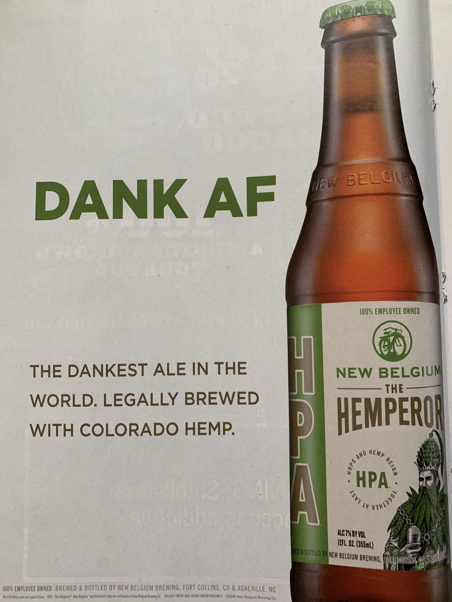
This ad appeals to the Millennials and those in Generation Y. The language used is eye catching especially for a magazine (a formal print), although this ad is appealing to a certain demographic. The ones behind the ad, know who their consumers are. The “texting” language and use of hyperbole is a direct take form how their consumers speak/text in their everyday lives, their a relatable, offbeat, and hipster brand.
Race
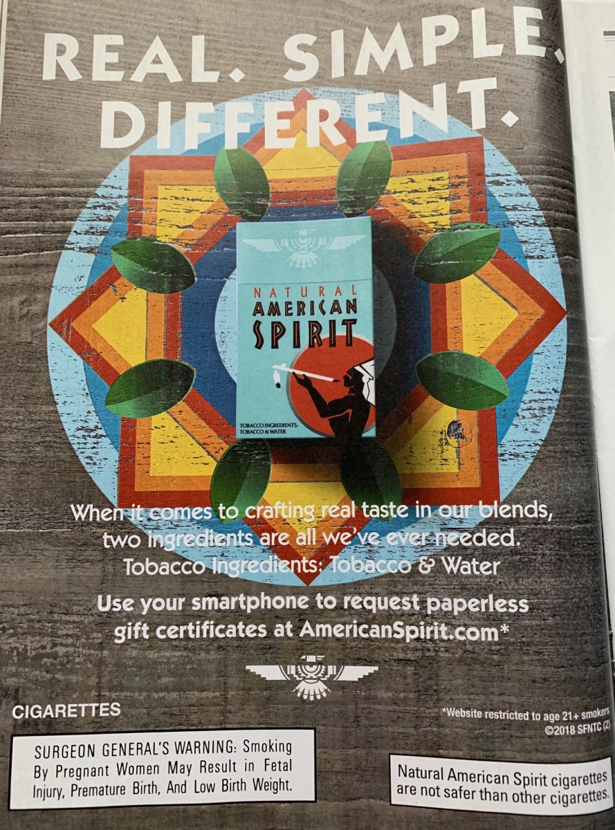
The cigarette company used Native American appeal to attract consumer by way of using the name “American Spirit”. The tobacco must be really good.”If they smoke it and have a have a good time, I probably will too”. – random consumer. Although the “real” ingredients are listed it subtle implies that the cigarettes are made with some magical Native essence, maybe even special ancient native herbs. There is commonly held notion of peace, tranquility, traditional, health,ancient and spirituality when people think of natives. It appeals to the idea of a better cigarette. American spirit cigarettes are are implied to be healthier as well which is crazy but it’s just because of the branding , I found an article to prove it: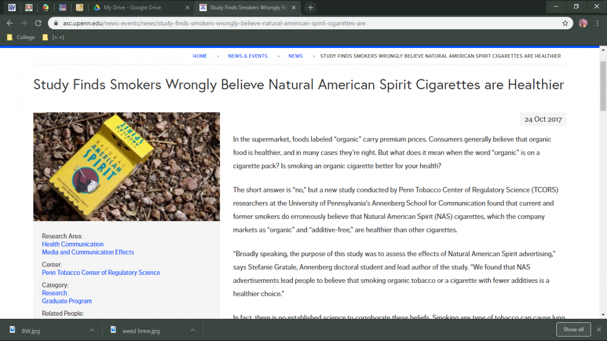
Monica Jeune Oct21
Monica Jeune Oct 7 Hw#4

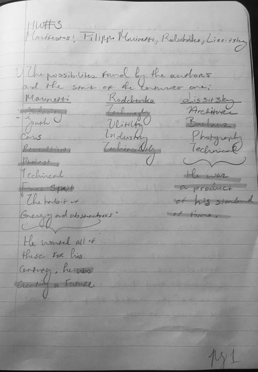
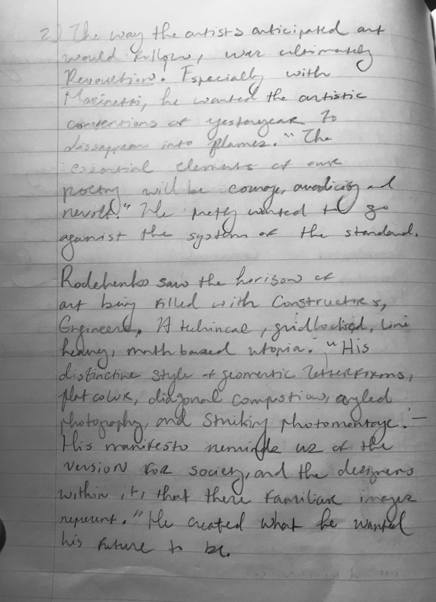
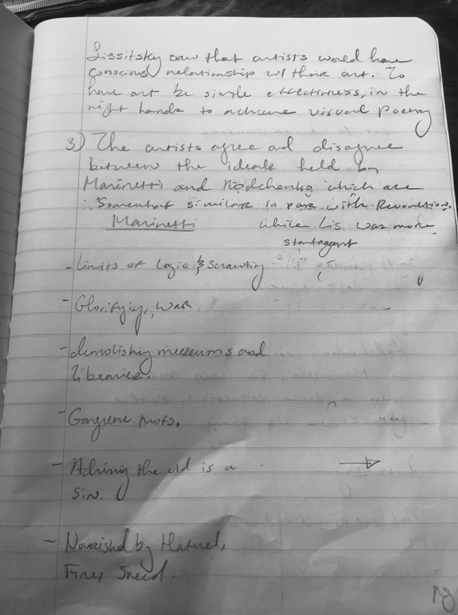
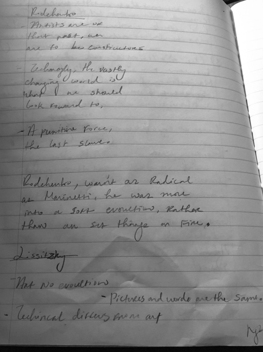
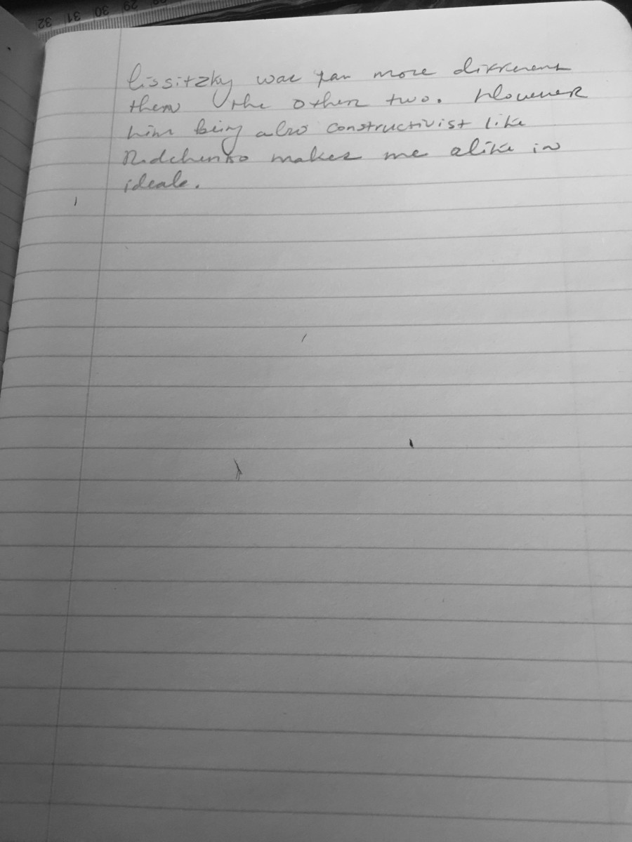
Monica Jeune Sep23 Manifestos
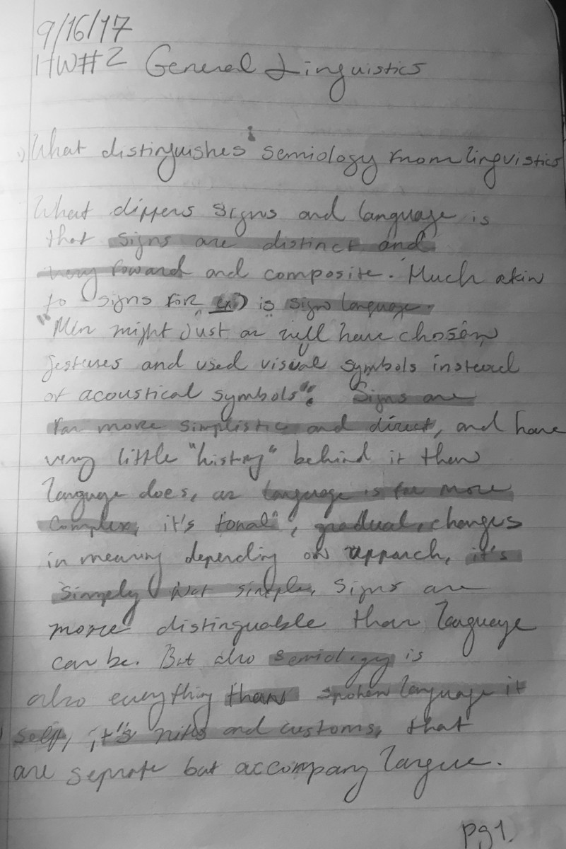
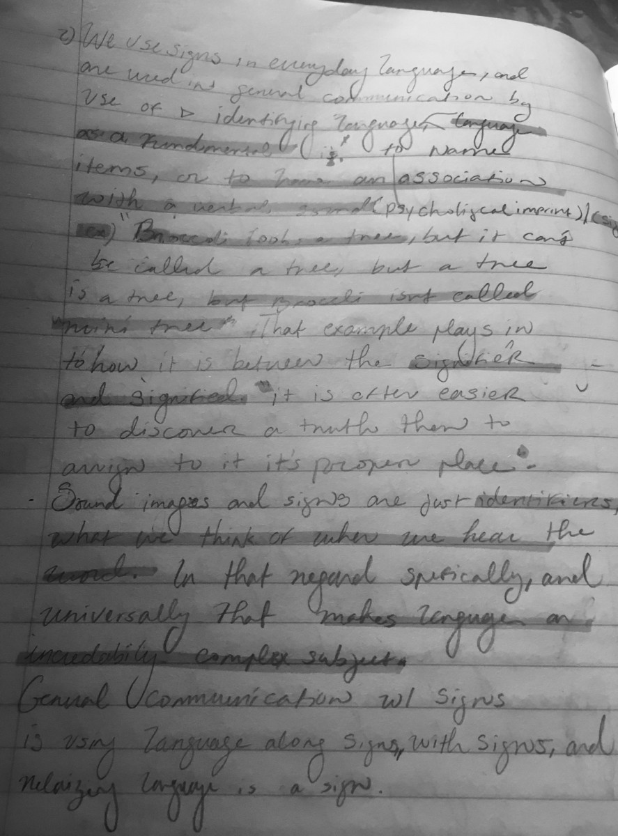
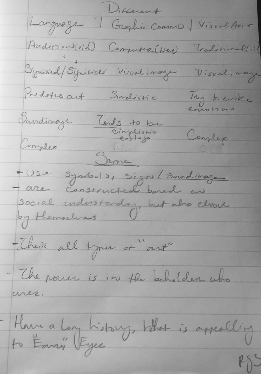
MonicaJ. for Sep 16th
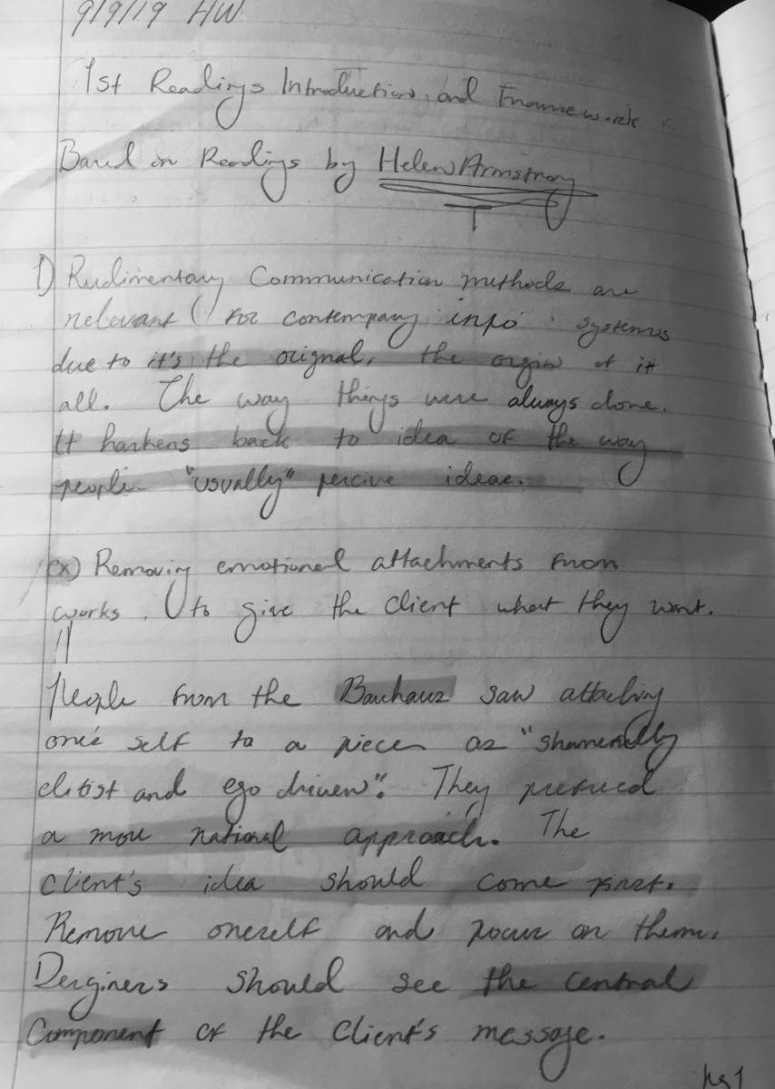
Monica J. for Sept 9th

