Author: Ariana Dejesus (Page 1 of 2)
INTRO:
- Image = “imitari”
- Semiology = study of signs/symbols.
- “Can the ‘copy’ produce true systems of signs and not clumps of symbols?’
- Phonemes = the way words sound?
- Image felt weak in being able to communicate? By linguists especially.
- There are some who think the image is an extremely fundamental system in comparison with language.
- “Now even — and above all if — the image is in a certain manner the limit of meaning, it permits the consideration of a veritable ontology of the process of signification.”
- “If meaning gets into an image, what is there beyond”??? What is this insinuating?
- Only focuses on the advertising image because in advertising, the signification of the image is undoubtedly intentional.
- Advertising imagery is frank. Clear-cut.
THE THREE MESSAGES:
- “En abyme” = “placed into an abyss.” In Western art history, “mise en abyme” is a formal technique in which an image contains a smaller copy of itself, in a sequence appearing to recur infinitely.
- Assonance = in poetry, the repetition of the sound of a vowel or diphthong in non rhyming stressed syllables near enough to each other for the echo to be discernible.
- The name Panzani not only shows assonance, but also its Italian-based branding. Barthes calls it “Italianicity.”
- The image of the Panzani products give multiple messages without the need for words; it’s freshness from looking at the packaging, and also the “essentially domestic preparation for which they are destined.”
- Items spilled out of the bag signify freshness? No preservatives?
- Talks about the more obvious symbolizing of “Italianicity”: tomato, pepper, the color scheme.
- 1. Linguistic message. 2. Iconic message. 3. “A message without a code.”
- More of a matter of anthropological knowledge.
- Literal image is the designated symbol, the symbolic image is implied? (Denoted and connoted)
THE LINGUISTIC MESSAGE:
- “What are the functions of the linguistic message with regard to the (twofold) iconic message? There appear to be two: anchorage and relay.”
- Text helps to identify the scene a bit more blatantly.
- Caption helps choose the level of perception. It helps the viewer hone in immediately on what should be honed in on.
- “The text directs the reader through the signifieds of the image… It remote-controls him towards a meaning chosen in advance.”
- Anchorage is the most frequent function of the linguistic message and is commonly found in press photographs and advertisements. The function of relay is less common, it can be seen particularly in cartoons and comic strips.
THE DENOTED IMAGE:
- The distinction between the literal message and the symbolic message is operational.
- Only the photograph is able to transmit the (literal) information without forming it by means of discontinuous signs and rules of transformation.
- To reproduce an object or a scene in a drawing requires a set of rule-governed transpositions.
- The drawing does not reproduce everything, while remaining to be a strong message.
- The denotation of the drawing is less pure than that of the photograph, for there is no drawing without style.
- The drawing demands an apprenticeship.
- When using a photograph, a scene is captured mechanically, not physically. Along with the person behind the camera manually influencing the distance, lighting, framing… “The myth of photographic ‘naturalness’.”
- “This kind of temporal equilibrium (having-been-there) probably diminishes the projective power of the image.”
- What does “The ‘this was so’ easily defeats the ‘it’s me’.” mean?
RHETORIC OF THE IMAGE:
- Lexical unit: a lexical item is a single word, a part of a word, or a chain of words that forms the basic elements of a language’s lexicon.
- “What gives this system its originality is that the number of readings of the same lexical unit or lexia (of the same image) varies according to individuals.”
- Do not “inventorize” the connotators, but try to understand that in the total image they “constitute discontinuous or better still scattered traits.”
- “The connotators do not fill the whole of the lexia, reading them does not exhaust it.”: A balance? You can’t have one without the other?
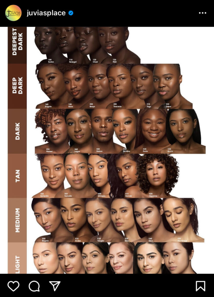
Juvia’s Place Foundation Ad 
NYX Butter Gloss Ad 
Burger King Kitchen Ad
The Juvia’s Place ad was found on their Instagram account. Their main message with their products is that they include all kinds of shades, including a larger variety of darker shades since it is usually hard for Black people to find their correct foundation shade. The NYX ad was found in the shopping section of Instagram. You can tell they are trying to be racially inclusive simply by looking at the emojis used. They are trying to communicate that their colors work on everyone. Lastly, the Burger King ad was a women-targeted ad found in newspapers, trying to acknowledge the lack of women in head chef positions. It clearly was not a successful ad, but more of a sexist ad.
McLuhan writes on the relationship between man and technology. He talks about technology and media being “extensions of man,” meaning the influence the medium has on society as a whole should be taken into consideration more than what the contents the medium has. “All media are extensions of some human faculty — psychic or physical.” McLuhan speaks on the influence media has not only physically, but mentally, and can poke at the minds of the people. It’s interesting to see the breakdown of creations most don’t really give second thought to. For example, clothing being an extension of the skin, or a book is an extension of the eye. Through these comparisons, it’s easier to grasp the theme of creations having an origin. Without skin or bodies, we wouldn’t have anything to clothe. Without eyes, we wouldn’t be able to read a book. These things would probably not even exist. These creations would no longer have any meaning.
The hazards of technological progress that McLuhan speaks of are pretty much the same as those talked about today too. He asks, “When this circuit learns your job, what are you going to do?” With more and more technological advancements, the more humans rely on it to do humans jobs. This is the same issue we see today within minimum wage jobs; instead of having 5 registers lined up with 5 other people to take your order, you’re now faced with 4 order kiosks for you to order for yourself, and a single employee to take orders. The creations will eventually take over human jobs; “mechanization” gone bad.
McLuhan states, “The medium is the message.” A designer’s work is inferior to the media they use to create because it is trying to do the work of past media. McLuhan explains how this makes things difficult because new pieces of work are approached with the same responses as the old; it’s what society has grown accustomed to. According to McLuhan, in order for artists and designers to play a decent role in creating new messages, they should have goals. He claims that students no longer strive towards goals, but wish for roles. It sounds like McLuhan portrays many upcoming designers as looking for a job where they’re just ordered around on what to do with no thought for themselves. He explains there should be a shift in education from instruction to discovery, allowing artists and designers to learn a natural creative thought process and individuality.
Jan Tschichold emphasized the change in typographers priorities; reforming their typographical designs to have a stronger sense of clarity rather than “beauty,” or the aesthetic of the typography. Not only does Tschichold speak about the change in typography in this sense, but also the responsibility a typographer has with this change in mind. Tschichold states, “It is up to the typographer to express this relationship clearly and visibly through type sizes and weight, arrangement of lines, use of color, photography, etc. The typographer must take the greatest care to study how his work is read and ought to be read.” According to Tschichold, a typographer should design in a way that is clear and uses other forms of design to relate to one another in a logical relationship; they work well with one another and in harmony.
Karl Gerstner seemed to believe design was more effective when using a more mathematical approach. In “Designing Programmes,” there is an abundance of numbers, equations, units, and quite frankly, a whole lot of things I barely understood. Math has never been my strong suit, so seeing his explanation on the grid with all these numbers, directions, and orders was a lot to take in. I do love this concept though. The amount of different layouts and creative solutions you can create with this grid is very interesting. To Gerstner, a designer should be able to combine the elements of their design; “The creative process is to be reduced to an act of selection. Designing means: to pick out determining elements and combine them. Seen in these terms, designing calls for method.”
Similar to Karl Gerstner, Josef Müller-Brockmann believes in a structured grid for designers. Brockmann states, “The use of the grid as an ordering system is the expression of a certain mental attitude inasmuch as it shows that the designer conceives his work in terms that are constructive and oriented to the future.” While I agree it may be beneficial to designers to have an initial layout to build off of, I don’t think it’s necessary at all. It may help some, similar to gesture drawing sketches may help an artist get the initial layout of motion in the drawing, but I don’t believe it needs to be followed by designers in order to work in terms that are constructive or aimed to the future. Clearly akin to Gerstner, Brockmann believes a designer’s work should be clear, functional, and involve mathematical thinking.
According to Gropius, past art was lacking in creativity due to schooling. He claims “the academy” isolates the artist from industry itself and hands-on experience or work. I agree that school alone isn’t enough to teach creativity, but I find that such an obvious take on artists and their education. The entire paragraph explaining this is something I’ve understood before I started studying graphic design and advertising in high school. If you lack creativity, art school is going to be a lot more difficult for you. Gropius goes on to say, “On the other hand, manual dexterity and the thorough knowledge which is a necessary foundation for all creative effort, whether the workman’s or the artist’s, can be taught and learned.” While it’s very tedious, I think school is still a fundamental experience for artists. While not being able to teach creativity or talent, it’s still beneficial to understand the foundations and history of your area of art; it has the ability to enhance your artwork.
Moholy-Nagy was a pioneer when it came to photography and graphic design. After reading “Typophoto,” it seemed that Moholy-Nagy believed typography and photography should go hand-in-hand to create the most effective design and shape new art; they can and should work in harmony. He explains how photography can be highly effective when used as typographical material, meaning it can serve as a more precise visual representation so there won’t be much individual representation. Photography can be used as a secondary explanation of what the typography is trying to communicate, that way there is no confusion on what is trying to be told.
In Herbert Bayer’s successful attempt at a future art form, he founded the Universal typeface, consisting of only lowercase letters and geometrical forms. He explains this was to bridge the gap between people with different languages. He states, “For a long time to come we will accept the existence of the different languages now in use.” I don’t believe there will ever be a time where every single individual will only ever speak a single language. However, I do agree this will continue to pose a barrier, but we have ways to go around that, and Bayer has already showcased his way. Very similar to Moholy-Nagy, Bayer emphasizes the main way to bridge this gap is by integrating both text and photo. With the sense of context clues, visual representation, and a universal text, this way of communication becomes accessible to almost all. This combination went on to become the most effective way of communication within advertising, graphic design, etc.
These manifestos were extremely hard for me to understand, so I’m not entirely sure if I’ve fully understood what the messages were. I believe Marinetti’s point is that there is always a competition in the process of new inventions. People will never be satisfied with the originals of inventions because, over time, people seek to see the object’s spoilage. Most of this manifesto seems to be very hostile in its speech. There’s a large emphasis on violence and uproar in order to get a hold of the future they want. Marinetti claims “poetry must be a violent assault on the forces of the unknown, to force them to bow before man.” This sense male superiority is followed up shortly after with saying they want to feel contempt towards women. This manifesto glorifies war and rebellion, arguing a fight against morals is better than cowardly supporting feminism or utilitarianism. Marinetti seems to want the industrial age to move forward even faster, praising machinery and wanting to take advantage of it.
In contrast to Marinetti, Rodchenko seems to want to cater to the wishes of society and the people as a whole. In Rodchenko’s manifesto, it seems as though he wants art to serve a purpose and be useful to society, such as talented people like constructors, engineers, lab workers. Another occupation that would probably fit Rodchenko’s views is an architect; someone able to use their artistic creativity to create buildings, homes, and other structures that will still serve a fundamental purpose. I think it’s understandable to believe inventions and art should also consider the sense of social responsibility and contribution, but not every piece needs to.
From what I could try and understand, El Lissitzky focused on communication. Lissitzky anticipated the growth and adaptation of communication. New forms of media would take over the use of books. He knew that there was “no new shape for the book as a body,” and he anticipated that this would change and continue to do so. Society is also brought up in this, speaking about the use of posters and paperbacks was easy for everyday people to get a hold of as well.


Recent Comments