Author: Kami Roberts (Page 1 of 2)
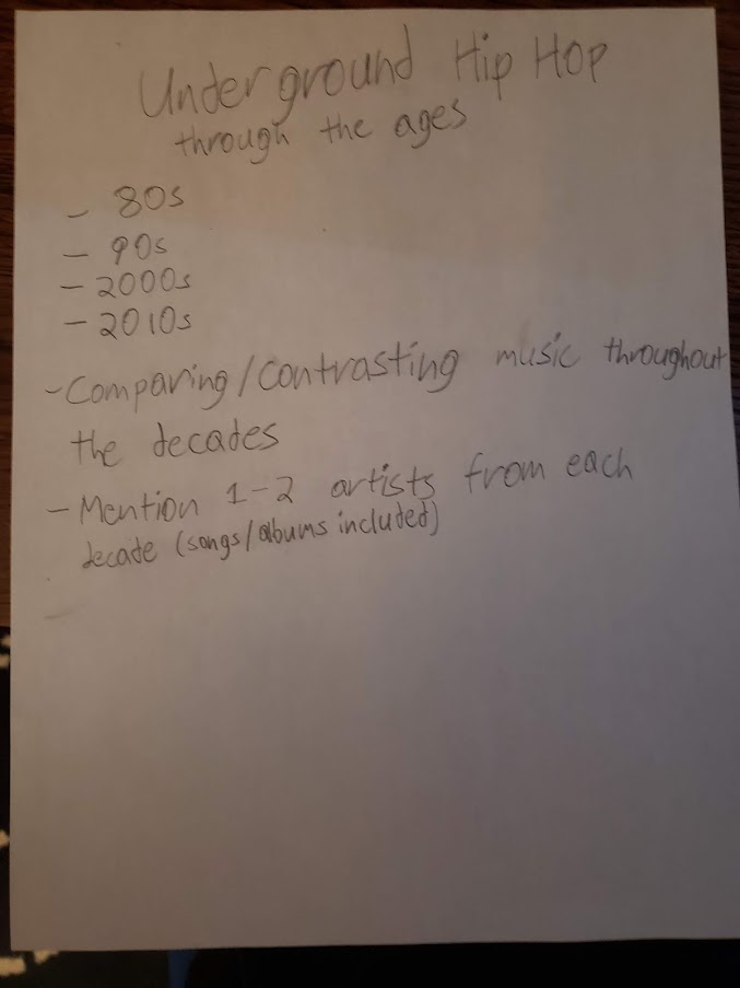
Underground Art refers to when artists steal an artwork, alter a few aspects of it, and then sell it as an original. Despite the method used to create this are it actually gained a lot of followers. The reading makes it clear that “the phenomenon is not new, however. From the beginning of the twentieth century avant-gardes have ceded original ideas to the mass marketplace.” In some instances art can be a remix of someone else’s idea or even a combination of multiple people’s ideas. This is especially true with music. Different music styles, beats, and arrangements are copied and remixed all the time giving birth to new songs. Heller states in his reading “How can one design if the past is unknown? As a political tool it helps to understand the language of persuasion, even if the goal of the design brief is not to change politics.” From the moment it was created, art throughout the ages has been (fundamentally at least) a remix of what came before it.
Resources:
https://www.ukessays.com/essays/music/music-of-comparison-mainstream-and-underground-music-essay.php
Notes:
- The image in an advertisement greatly enhances the message it portrays
- The 3 colors used (red, yellow and green) symbolize the country of Italy
- A picture can sometimes convey a message without the aid of text/typography
- The functions of a linguistic message are anchorage and relay
Questions/Things I don’t understand:
- The phrase “en abyme”
- How come there are french concepts and connotations within an art piece made for Italy?
- The phrase “the one lexia mobilizes different lexicons”
Image Origin-https://twitter.com/keithboykin/status/917048777864867840/photo/1
This ad came out in 2017 and was blasted all over the internet for it’s obvious racism towards black people. Dove almost immediately took it down after the backlash they received. Many shared it as a display that racism, subtle or blatant, still very much exists in modern day society.

Image Origin-https://oldnavy.gap.com/browse/info.do?cid=1180206
This ad is a bit more “human friendly”. Old Navy started this campaign in early 2021 for the promotion of women’s body equality. Accompanying the ads, was a series of clothing for all sizes: Lifestyle and Activewear alike.

Image Origin-https://www.inma.org/blogs/print-innovations/post.cfm/newsworks-shares-best-print-ads-of-2020
This ad dropped sometime in 2020. Tesco had made a new line of bandaids that better matched skin tone as it came in 3 different skin tones. For a long time this only applied to people with lighter skin tones. They weren’t the first people to come up with this idea, but they thought it was important enough to address it.
Marshall Mcluhan talks about how technology and media affects design strategies over the years. In his 2nd reading, he says “All media are extensions of some human faculty- psychic or physical. The wheel is an extension of the foot, the book is an extension of the eye, clothing, an extension of skin, electric circuitry an extension of the central nervous system. Media, by altering the environment, evoke in us unique ratios of sense perceptions. The extension of any one sense alters the way we think and act- the way we perceive the world. When these ratios change, men change.” He also makes many references to other inventions in his first reading, as he mentions the electric light, the radio, TV, etc. To this day, technology and media, play a profound way in how we design. As we progress into the future, design become more simple and modernistic for the audiences we design them for.
Karl Gernster developed a systematical solution for when he was making Swiss Typography. He viewed Graphic Design as a very technical field, as he states, “This implies: not to make creative decisions as prompted by feeling but by intellectual criteria. The more exact and complete these criteria are, the more creative the
work becomes.” His system helped him to decide what typeface, color, appearance, and expression of his typography.
Jan Tschichold has a similar outlook to Gernster, believing that art and design is a balance of creativity and logic. In his reading, he says, “Every part of a text relates to every other part by a definite, logical relationship of emphasis and value, predetermined by content. It is up to the typographer to express this relationship clearly and visibly through type sizes and weight, arrangement of lines, use of color, photography, etc. The typographer must take the greatest care to study how his work is read and ought to be read”.
Josef Müller-Brockmann, another constructivist, states “Every visual creative work is a manifestation of the character of the designer. It is a reflection of his knowledge, his ability, and his mentality”. He also goes into detail as to why the grid is so important and how it has been helpful in the creative process.
Beatrice Warde believed printing to be a method of sending messages to people. She compared printing to drinking wine in a glass cup in the sense that the wine should be viewed by everyone. She said that “The most important thing about printing is that it conveys thought, ideas, images, from one mind to other minds. She also compared the fine arts to listening to music in a language you don’t understand. Both shut down the logical part of your brain and leaves the abstract part of it to fully take it in.
I believe Gyorgy Kepes believed something similar if not the same as many of his artworks in his book were abstract as well. He also thought art was like a machine. In his words, “The only way to master it visually is to perceive it in its dynamic quality, in the functioning interconnections of its visible parts.


Recent Comments