This project was from an client that our my professor, a couple semesters ago, brought in for the class to help them brand their selves. This is what I came up with.


Where Illustration and graphic design come together
This project was from an client that our my professor, a couple semesters ago, brought in for the class to help them brand their selves. This is what I came up with.
Puss in boots Recreation Process book
This was recreation of an old fable. I chose Puss in boots and changed it to a Japanese theme, going back in time to the ninja/samurai era. To see in detail click the pdf.
Photo Reference:


These were used to help me with the position of the character. Along with other images on pinterest as well, I combined things from the images I got inspired by.
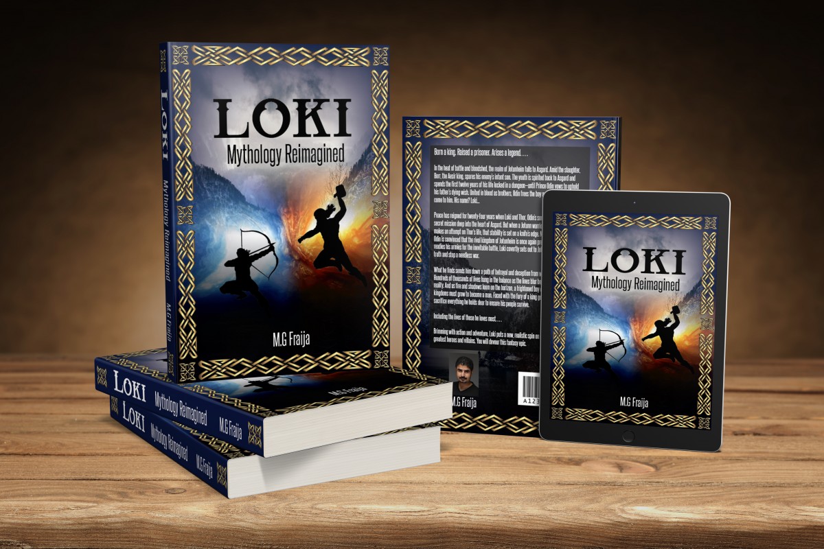
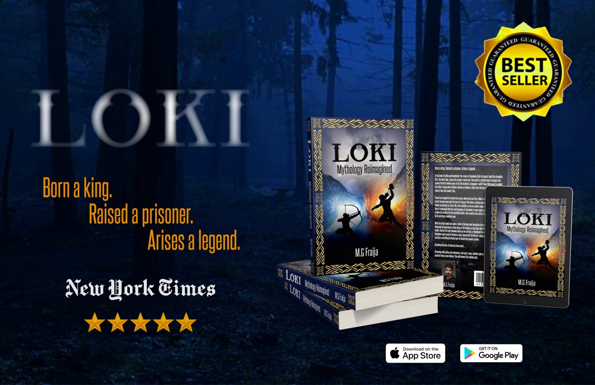
One assignment to make a book cover for an author on 99design.com. I chose the book Loki by M.G Fraija. Here are my two designs. 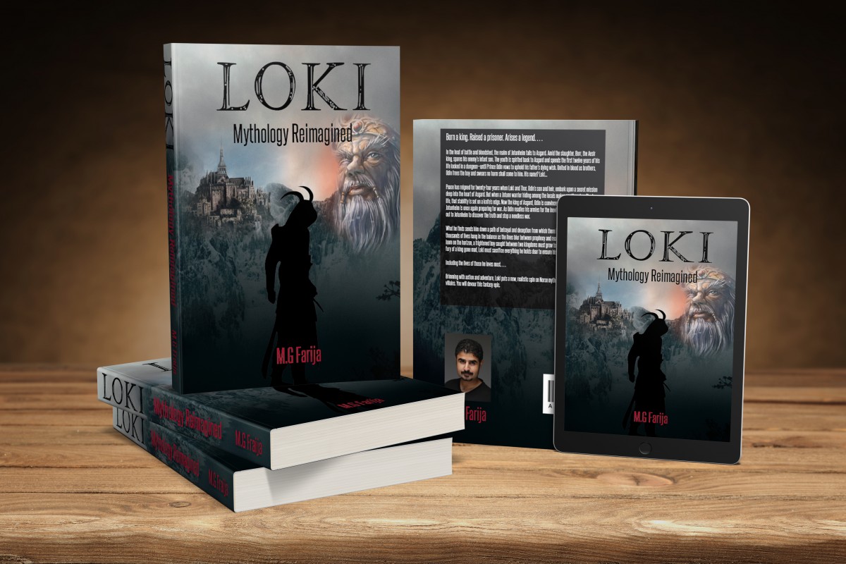
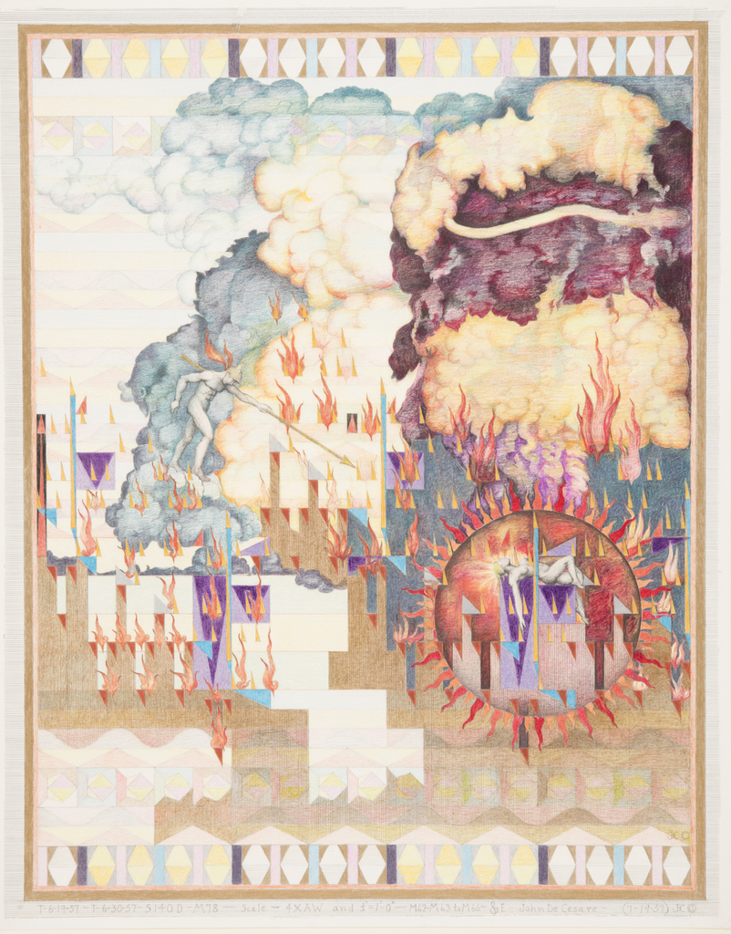
This piece was the first piece I caught interest to when I started looking around. It is unique because I didn’t see nothing like it. I had to stare at it for a bit to try and figure out. It looked like a bunch of building on fire and there is a women inside one of the building but using the shape of the sun to be used as a magnify glass to see what’s happening inside. This drawing had a lot of geometric shapes and color which really defined the composition.

The second piece that i found very interesting was the LED Wallpaper which was constructed in 2013 by Ingo Maurer. This piece was different from most of the other is because it is an architectural piece which uses LED lights. Connecting these LED lights were silver pathways going from one light to the next. The lights were set to go off in patterns and had the colors blue, red and white. Out of everything in the museum, this was the only work of art that lit up.
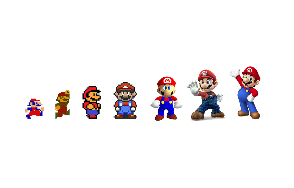
The third artwork is the Evolution of Super Mario which was designed by Joris Laarman and dated in 2015. It is made out of digital print on vinyl. This artwork caught my attention because I am a Fan of the Nintendo Character Mario and used to play many Super Mario. Seeing the old Mario from blocky figure to more realistic look. It is memorizing that the graphics of the gaming are increasing every year. This artwork is different from the other because it is like a timeline based on the progression of Super Mario.
Outline for Sprite Logo Research Paper
In 1961, the soft drink that was introduced to the world from Coca-Cola, with the same color for the last 50 years is Sprite. Sprite has had the color green since it was created. Sprite drinks are all over, in mostly every store. Sprite had many changes to its logo appearance since 1961.The logo that Sprite has right now fits the brand. The Sprite brand has a unique history behind it.
In the 1800s-1900s, Dr.Pepper and Coca-Cola companies have been competing for cola drinks for a while. Dr.Pepper came up with a non-cola drink and it was called 7UP and it became one of the top soft drinks in America at the time{Dr.Pepper/7UP). Then Coca-Cola decided to create their own non-cola drink to compete with 7UP, and they created Sprite in 1961.“Sprite is a cool, crisp, clear lemon-lime refreshment, and its unique, delicious taste quenches thirst,” and the color green in Sprite gives off that cool, crisp, and refreshing feeling in the drink. Sprite started to rise to the top of the leader boards in best non-cola drinks in the United States.The Sprite brand has consistently aimed to connect with the urban teenager through a many marketing campaigns. Each marketing campaign, Sprite changed its logo, to promote its ideas but still kept its main colors.
Sprite started with this plain layout with the word “Sprite” with some green in it and a interesting shape as a background. Then later on the company decides to alternate the logo and added more green and yellow to represent the favor of this soft drink which tastes like lemon-lime(logos.wiki).The green color they gave the font, gave the logo a refreshing look in which many people would buy the drink if seen in stores. Through the brands years, they have changed many things from slanting the words to making the lemon-line shape to the top of the “i” to adding and removing the splash. In 2009, Sprite changed the logo, added blue and green and a stroke to the font and increased the size of the lemon/lime on the “i” and added a silver shape around the background(logos.wiki). These designs helped increase the buying and consuming of Sprite. Sprite has been paying attention to some health concerns by creating a another drink called Sprite Zero.
The design of Sprite logo has a good image for it’s soft drink. The design gives off a sense of refreshing, lemon-lime image when you see it in the refrigerators in the stores. Sprite has made many commercials showing that the drink is refreshing and crisp. One particular commercial that caught many people’s attention is the collaboration with Lebron James showing off that the drink is even appealing to athletes.
Outline for Sprite Logo Research Paper
In 1961, the soft drink that was introduced to the world from Coca-Cola, with the same color for the last 50 years is Sprite. Sprite has had the color green since it was created. Sprite drinks are all over, in mostly every store. Sprite had many changes to its logo appearance since 1961.
First paragraph:
-Why did they choose the color green?
-Elements and Attributes of the brand
-Brand identity
Second paragraph:
=The Logo Changes throughout the years…
-The Design strategy
Third Paragraph:
-Agree with the design
-Commercial acceptance
Conclusion : Summary of why sprite is relevance in our society
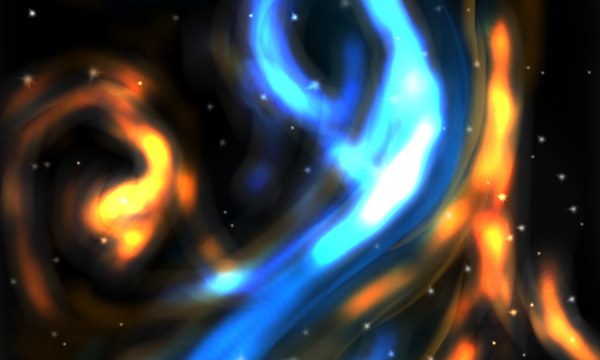
This is the start of my banner. I just recently got any idea to change it to something else but this is the first idea. It is a spiral kind of space object.
The OpenLab is an open-source, digital platform designed to support teaching and learning at City Tech (New York City College of Technology), and to promote student and faculty engagement in the intellectual and social life of the college community.