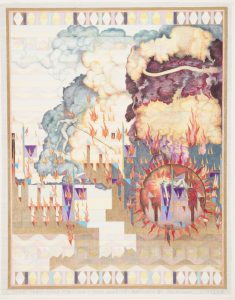
This piece was the first piece I caught interest to when I started looking around. It is unique because I didn’t see nothing like it. I had to stare at it for a bit to try and figure out. It looked like a bunch of building on fire and there is a women inside one of the building but using the shape of the sun to be used as a magnify glass to see what’s happening inside. This drawing had a lot of geometric shapes and color which really defined the composition.

The second piece that i found very interesting was the LED Wallpaper which was constructed in 2013 by Ingo Maurer. This piece was different from most of the other is because it is an architectural piece which uses LED lights. Connecting these LED lights were silver pathways going from one light to the next. The lights were set to go off in patterns and had the colors blue, red and white. Out of everything in the museum, this was the only work of art that lit up.

The third artwork is the Evolution of Super Mario which was designed by Joris Laarman and dated in 2015. It is made out of digital print on vinyl. This artwork caught my attention because I am a Fan of the Nintendo Character Mario and used to play many Super Mario. Seeing the old Mario from blocky figure to more realistic look. It is memorizing that the graphics of the gaming are increasing every year. This artwork is different from the other because it is like a timeline based on the progression of Super Mario.


