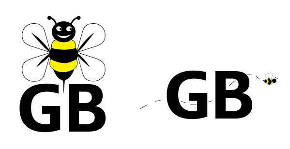
First week of the internship, the design team ( me and 2 other design interns) were given a task to think about for website design and introduction video of what the company is about. The director is waiting to hear from the coder on setting it up for us, the design team to work on. In the meantime, we decide to give some suggestions on possibly new logo redesigns and font changes. We did not want to change the logo entirely because it goes with the company’s identity. So the three of us came up with 2 designs each and will present the designs to the director in the upcoming meeting.
These are the two alternative logos I have created. I just changed around bee, and changed the typeface to a san serif. Then I felt like I should make the bee smaller and have a trail through the “GB” for a playful/ entertaining feel. 
Logos by: Kyle Sealy


