
Internship Blog #9: Final PSP Project
My final assignment was to design a survey that PSP conducts in each store that they manage that lists various components of the front and back of house displays, appliances, and systems. One of them being the Grand Seiko Boutique, based in Manhattan. The design process wasn’t too thought out. I pretty much designed grids for each appliance and their descriptions along with photos for each that were given to me.
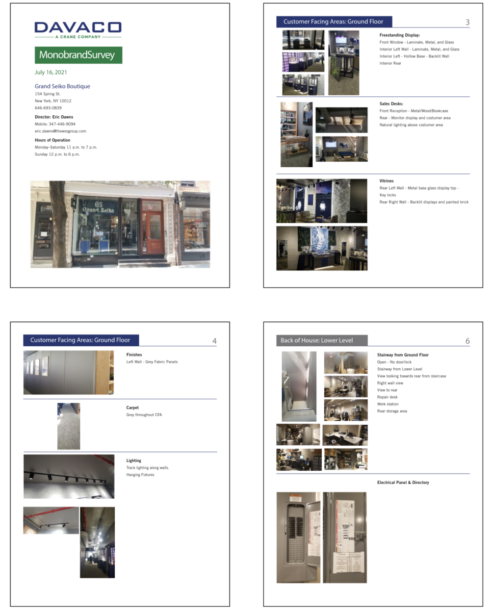
Grand Seiko Boutique Survey
Internship Blog #8: PSP One Pager
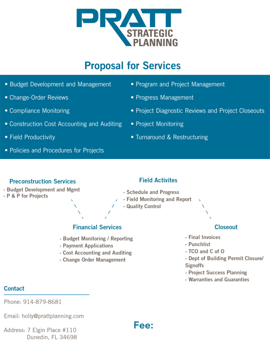
This week’s assignment was to design a one pager showing an in-depth description of the company’s overview, proposal, product, and services. My design choice was to use the company’s logo colors and incorporate them into the one pager. Beforehand, I first had to research what a one pager was since I never heard of it nor seen one. I then had to look at templates and examples to get an idea and feel on how this one should look. These were the final results
.
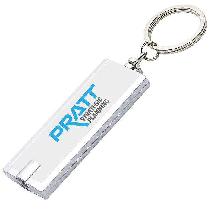
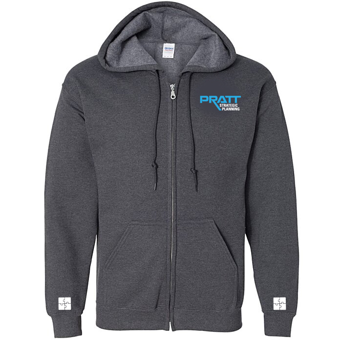
Internship Blog #7: PSP Merchandise & Promo Items
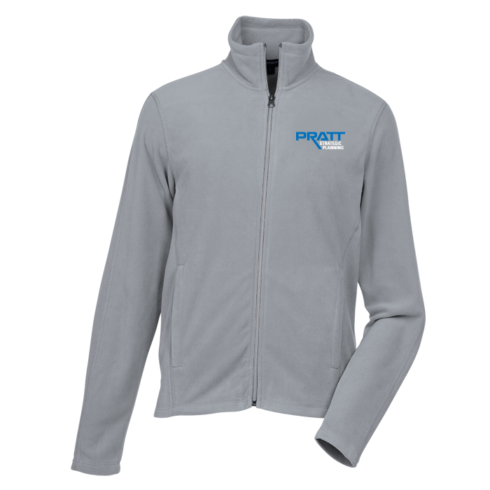
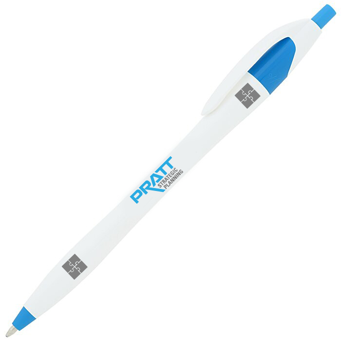
This week’s assignment was to design the company’s merchandise and promotional items that they will then give to potential clients. The overall design is simple, just how the company wanted it to be. With only their logo and trademark puzzle pieces.


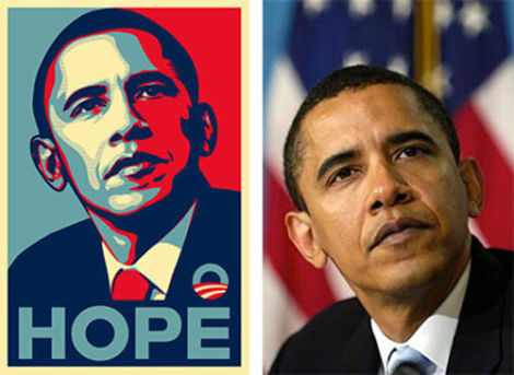
Obama Hope Poster Case Study
In 2006, street artist Shepard Fairey, designed the famous “Hope” poster of Obama. Big issue at large was that the photo he used wasn’t his, it belonged to the Associated Press. In 2008, the Associated Press sued Shepard for copyright violation and property damage. Therefore, led to a sentence of two year’s probation and $25,000 fine.
In my opinion, I think this is every designer’s worst nightmare, including mine. Can’t image designing something so mesmerizing and well done, that’ll inspire people and even give them hope, just to be hit with a lawsuit and have it tossed out the window. I remember seeing this poster as a kid and thinking that it was so iconic, with its vibrant colors and the big word “HOPE” slapped on it. To this day, this poster is still never forgotten. Overall, this poster will always be regarded as one of the most influential posters to ever be designed, despite the misfortunes that occurred.
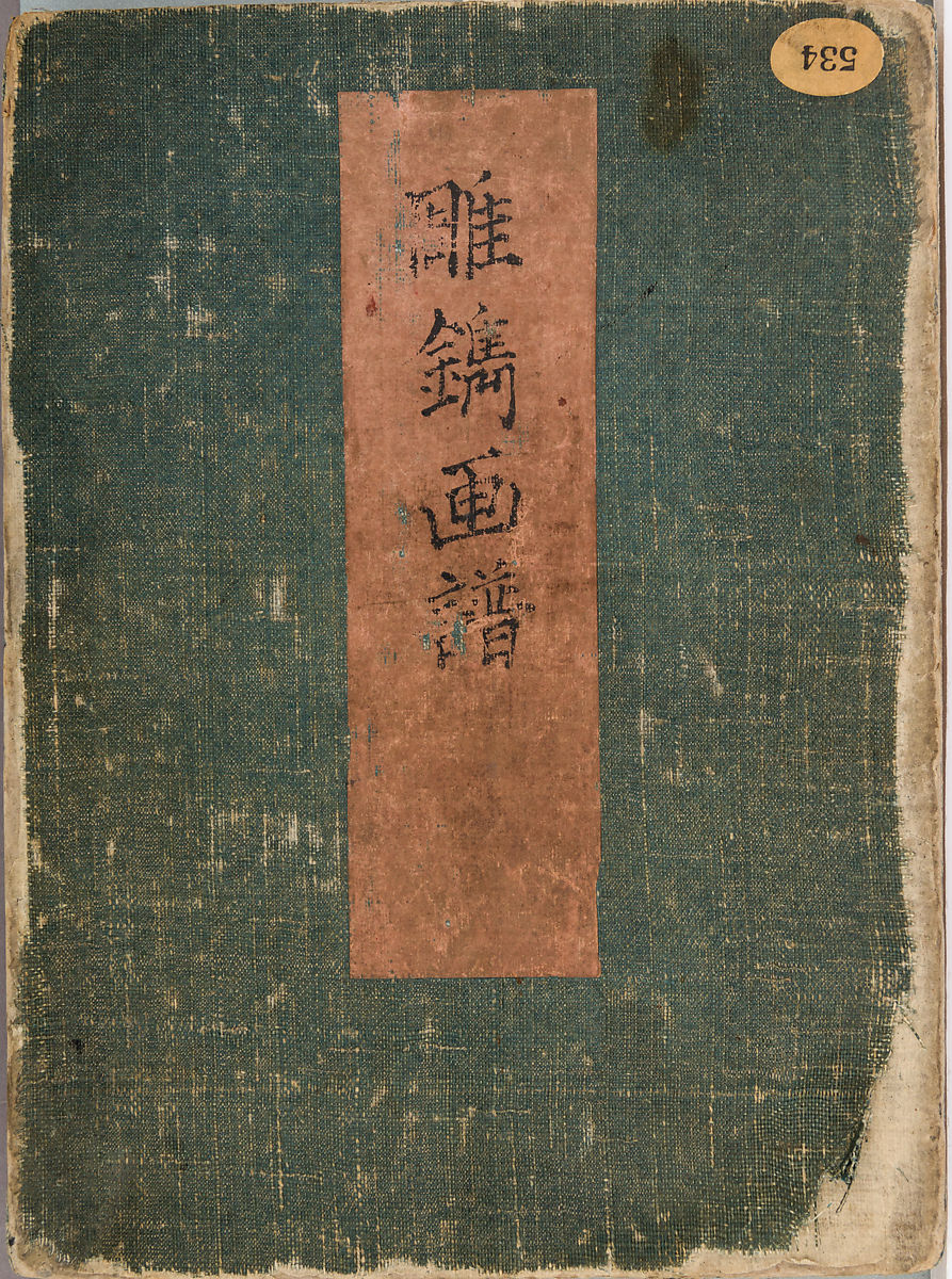
The Met Experience
The MET Museum is home to many vintage and antique artifacts, sculptures, painting, etc, that goes way back to possibly the B.C. time period. Even though I couldn’t make it to this field trip, I have been to the museum before. I was truly amazed and inspired by their sculptures. This time I explored their virtual exhibitions, and the one that caught my attention was Samurai Splendor: Sword Fittings from Edo Japan.

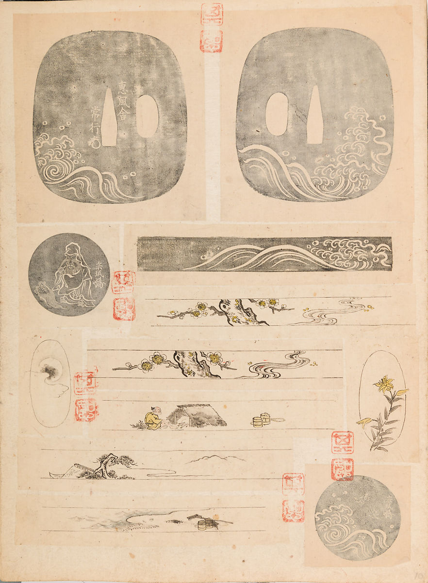
Blade and Mounting for a Short Sword (Wakizashi) Artist: Owari-Seki (Japanese, active 17th century) Medium: Steel, wood, lacquer, ray skin (same), baleen, copper-gold alloy (shakudō), copper (hiirodō)
This sword was crafted by a swordsmith in 17th century Japan. What’s unique about this sword is that it is made of multiple alternating layers of copper-gold alloy and dark red copper, which are carved in a spiral manner to reveal the layers. I chose this piece because I was attracted to its vintage feel and style. Also its color and polka a dot pattern.
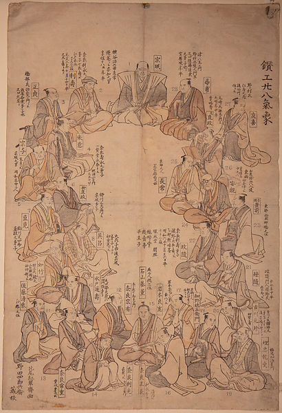
Portraits of Twenty-eight Metal Artists Artist: Kitao Shigemasa Medium: Woodblock print; ink and color on paper Size: 20 1/8 × 14 1/4 in.
This is an ink portrait of Japan’s twenty eight of the most influential metal artists or sword fitting makers of the Edo period. This portrait is depicting the initiators of the renaissance movement of the sword craft in Japan. Sitting at the very top, Yokoya Somin, is celebrated as The Godfather of this movement. This artwork was interesting due to the fact that these artists were very much depicted like the European Godfathers of the Renaissance, who have started a new art movement, but this time it was swords.
Album of Designs for Metal Carving (Chōsen Cafu) Artist: Ranzan Tsuneyuki Medium: Ink on paper, pasted into a bound volume Size: H. 9 in. (22.9 cm); W. 6 1/2 in. (16.5 cm); D. 1 1/2 in. (3.8 cm)
This is the personal sketchbook of sword fittings maker Ranzan Tsuneyuki . The sketchbook contains monochrome and colored pen and ink sketches as well as drawings of existing works that served the artist as model and as inspiration alike. What amazed me was the mastery and skill it took to draw these beautifully sketched sword fittings along with other sketches of nature and patterns.
Gordon Parks
Gordon Parks was and will always be regarded as one of the most influential photographers in the 20th century. His work documented American life and culture from the early 1940’s into the 2000’s, that revolved around race relations, poverty, civil rights, and urban life. His artistic style allowed him to break the color line during segregation. Also capture expressive images that explored the social and economic impact of poverty, racism, and discrimination. 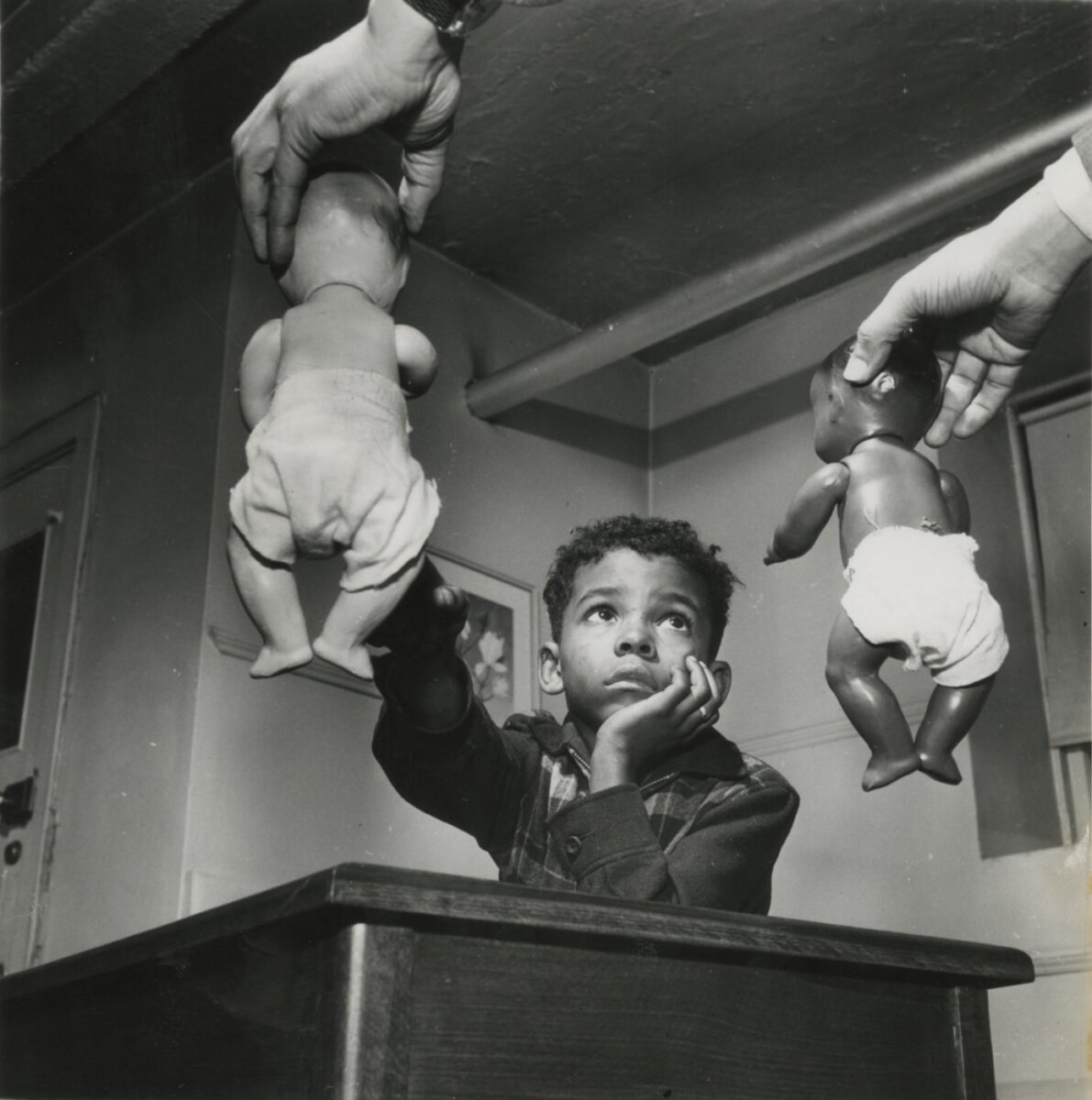
Internship Blog #6: PSP Business Card
This week’s assignment I was told to design business cards for the company. My thought process for the design was simple with little design elements since it is for a professional setting. The puzzle pieces were used to symbolize the “strategic planning” aspect of the company.
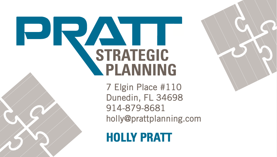
Pratt Strategic Planning business card
Internship Blog #5: First Week Assignment
My first tasks were to:
- Review Pratt Identity files, including stationery, invoices, and surveys.
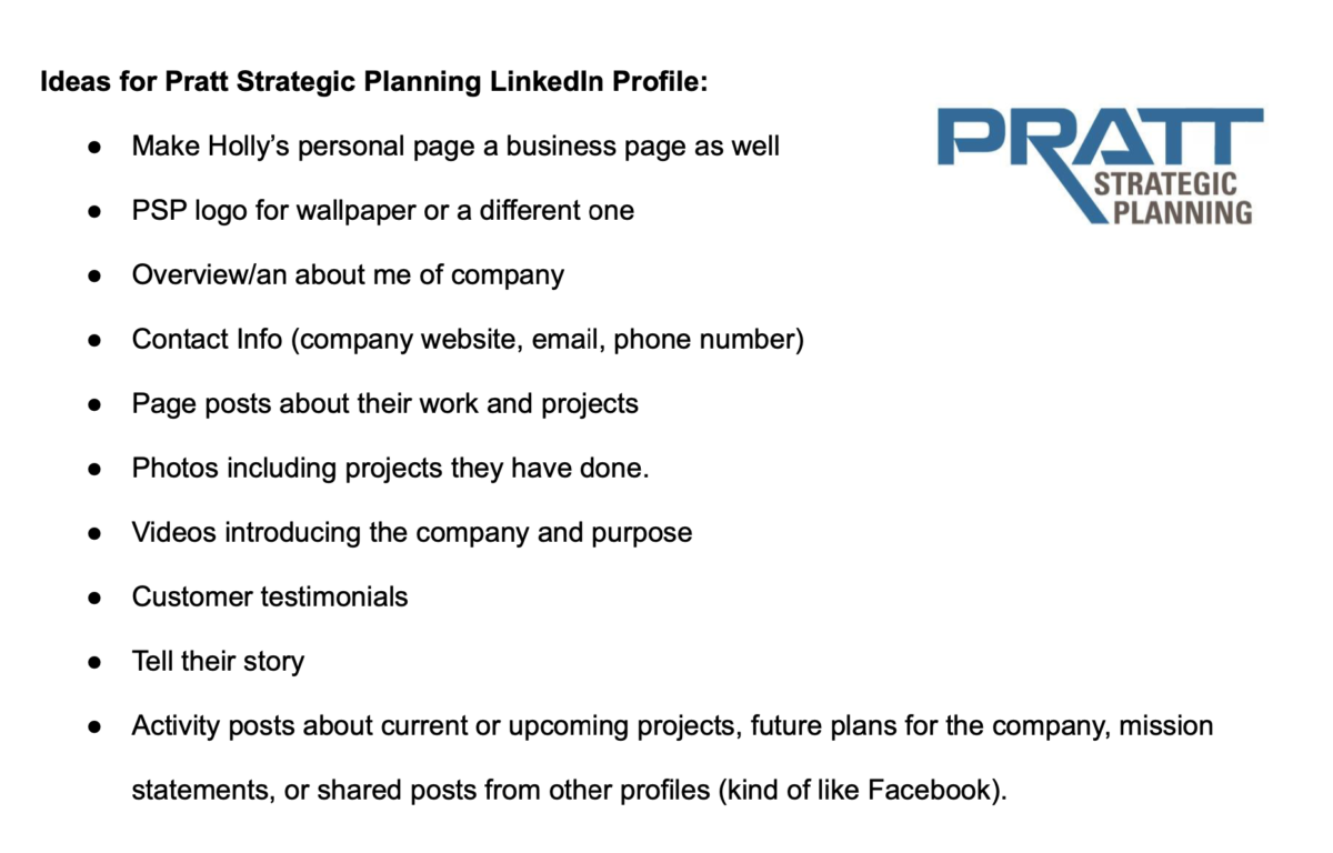
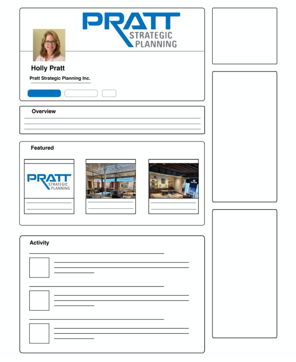
- Research LinkedIn pages to determine best structure and visuals for PSP:
- Should we have a LinkedIn for the business, separate from Holly’s personal page?
- Make a list of ideas for the page, share with Lisa on Thursday afternoon
- Begin creating visuals and gathering content for revised LinkedIn page
Easy start to the Internship in my opinion, but it was fun. I’ve had experiences in all my COMD classes doing research and drafts, so this was a no brainer.
Internship Blog #4: Finally Secured an Internship!

Good news is that I finally secured an internship with Brooklyn College though it is only remote, which was somewhat convenient since I could save money and the troubles to commute to the college, but it would’ve been great to be in a work environment. Either way I was just glad I secured this Internship.
This week a Zoom Introductory meeting was set to virtually meet my Internship supervisor, Lisa and Owner of Pratt Strategic Planning Inc., Holly Pratt. Holly Pratt is the principal of her own construction company based in Staten Island. Her company strives for “Best Quality Customer Service in every project, assignment or opportunity”. During the meeting, Holly was introducing her role and her line of work and pretty much what design elements she wanted for her website, LinkedIn profile, promotional items, etc. to spread the word about her company and really attract clients.
Overall, my tasks for this entire semester will be to learn how to apply a logo to different medium to create a brand image. Learn different areas of research material; communicate with vendors, etc.
Hope it goes well!

