Session 1
> Midterm from 9:15am until 10:45am <
When you are done, please print yourself 1 copy of Project #1 Rubric (put your name on it) and this final instruction page.
1) Group Crit
• In groups of 3 people, critique each member of the group together by going through the rubric and discussing their progress (using their ePortfolio) in each category
• Remember, this is a book meant to teach the reader about basics typographical rules and concepts. Your goal is to make sure the book does that first and foremost! The content about the person-of-interest is merely a way to tie these sections together stylistically (like a menu of different dishes that follow one theme of food: Olive Garden = Italian).
INSTRUCTIONS:
For the 2 students giving the crit:
1. Look through the book objectively as if it were printed
2. Go through each section and check for basic cleanliness (are things lining up with the grid, are the columns clear, are there headers, captions, and other essential directional features)?
3. Recall the instructions for each section (or look back at the Resources page to find each assignment) and see that students followed instructions
4. Finally, use the rubric that student printed for him/herself and discuss with that students the grades all that 3 of you would give
For that 1 student getting the crit:
1. DO mention your intention for design choices that your classmates misunderstood! If they know your intention / logic / reason / concept behind that choice, they can help you better communicate or show it
2. DO NOT interject too much during their conversation, so that you can see how your book is being interpreted by others. Communication Design means “does your design communicate with others” and these are your guinea pigs, take advantage of their conversation!
3. DO hand in your rubric to me (so I can scan) and remind me to give them back to you in Session 2
Session 2
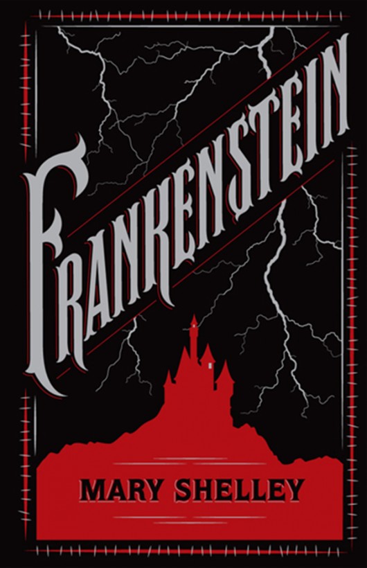
Introduction Play this game on famous book covers!
1) Your cover designs must include:
1. Title that suggests this is a book about type (as well as your theme)
2. Your name
3. Type & Media
4. Fall 2016
2) Some tips:
General tips
• Show, don’t tell
• Use symbolism
• Convey genre (mood lighting)
Typographical tips
• Hierarchy (2 fonts?)
• Contrast (color & value)
3) Workshop
4) Prep for Print
• Create new doc with these specs (NOTE: “Facing Pages” is not selected):
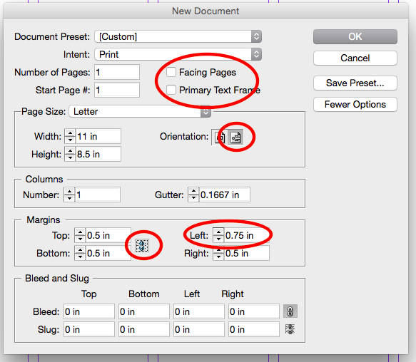
• On master page, create that grid again:
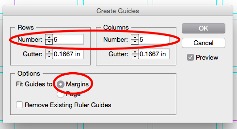
• Create Style Sheet (Header, Subhead, Caption)
• Import pages (making them single layouts by dragging)
• Some items may have shifted during takeoff! (i.e. reposition things into margins)
• Apply style sheet to all headers, subheads, and captions
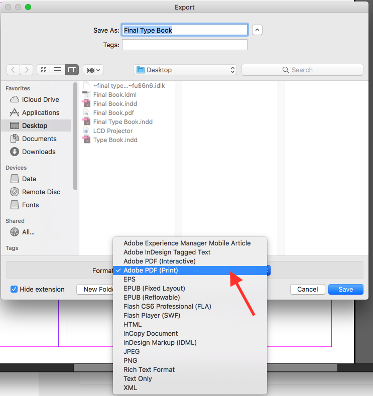
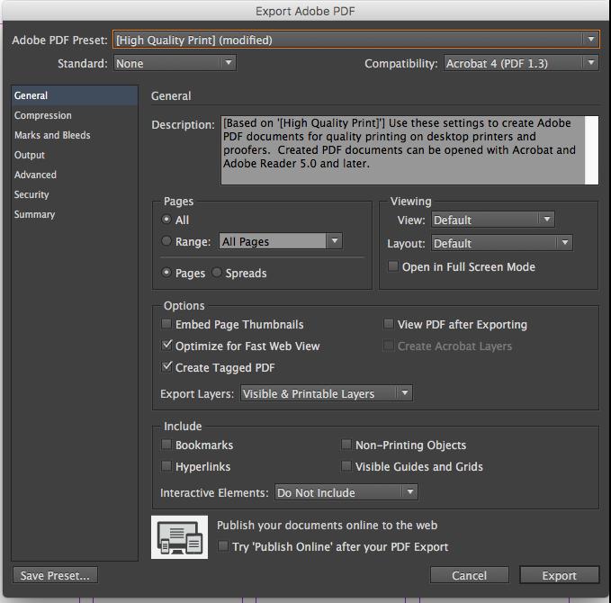
• File > Export
Printed books are due November 12th
