Essentials
Amendment to Syllabus:
• Only 1 Excused Absence allowed for
1) a doctor’s note
2) more than a week in advanced notice of absence
• Allowed 15 minutes before counted as late
• Allowed one lateness-because-of-train freebee that won’t count towards absence tally
• Class collective glossary
How to transfer your projects to include its fonts
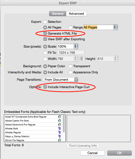
How to export:
Workshop Itinerary
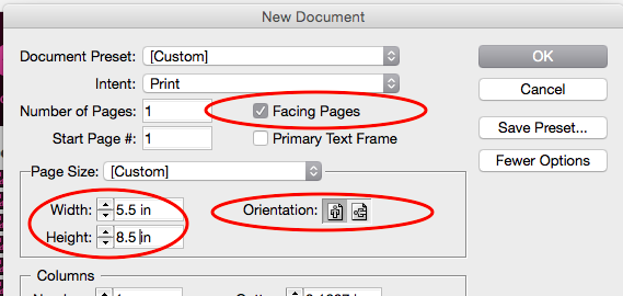
1. Create “facing pages” (width) 5.5 in. by (height) 8.5in.
2. Figure out how many pages for each part of your outline
3. Create that number of pages in your InDesign file (save file as a name you will remember)
4. Thumbnails Sketches – based off of your outline and your anticipated spreads >> Sample outline to thumbnail <<
5. Master page
– Grid (and gutter)
6. Style sheet
– Typography for each categories of content

– Color Scheme of up to 3 colors:
Inspiring palettes by color here, by concept here
Duotone effect with your color palette to help unify your magazine further:
7. Placing content images, text, text wrap, clipping mask,
8. Edits
– Scaling, text wrap, fitting, clipping path, run around, grouping
9. Exporting
– Resolution, packaging, binding
Project #2 ePortfolio Submission Page Sample w/ Instructions
Project #1 Type Book
Final Checklist (Type Book Assembly)
Type Book | Section 1 | Anatomy and Letterform
Type Book | Section 2 | Five Families of Type
Type Book | Section 3 | Variations
Type Book | Section 4 | Alignment
Type Book |Section 5 | Leading, Tracking, Kerning
Type Book | Section 6 | Type on a Path
TypeBook | Section 7 | Legibility: Color
TypeBook | Section 8 | Hierarchy
Type Book | Section 10 | Logotype
Essentials
Amendment to Syllabus:
• Only 1 Excused Absence allowed for
1) a doctor’s note
2) more than a week in advanced notice of absence
• Allowed 15 minutes before counted as late
• Allowed one lateness-because-of-train freebee that won’t count towards absence tally

• Class collective glossary
Basics
History
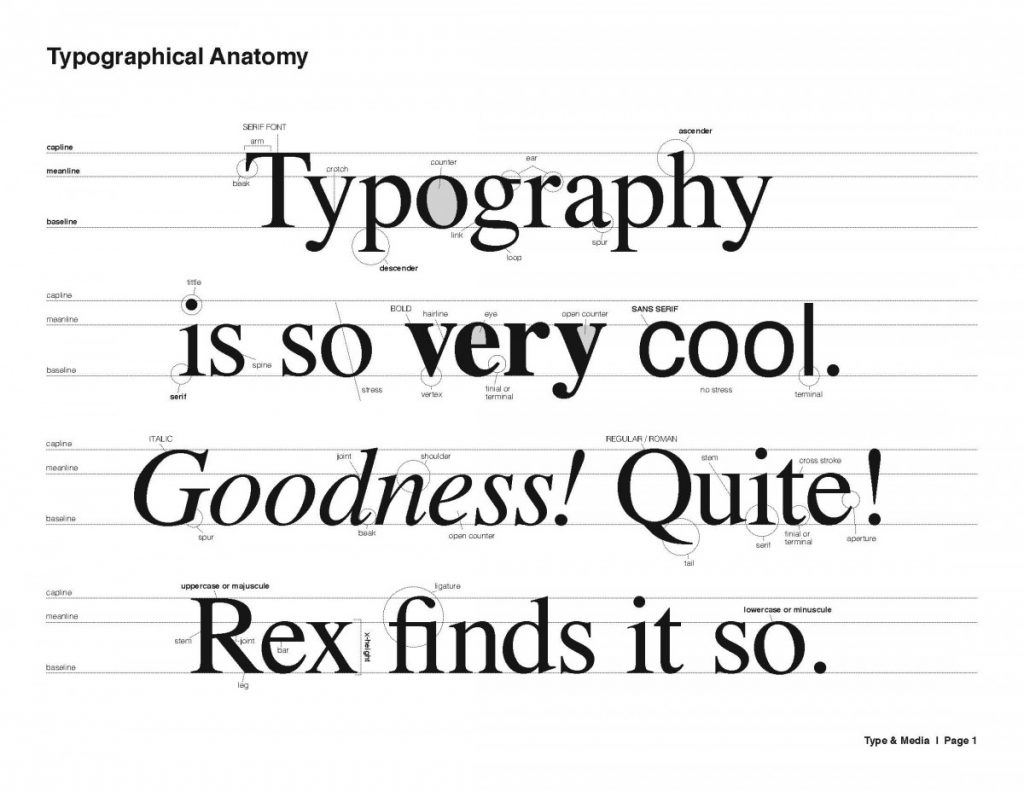
Type Anatomy
• Link to Libby Clark’s vocab terms and videos
• Ellen Lupton Thinking with Type
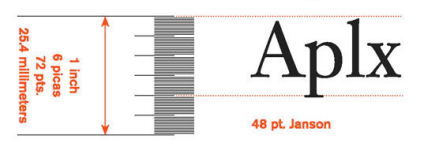
Type Measurement
Families of Type
• Art historical context presentation by Johanna Goldfeld
Hierarchy
Why do we need at least 3 levels of hierarchy?
The Grid
• Ruler, Grids & Guides (Adobe)
• Using The Grid For Your Designs (Adobe)
Layout Parts (Prof. Mary Brown)
A) text page – the area on a page, within the margins, where text appears.
B) margin – the area of the page around the text area.
C) folios – the page number. In most instances this is at the bottom of the page below or outside the text area.
D) header – the area at the top of the page, outside the text area. A running header is a header that is repeated across many pages
E) footer – the area at the bottom of the page, outside the text area. A running footer is a footer that is repeated across many pages.
F) gutter – the gutter separates the columns and rows from each other. It is also the area where two facing pages meet.
G) active corner – the upper left corner of any field in a grid system. This is where the top of the text is aligned.
H) passive corner – the bottom right corner of any field in a grid.
Type on a path
Logo
Logos made from Type, by Before & After
Typography Tips
20 Typography Mistakes to Avoid
• Type Basics Review Lecture: http://thinkingwithtype.com/misc/Type_Basics.pdf
• Experimental Grids http://thinkingwithtype.com/misc/Experimental_Typography.pdf
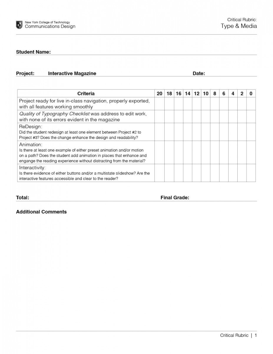
Quality of Typography Checklist
1. No widows
2. No orphans
3. No double end-of-line hyphens
4. Consistant wordspaces/letterspaces = even color
5. No stroked/outlined type (except headlines)
6. No artificial expand/condense
7. Maintain style consistency in content categories
8. Proper kearning in headlines and large type
Interactivity & Animation
