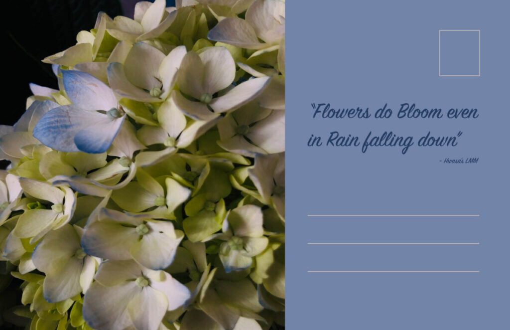
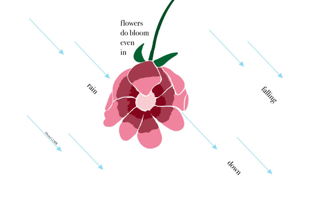
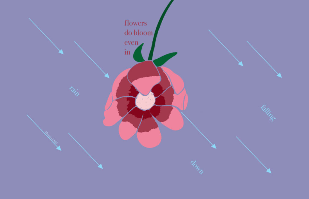
In this assignment we had to choose a quote from any form of reference such as a movie line, song lyric, book, and etc. I chose the quote “Flowers do bloom even in rain falling down” from a song called LMM. This song is by Hwasa and she is a Korean artist that I have been listening to lately as she recently released her first album. LMM is a song about strength and fears, and about being able to face forward even though it seems that everyone is pulling you down. Within this quote, I see the word ‘Flowers’ as her or us, individually, and the word ‘rain’ as the obstacles coming down at you.
Before finalizing on my three pieces, I worked on some sketches to see in which direction I wanted to go. I knew I wanted to incorporate a flower because they’re seen as easily destroyed if not well taken care of. I also wanted to incorporate rain as attacks, but not leaning far away from actual rain. Here are some sketches that I started with:
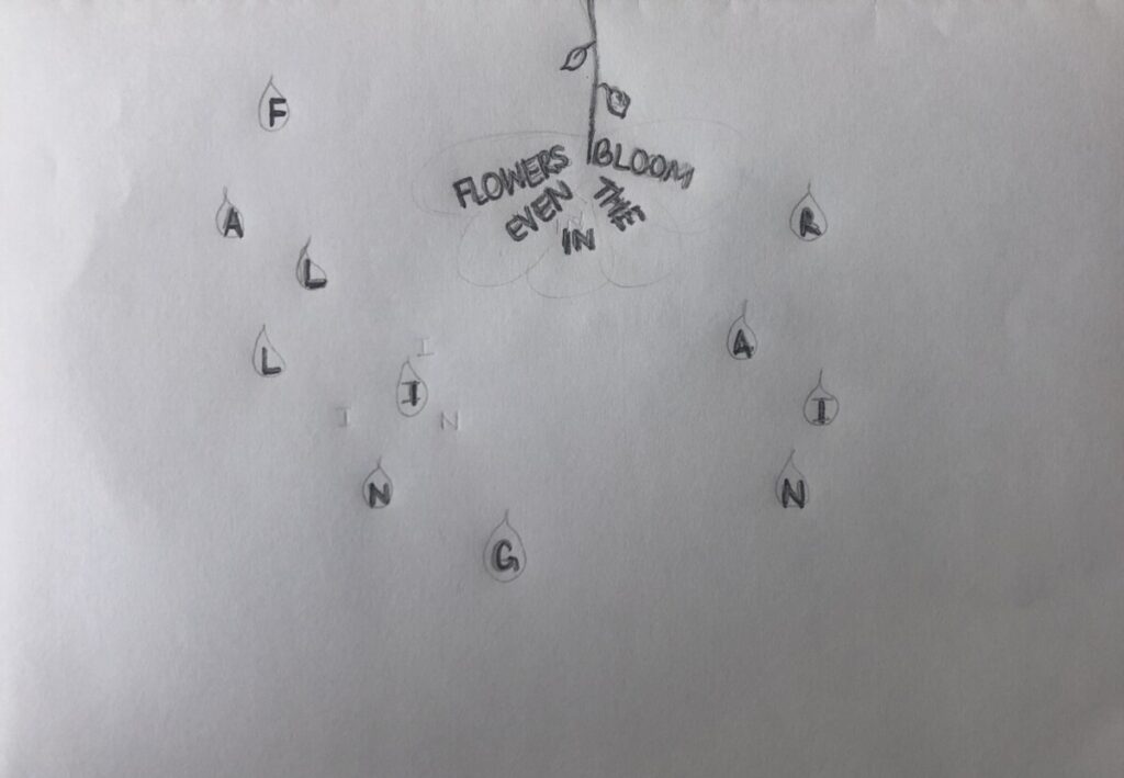
Sketch 1 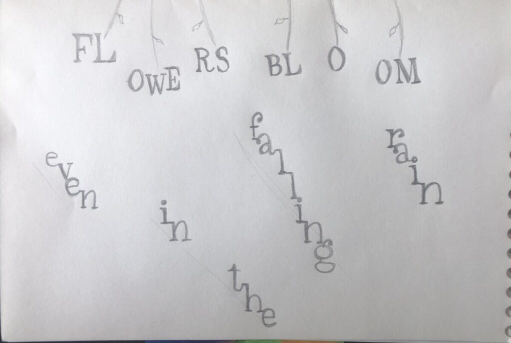
Sketch 2
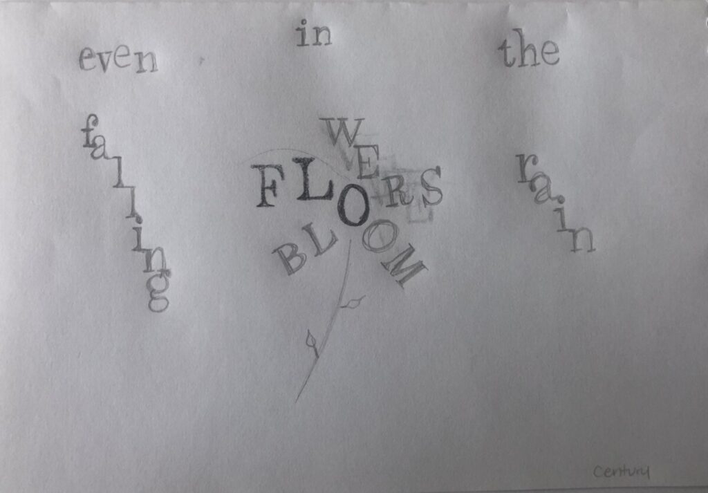
Sketch 3 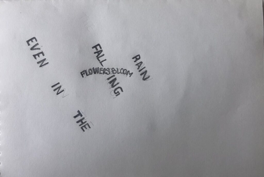
Sketch 4
Concept 1
In my first concept, I wanted to focus more on the type. I used Didot as my typeface because I like the lightness on the letters. Using the bold font, the thin stems can be seen on some letters and this resonating with me as having some fragility. In the first half of the quote, ‘Flowers’ and ‘bloom’ aretwo focal points I wanted the viewer to see so I made both ‘Flowers’ and ‘bloom’ bold. The end of the quote, I wanted the type to mimic the rain falling at a diagonal so I used italic font on ‘rainfalling down’. All the texts are stacked on top of each and both parts of the quote are on opposite sides of not only the color solid but also the page. Initially, to split up the type, I had gone with a vertical split approach and I changed it to a diagonal because I saw the ‘Flowers’ rising over the ‘rain’.
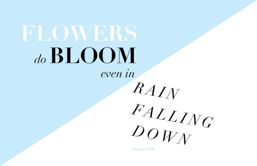
Concept 2
In my second concept, I wanted to introduce a bit of line art so I went ahead and sketched a flower and rain that look like arrows. I drew the flower coming down from the top just like the rain does because flowers usually are on the ground and it seems like the rain is attacking them. In this concept, I can show the flower blooming even as the rain falls and due to gravity, the rain would just slip away downwards. I kept the words ‘rain falling down’ are raindrops and so I also used italics to give it a diagonal visual. As for the raindrops, I gave them triangle shapes at the bottom of each one to make them look like arrows. In this case, I wanted the rain to be something hurtful to signify and enhance the sort of obstacles one has to face. Figure 1 shows these descriptions in its original form. In figure 2, I decided to add some color to complement the flower and to create an environment.
Concept 3
In my third concept, I wanted to use a photo and type to have it seem like a postcard. This is the reason as to why I have two sides. On the left I used a photo I took of some flowers I had and particularly this photo because it contained some shades of blue that give it color against a rainy day. On the right side, I also included a light blue shade to read off as calmness and strength. I wanted to emphasize on flowers blooming more and so I had the photo take over the majority of space. As for the text, the first half remained on the left side on the top of the flowers, giving it a light yellow shade so it can be legible and to correlate with the flowers behind it. On the right side, I kept the ‘rain falling down’ as italics and aligned each word on top of each other but at different starting points to mimic rain.
