Entry 14

Trip To The Cooper Hewitt

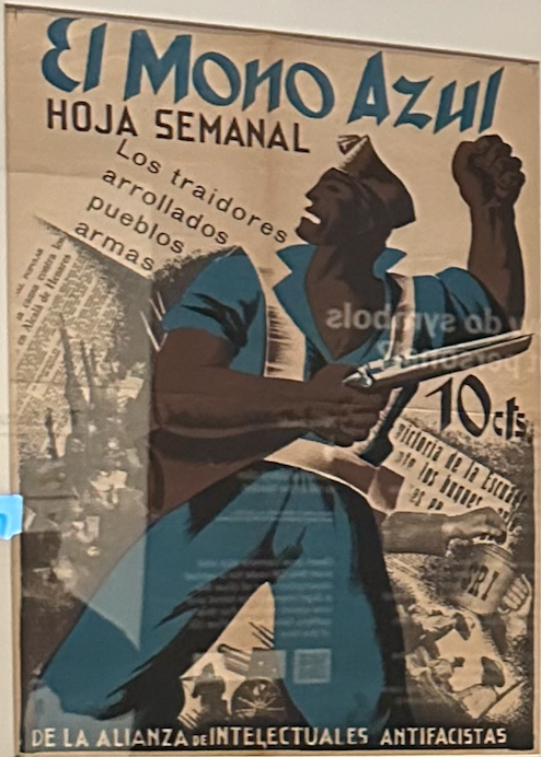
El Mono Azul (The Blue Monkey)

Produced by the Alianza de Intelectuales Antifascistas. It utilizes symbols, such as the clenched raised fist, to represent solidarity, and resistance; but also convey support. It uses a strong bold blue, meant to capture attention. Based on the blue overalls and gun help, it represented the working class and militia. It looks to be a political cartoon, used within Spain to celebrate their spirit. These images look to give a boost of morale. Behind the figure is a layer of what looks like articles, combining visual and literary elements.

La Lutte Continue

Produced by Atelier Populaire, the poster has a red background, with a raised fist and brick arm in the foreground. The raised first is synonymous with solidarity, resistance and unity. La Lutte Continue is French for The Struggle Continues. The red coloring represents urgency or danger, and the black represents strength and determination. You can link this and the time period (1968) to a message that there is a fight for social and political change, and that the people are of a collective and resisting together. 

The Hand That Will Rule The World – One Big Union in Solidarity

Produced by Ralph Chaplin, the poster features a large muscular fist, all made by the combination of all the working class members fists. This symbolizes the collective strength of the working class, showing they have the power to “rule the world.” The veins and firm grip emphasize this, showing the strength. The text is the same at the title, which again goes hand in hand with the imagery, further pushing the idea of unity and solidarity. 


Entry 13

Ethic Scenario 4

Q1. Well the question would be did the photographer and I have a conversation prior to this, about what exactly I am expecting and looking for. Then, depending on that, I would be able to explain to the photographer why it is unacceptable and does not meet the standard of what I need. I’d firstly see if they can A. redo it, B. refund me, and if that doesn’t work C. use free or cheap licensed imagery from online for the time being. Value and integrity should be weighed higher than cutting corners. 

Q2. Well, to be straightforward, keeping the celebrity as an endorser would damage the brand’s value and public image. As a brand the most important thing is the people, as well as the brand image. I’d probably relay concern to someone higher up, like the executives, to have a conversation with this person to fully understand what they have said (as it said interpreted), and then most likely cut ties. Depending on these variables, I would end up either staying or leaving the brand. 

Entry 12

Ethic Scenario 3

Q1. I would firstly explain to the client why having something as big as a logo be similar to someone else’s is a bad idea. I would then explain to them the issues of infringement and property. I would give them the option of doing something within the style, giving them their own unique asset. If they’re really persistent though, I would most likely contact the designer and see if they would be willing to collaborate, and/or if the design is for sale, such as licensing. 

Q2. If I am the Art Director, I would question the demands made by the Executive News Editor, in a respectful manner of course. I would tell him that though I understand his rank or hierarchy, following protocol should be a priority. If they refused to budge, I would most likely just refused to follow his direct order, as again, it would be against the companies commitments and my personal ethics. I would then most likely report the issue to one of the higher ups when they become available, especially since at that point I wouldn’t want the Executive News Editor to make up anything about me. 

Entry 11

The first creative app I used was Coffitivity. When you first open the web page (as I couldn’t find the app) you’re greeted by teal, tan, and white color schemes, squared layouts, and a play + fast forward button. 

It’s straightforward to use, just press play and ambient noise begins; you have the choice of 3 free options; being “Morning Murmur,” “Lunchtime Lounge,” and “University Undertones.” You can also mix your own music with the coffitivity in the background as it’s a separate browser.

They also had a personal blog to read, with topics like “Block Distracting Apps and Websites with Freedom.”

I do tend to find it easier to concentrate when there is some level of noise, so seeing this app replicate a specific scene of a cafe or lunchroom was pretty cool. I would say it’s more useful (to me) during a study session, as there is a more constant environment. I believe it can be a valuable tool for college students to enhance their studying environment, especially when a lot of it happens at late night when coffee shops are closed. On the flip side, I don’t necessarily see myself using the app again, as I much rather music itself / my music playlist. Also, YouTube has an infinite selection of sounds like this, some even looped for 24 hours; and Apple have a feature that allows you to add background noise to your music or silence; though it is slightly different as rather than cafe or lunchrooms, it’s things like oceans, rain, and river streams.

Entry 10

I would consider Chaka herself a good role model, seeing a relatively “young” (as age of objective) black woman work hard on something she believes in, all the while working other jobs, has shown me that most people have a lot on their plate, but really it’s about the balance and mentality. She has told me to be more vocal within myself, something that I of course even know I don’t do enough. A mind over matter mindset. I’d be lying if I said the deaths weren’t killing me, as well as the multitude of assignments I keep putting off, but in reality I just have to keep going. Really I have to utilize the life I was given, in ways others couldn’t or can’t. A new sense of gratefulness.

Entry 9

I believe I’ve been doing well to maintain my overall work load, while still performing highly for the internship. Senior project has been beating me down, plus a multitude of other assignments, while trying to “finalize” my portfolio. Many times I’ve felt like giving up this semester, solely due to the passing of my grandmother, and then my little cousin (I really can’t catch a break), but so far I’ve been pushing myself because I see life will not wait for me. One project I’m proud of is the logo because of the versatility. There are four versions and all can be used interchangeably, as well as include other assets within. The outer being two T’s and a B for The Bold Type, the inner shaped to “IF,” and when extended it represents a puzzle piece, and when normal a key. The other iteration includes a line work face, based on her love of line art. Below I will specifically show the inner of the logo, in normal and expanded, as well as the profile face.

Entry 8

I haven’t done any collaborate work (as it’s me and the owner), other than speaking directly with Chaka every week to understand the directions she wants to go in regarding what she’s interested in writing about or displaying. So far things have been successful as she loves the logo, the different layers of it, as well as the way I’ve incorporated imagery into the graphics. I’ve been able to showcase the vision with stock photography showcasing black rights, the Brooklyn bridge, and food, all things that she has focused on. 

Logo with inner photo

Entry 7

This blog is about the completion of her website. We had met and it was already in mutual interest that since the logo was finished, a website mockup/layout was in accordance. So I took that and ran with it. I’ve designed it in mind of her original color scheme being teal and white; as well as all the subjects she cares about. I started with placement, figuring out the layout for the photos, type, etc. I then went page by page and inserted different photos and copy that went along with it. I also cut it to 4 categories being The 101, Food, City Life, and Community.

Before

After

https://drive.google.com/file/d/1KL-PqfsYCIE7MjPSRPgn31KlSNwHBdND/view?usp=sharing

Fairly large, zooming in gives no quality issues, just a couple seconds to load and recalibrate. Below is a video, easier for viewing.

https://drive.google.com/file/d/1Ex1eO9y9VNtRVN5YPTKaiNj6Lozq-X3w/view?usp=sharing

Entry 6

Shorter entry. More visuals. The gold ended up coming. I met her the same weekend to show her the progress and final work, she really loved it. The weights, the shapes, the meaning; she was satisfied with all of it. I even made different version that she could utilize for different purposes, as well as one with added line work due to her personal love for it. I also drew inspiration from Paula Scher’s Berkeley logo.

Entry 5

Two – Three weeks of work felt like two months. Everyday I drew up sketches of what I believed could potentially represent her brand; in the form of a logo. I wanted to create something that can be utilized within all platforms, but also be an interchangeable asset itself. So far I can’t figure the inside out, but I know I want it to be type, or a letterform. I also want the outline to be bold, and to overlap rather than be separate. Other than the logo though, I’m excited to make a website mockup for her. I believe it deserves better flow and layout. She had big conflicting graphics, conflicting fonts, and “ok” categories. To be continued..