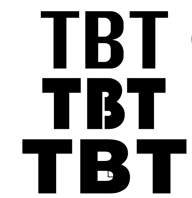
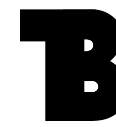
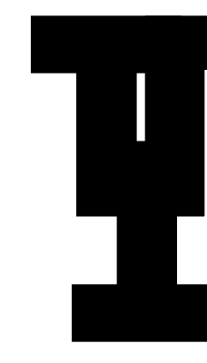
Two – Three weeks of work felt like two months. Everyday I drew up sketches of what I believed could potentially represent her brand; in the form of a logo. I wanted to create something that can be utilized within all platforms, but also be an interchangeable asset itself. So far I can’t figure the inside out, but I know I want it to be type, or a letterform. I also want the outline to be bold, and to overlap rather than be separate. Other than the logo though, I’m excited to make a website mockup for her. I believe it deserves better flow and layout. She had big conflicting graphics, conflicting fonts, and “ok” categories. To be continued..