Internship Blog #17
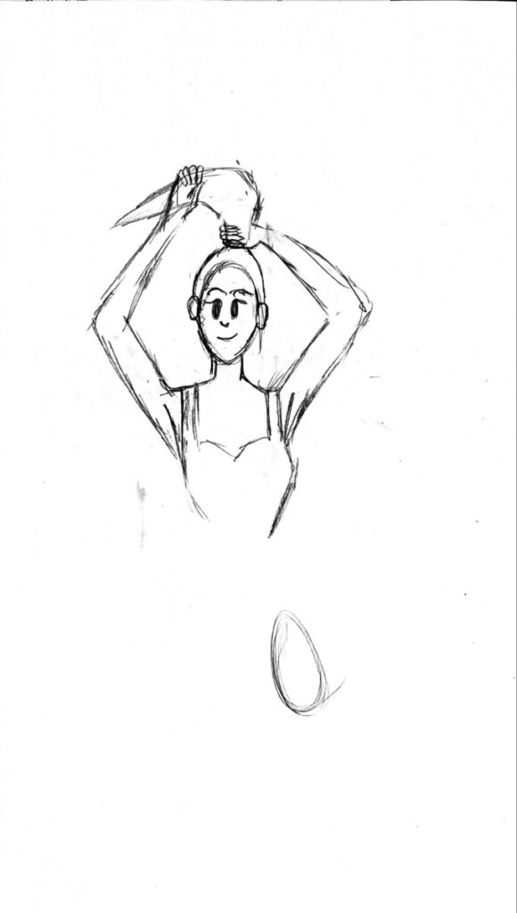
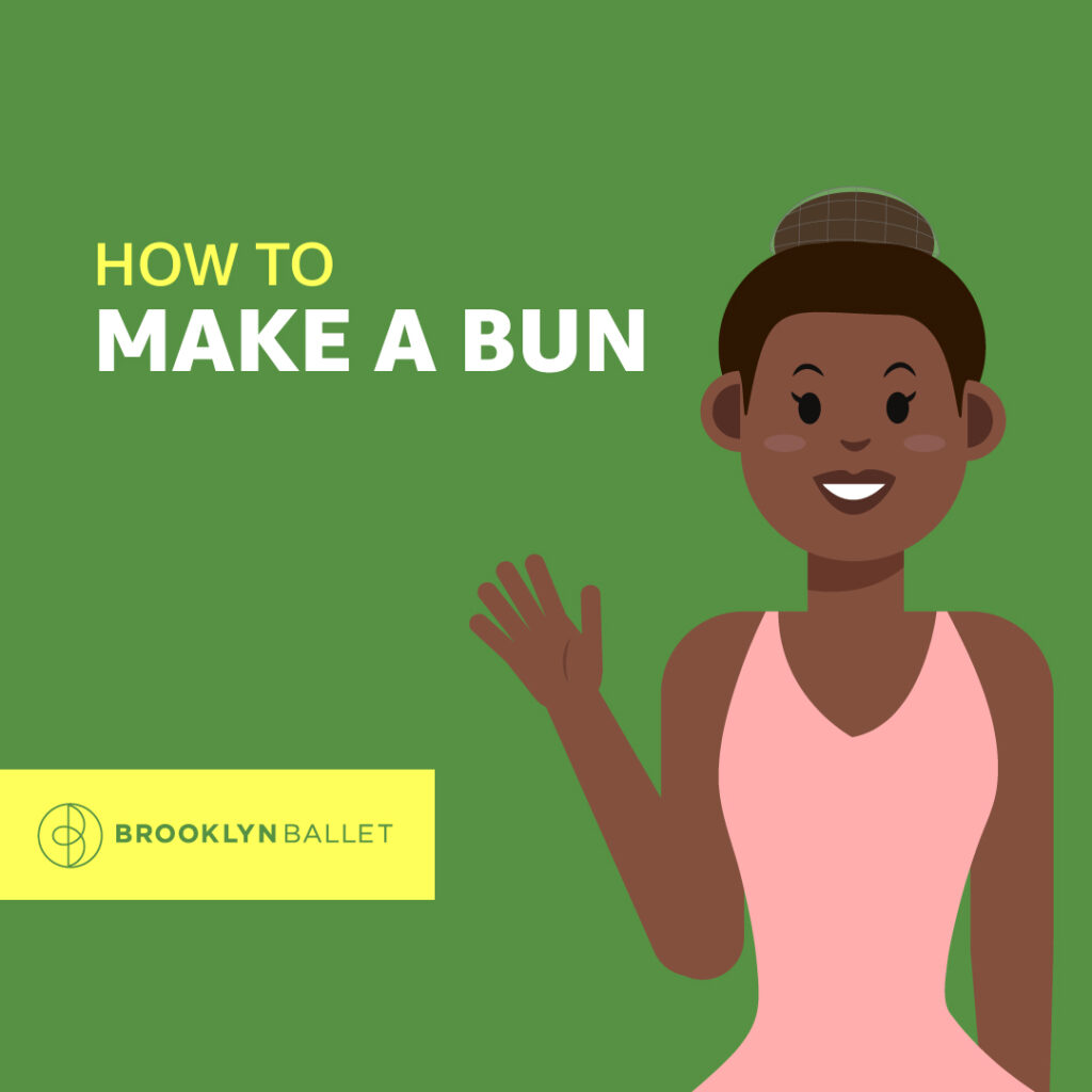
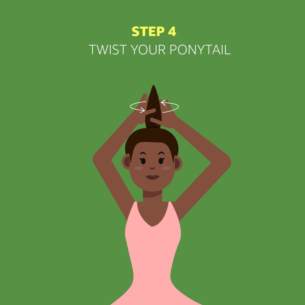
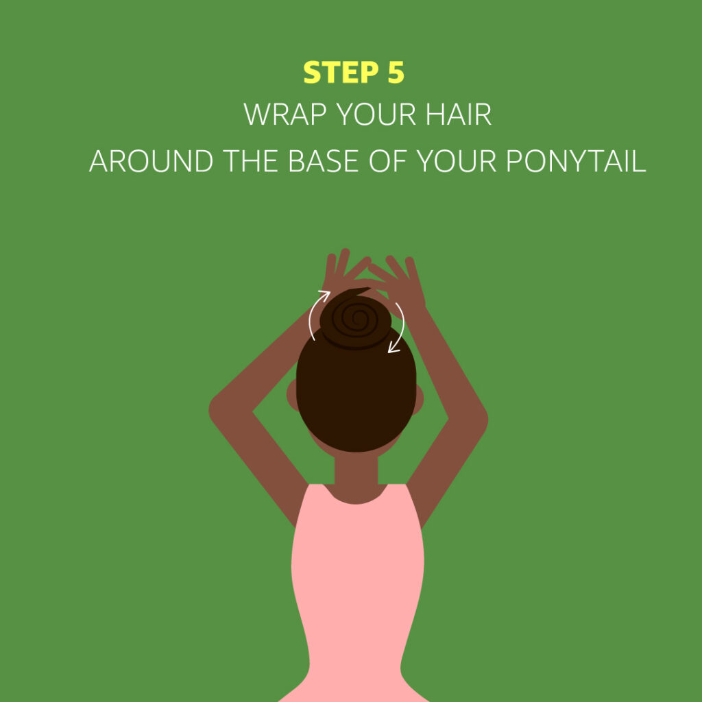
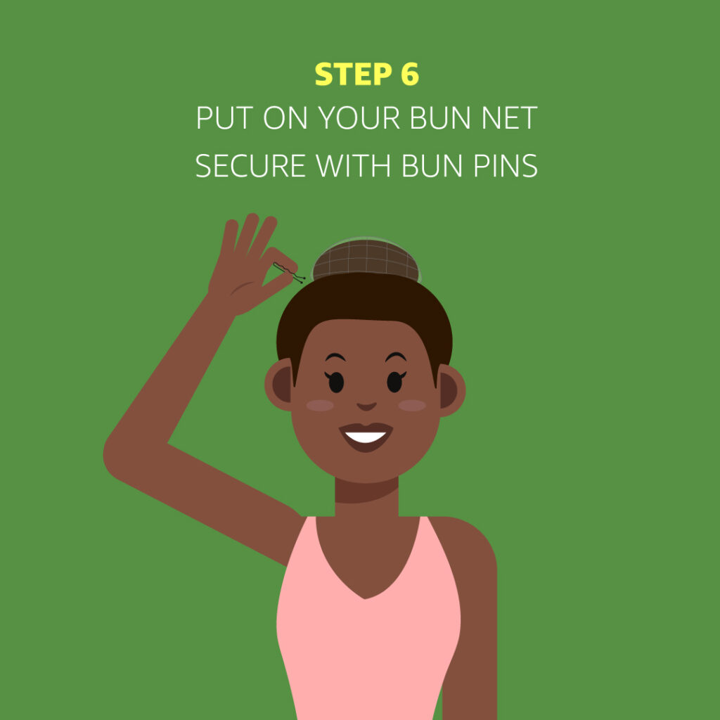
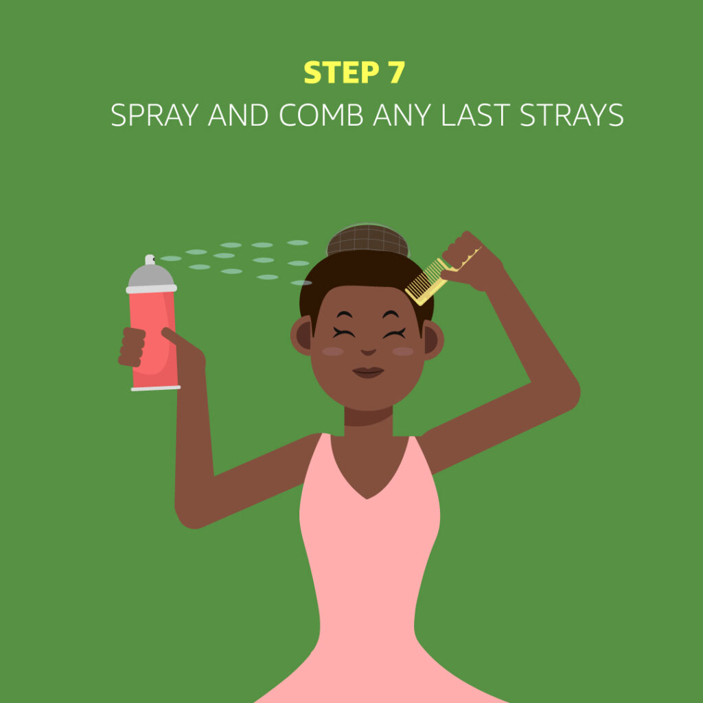
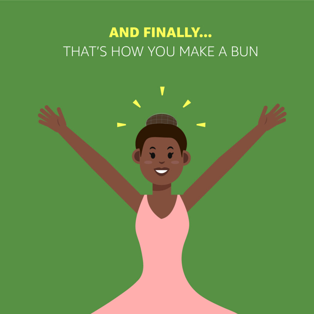
I decided to revisit one of the projects called “How to Make a Bun” for Brooklyn Ballet. The “How to Make a Bun” project was a project to teach kids and their parents how to make a ballet bun. The project was planned for social media use and I wanted to make it into the style of an Instagram carousel which usually has a max of 10 pictures.
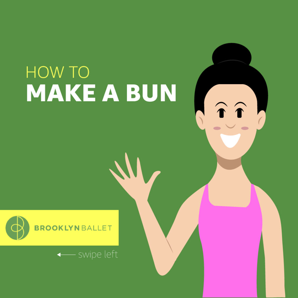
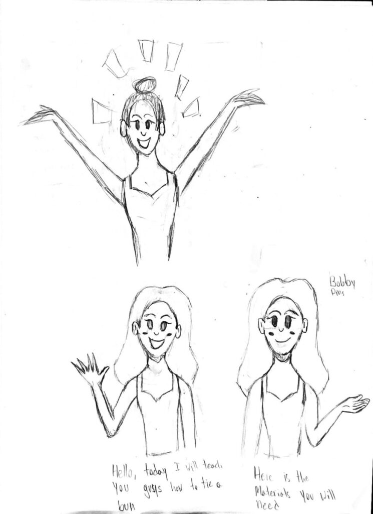
I was not a fan of the original cover I made at all. I did not like the original character I created and I was not a fan of how blurry the logo looked. The first thing I did was ask my coworker Beth for a better quality logo to replace the old one which she kindly provided to me. Next, I started working on a new character to replace the old one and I want the new character to have a cuter look. Once I finished creating the new character, I was much more happier with the new look. I also might have changed some weight sizes for the text.

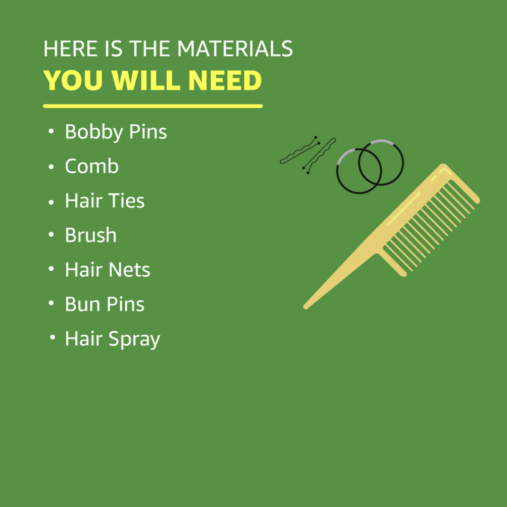
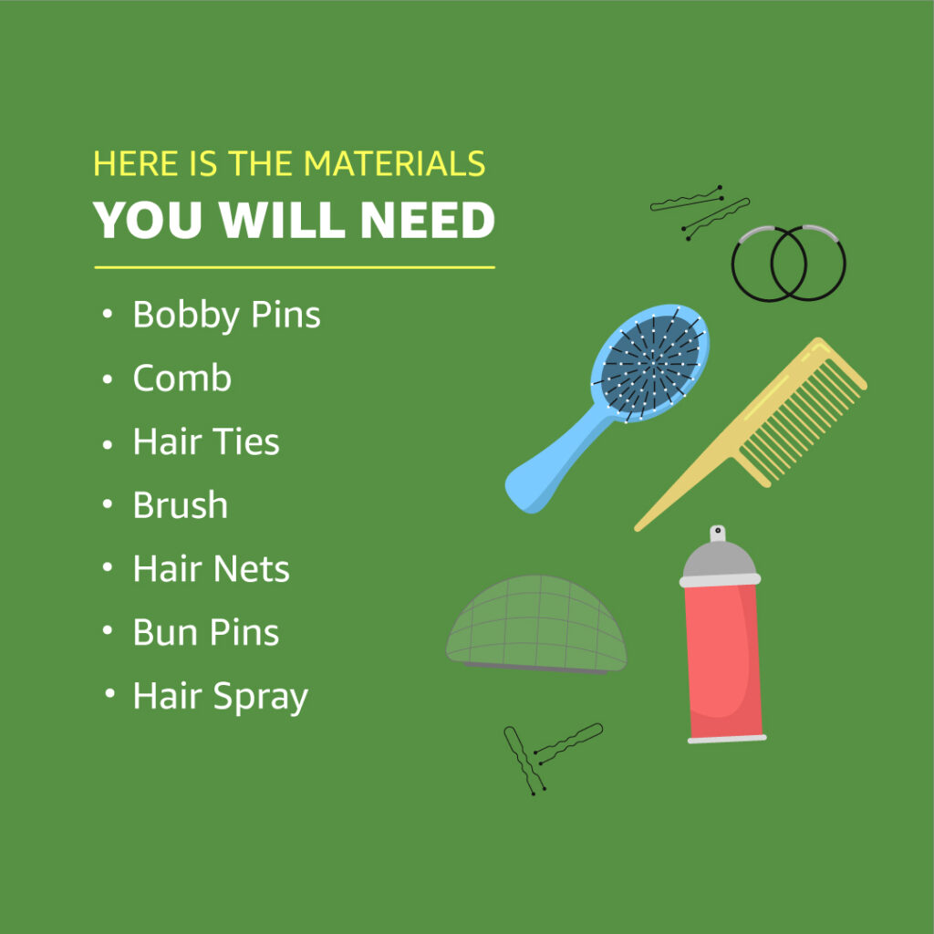
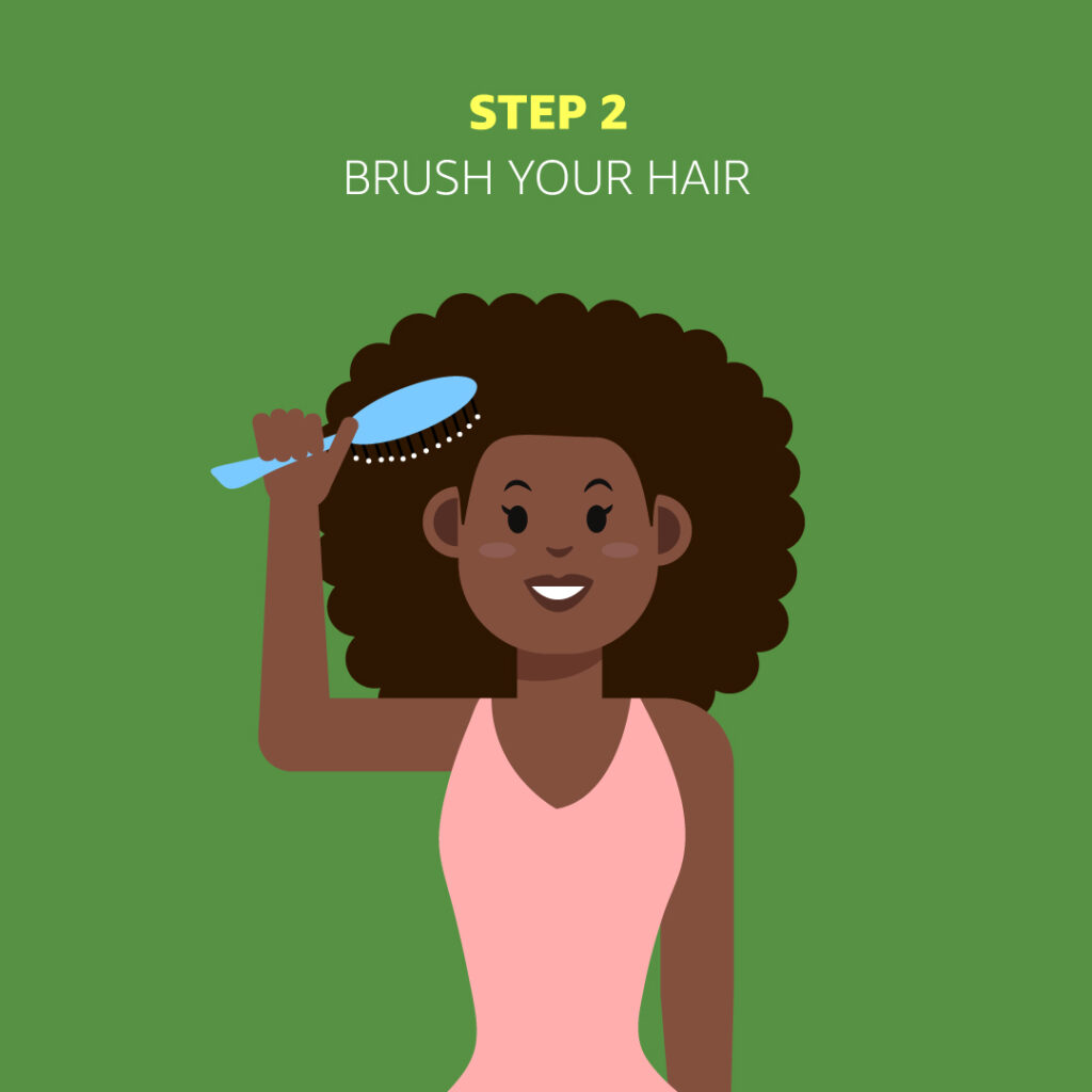
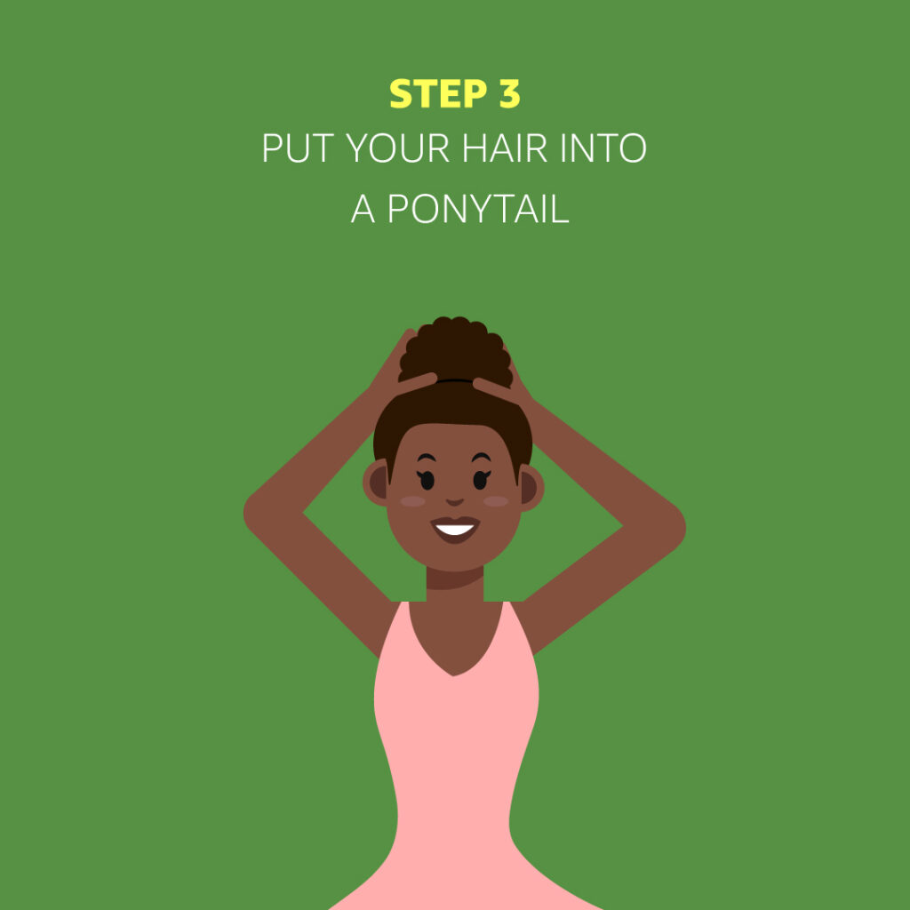
Next, I started working on illustrating the materials the character would be holding. I created bobby pins, a comb, hair ties, a brush, a hair net, bun pins, and hair spray. Next, I created universal steps for making a ballet bun for all hair types. Then I illustrated the character demonstrating the steps by using the items to make their ballet bun.
Once I was finally done with the project and I showed my supervisor Alison, she loved the results of the project and said that it will be up on social media very soon.


Internship Blog #16: Self Evaluation
Throughout my time working at Brooklyn Ballet, I feel like I’ve been doing a decent job. I’ve been completing the tasks that have been assigned to me but I feel like I’m not really working fast enough. I’m having that feeling because as a designer, I want to send my supervisor great work but I’m constantly overthinking the quality of my work. When I’m working on something I’m always constantly thinking “Is this good enough to show my supervisor?” It feels like my mind is constantly having a battle with itself when it comes to my work. It also doesn’t help that I was never given a deadline for most of my tasks.
The only project I feel really good about was when I was working with the graphic design team and creating merch mockups. The task was very easy and I felt like I was working very fast and communicating efficiently with the team
Overall I think the internship helped me practice my skills and I’ve improved ever since I started working at Brooklyn Ballet. I just feel like I need to work on balancing the speed and the quality of my work
Internship Blog #15
During class, we were speaking about ethical issues and we looked over the copyright case between Dr. Suess Enterprises and Comic Mix. To summarize the court case, Comic Mix published a book called “Oh, the Places You’ll Boldly Go!” that was claimed to be a parody of the Dr. Suess book, “Oh, the Places You’ll Go!”. Dr. Suess Enterprises sued Comic Mix for copyright infringement due to the similarities of the books.
In my personal opinion, I believe Dr. Suess Enterprises were correct for suing Comic Mix. Putting the books side-by-side, they look way too similar in art style, fonts, layout, and wording. I think there is a fine line between creating a simple parody and blatantly copying someone.

Internship Blog #14
Around November 14th, my supervisor Alison introduced me to a co-worker named Beth who is a graphic designer. Alison believed I could be a great help working with Beth because we both do similar types of work.
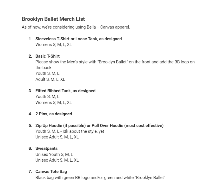
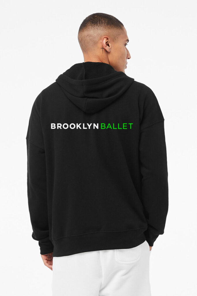
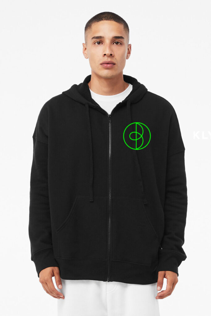
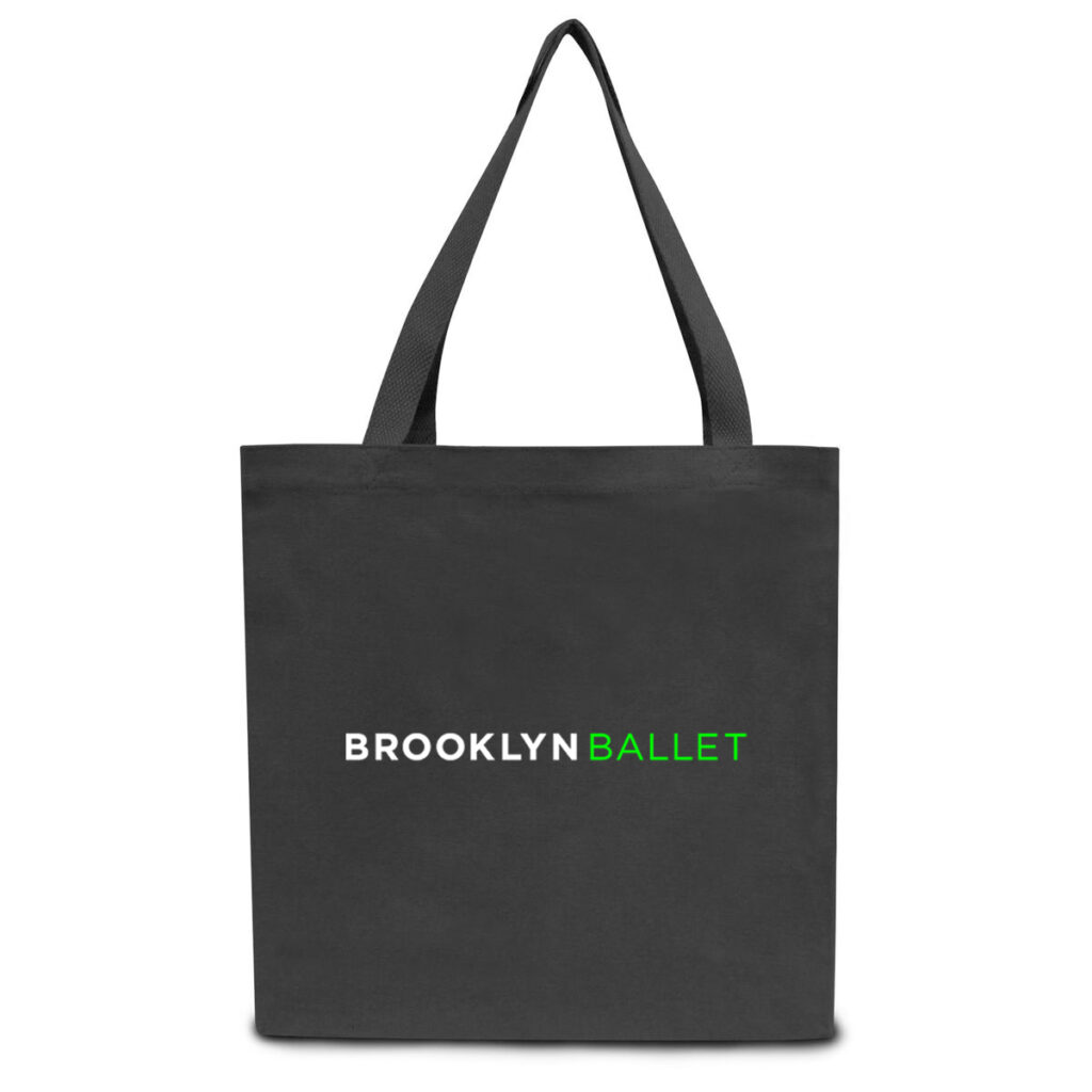
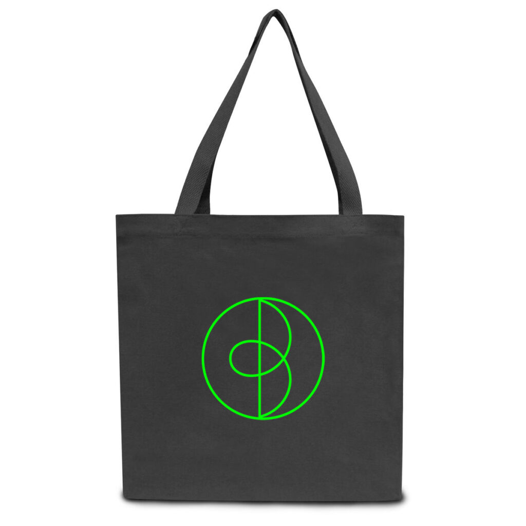
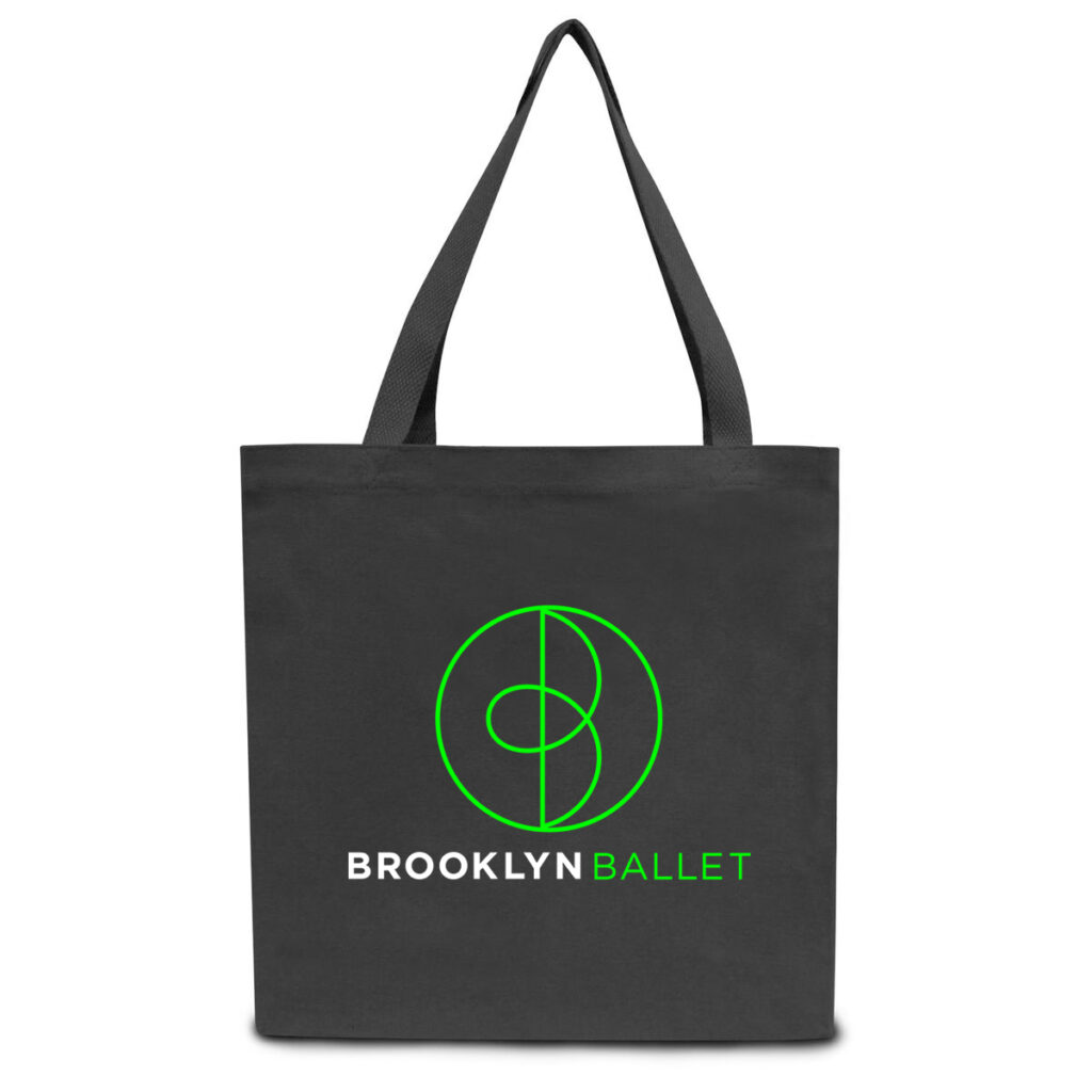
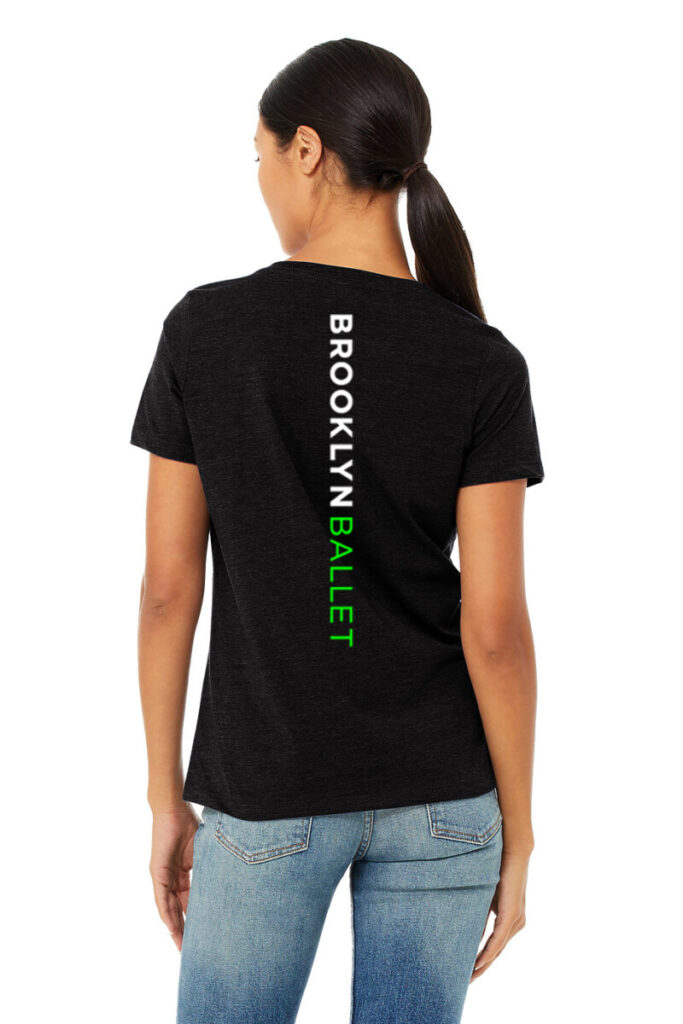
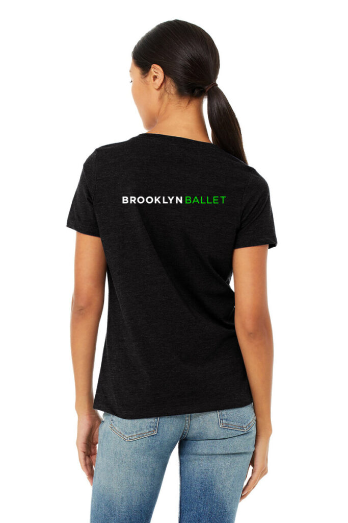
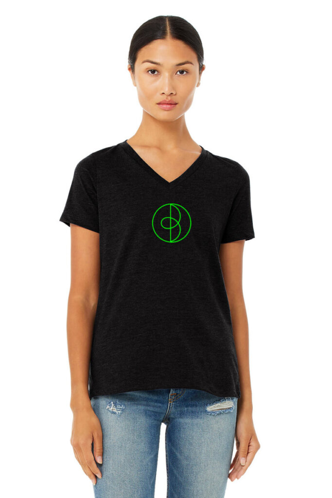
I had a meeting with Beth through a Zoom call. We introduced ourselves to each other and I was given the task to help create merch mockups for Brooklyn Ballet. Beth gave me a list of clothing and I began to work.
For this task, I decided to use photoshop to create the different types of merch mockups. There were different types of pants, shirts, hoodies, and bags that I had to create. Basically, I had to save pictures from Bella + Canvas and put the Brooklyn Ballet logo where it would look best. I sent the first batch to Beth for feedback. She just wanted me to readjust certain logos and work on more clothing. So I went back to readjust the logos, worked on more clothing, and sent it to Beth and she was happy with my work.
Internship Blog #13: Virtual Field Trip (Blue Exhibit)
For Week 11, we did a virtual field trip for the “blue.” Exhibition at the Nassau Museum. This exhibit dives into the different types of contemporary art, themed around the color blue.
Name of the artist: Pablo Picasso (Spanish, b. 1881 – d.1973)
Name of the artwork: Buste de Femme, 1902
Size of the piece: 29 in. x 22 in.
Medium: Lithograph
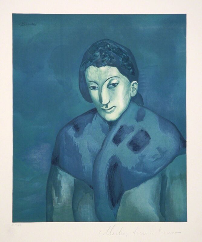
This painting uses a lot of tones of blue in order to give depth and detail to the artwork. The focal point of this painting is the woman. This piece of art caught my eye because it looks like it was staring right at me. This artwork gives me a sense of sadness.
Name of the artist: Utagawa Yoshiharu (Japanese, b. 1828-1888)
Name of the artwork: Large Elephant from a Foreign Country, 1863
Size of the piece: 30 x 14.25 inc.
Medium: Color woodblock print triptych

This artwork highlights an old-looking elephant with a bunch of people around it. The artwork uses a lot of gray for both the people and the elephant but uses dark blue for the background. There is a great contrast between the two colors. This artwork caught my eye because the elephant mostly takes up the canvas. The piece gives me a sense of mystery.
Name of the artist: James Casebere (American, b. 1953)
Name of the artwork: Blue House on Water #2, 2018, Edition 3/5 with 2 AP
Size of the piece: 60.5 in. x 47 in.
Medium: Plaster, Styrofoam, and Cardboard

The focal point of this artwork is the house. This artwork uses geometric shapes in order to create the shape of the house. It uses a lot of different tones of blue, yellow, red, and gray. The artist used the different tones of blue very well which helped give the house dimension. What made me choose this artwork is that I loved the reflection of the water. This artwork gives me a mood of peacefulness.
I thought the virtual experience exhibit was alright in comparison to visiting a museum in person. I thought the videos were very boring but I loved reading the pdf at my own pace and seeing all of the cool artwork.
Internship Blog #12: App Review Brainsparker
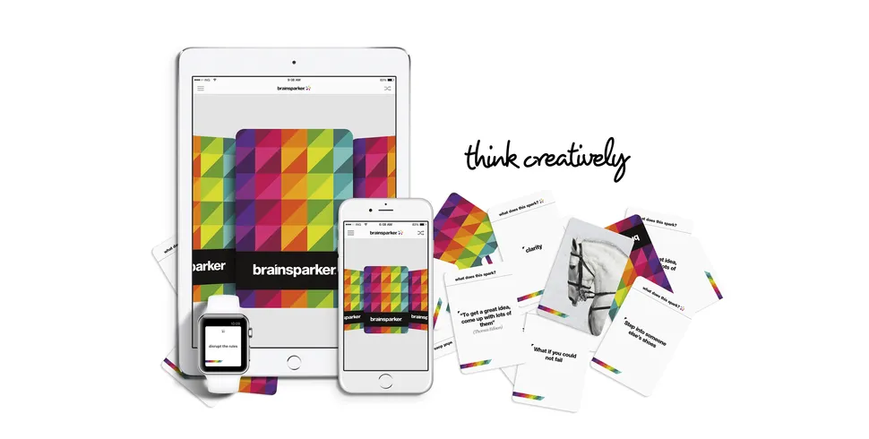
For my app review week, one of the apps I decided to review was the app called Brainsparker. Brainsparker is an app that contains 200 cards with thought-provoking words and phrases to help people spark their creativity.
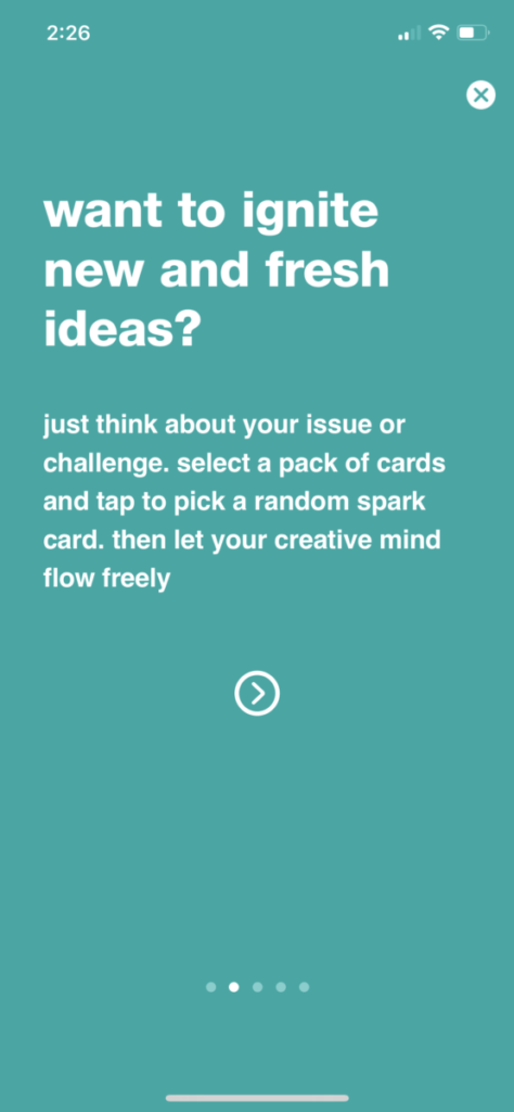
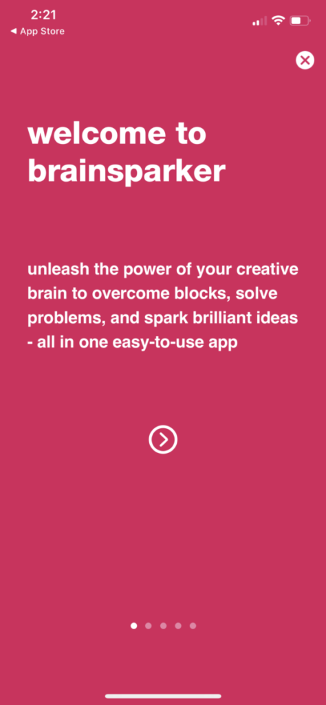
When I first opened the app, it started off by welcoming me and it gives a clear explanation of the purpose of the app.

The first thing I did was look at daily spark. You can schedule a notification from the app which gives you a maximum of 3 random spark cards throughout the day. You can even add a widget that gives you daily inspiration on your phone.
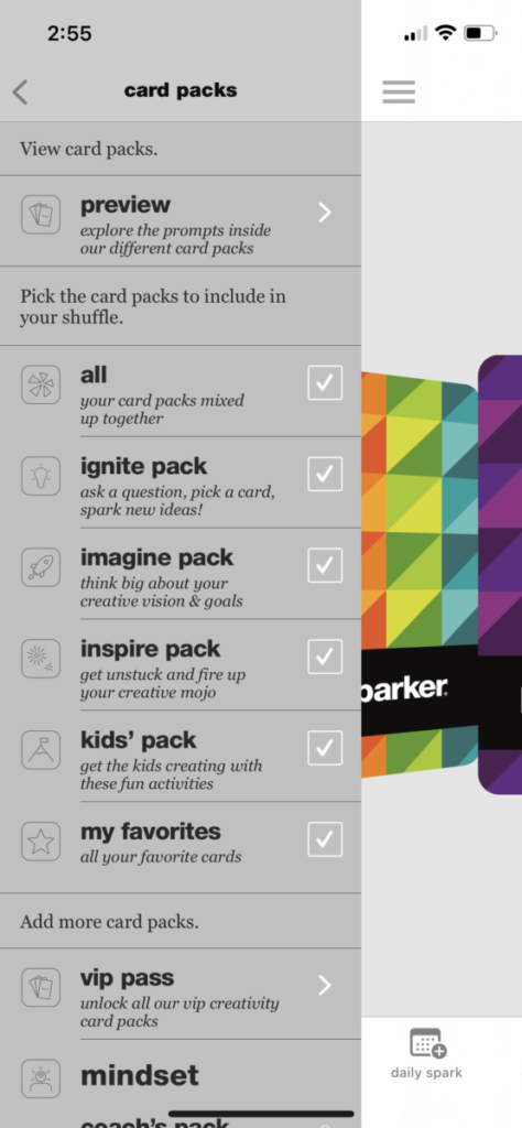
Next, I looked into the card packs. They provide many different options such as the ignite pack, imagine pack, inspire pack and kids pick. You can even organize your favorite cards and put them into a favorite pack. You can even more packs if you want for about 5 dollars. Once you start scrolling through the cards, it gives you different quotes and inspirations. You can shuffle the cards as well.
The app provides access to brainsparker courses, writing courses, and photo courses. The app gives you the ability to turn off sound effects, receive online support, and has a newsletter.
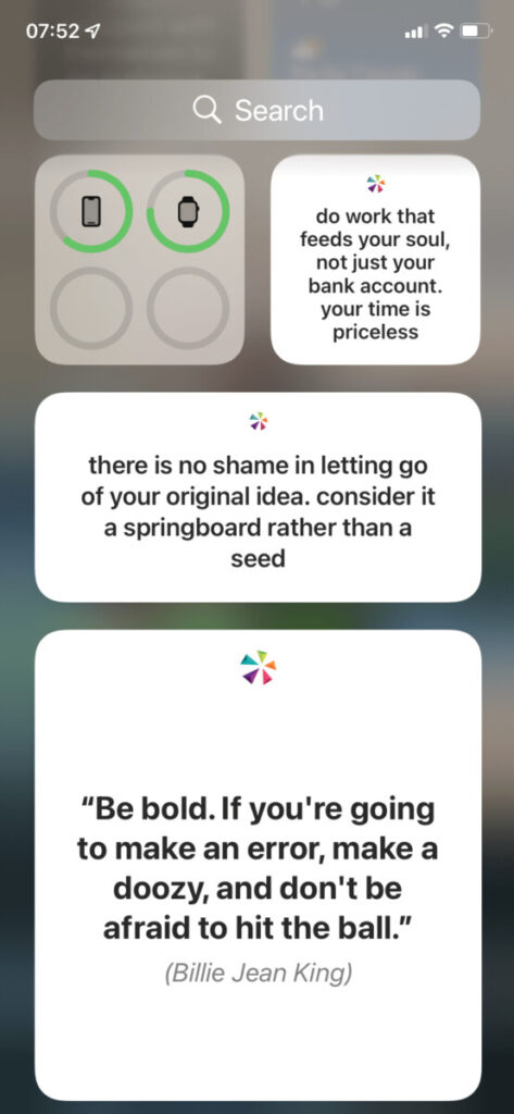
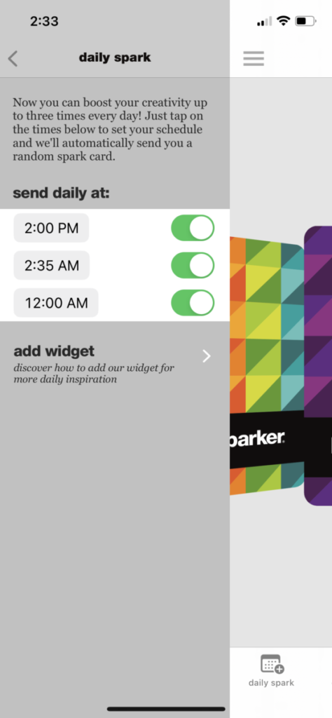
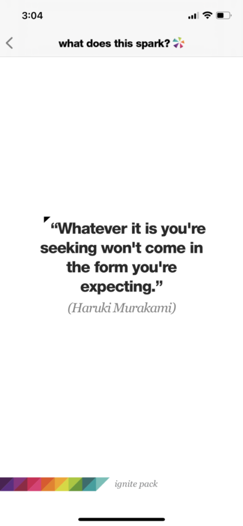
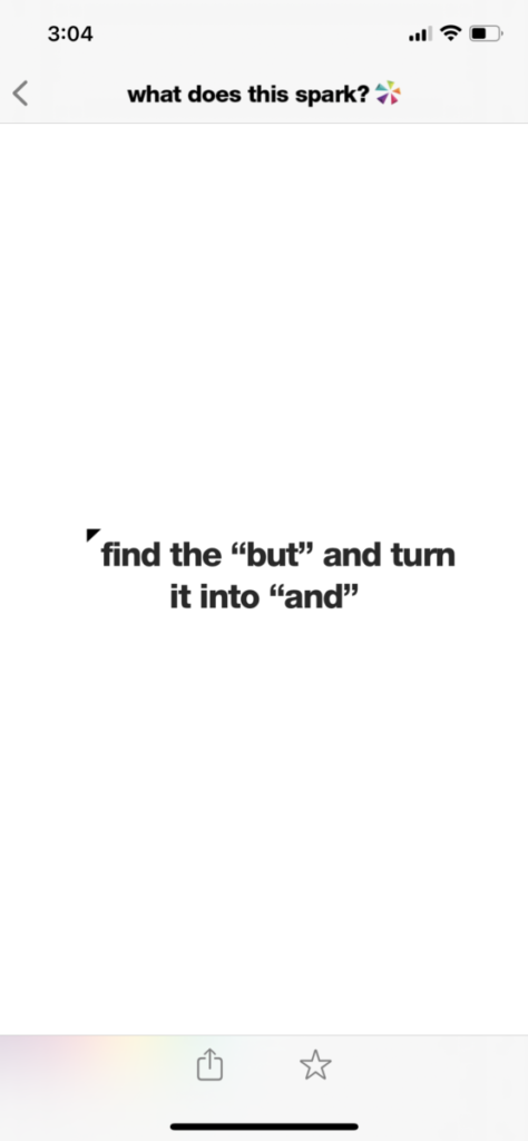
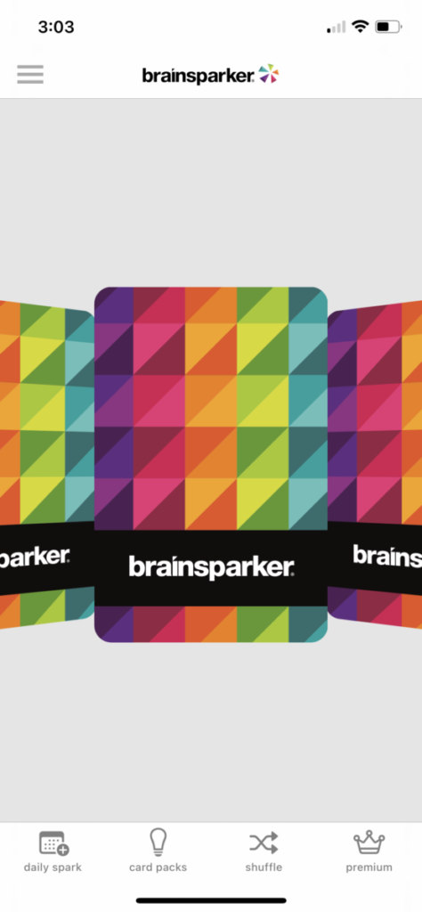
While I do think this is a nice app and functions very well, I do not think this app is for me. This is something I wouldn’t personally use in my everyday life.
Internship Blog #11: App Review SimpleMinds
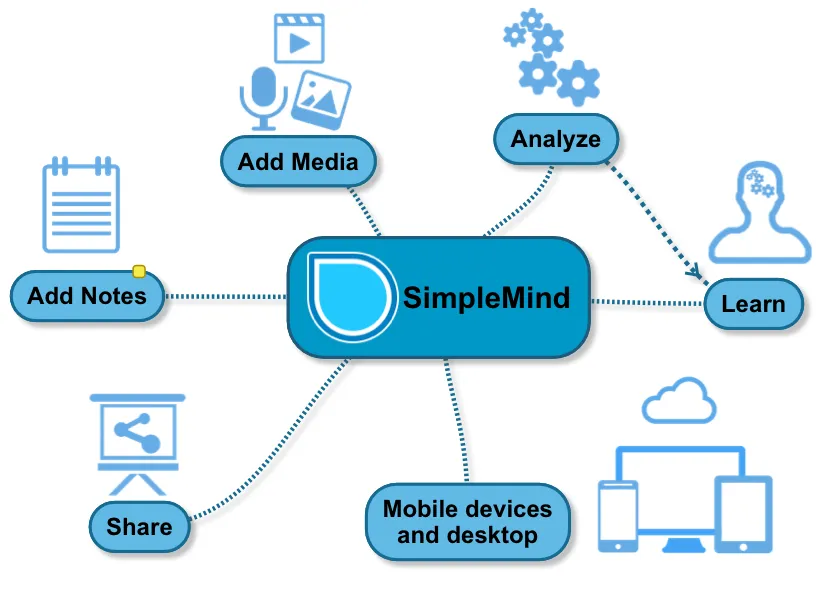
So for App Review week, one of the apps I decided to choose is the app called SimpleMind. SimpleMind is an app that helps you create mind maps which is a diagram that helps you link different ideas. When opening the app, it shows you a mind map that has a bunch of external tutorials on how to use the app.
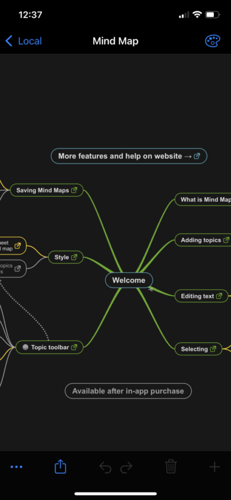
It was pretty easy to navigate and find out how to make mind maps of my own. For a test, I decided to use the central theme of the orange fruit. I typed out the name orange and easily created branches to connect words to the Central theme of orange. There is an undo and redo button to correct previous actions. When creating new branches, I like that you can move them where ever you want on the screen. You are able to copy, paste and delete branches very easily. You can also create notes for yourself which are connected to the branches so that can be very helpful to remind yourself about something.
The app gives you access to special themes so you can give your mind maps a great unique look. You can sort your created mind map and there is no limit to how many you can create. You can also delete your mind map once you no longer need it. I couldn’t find a good way export the mind maps if you want too but as an alternative, you can just simply screenshot the mind map or just look at it through the app.
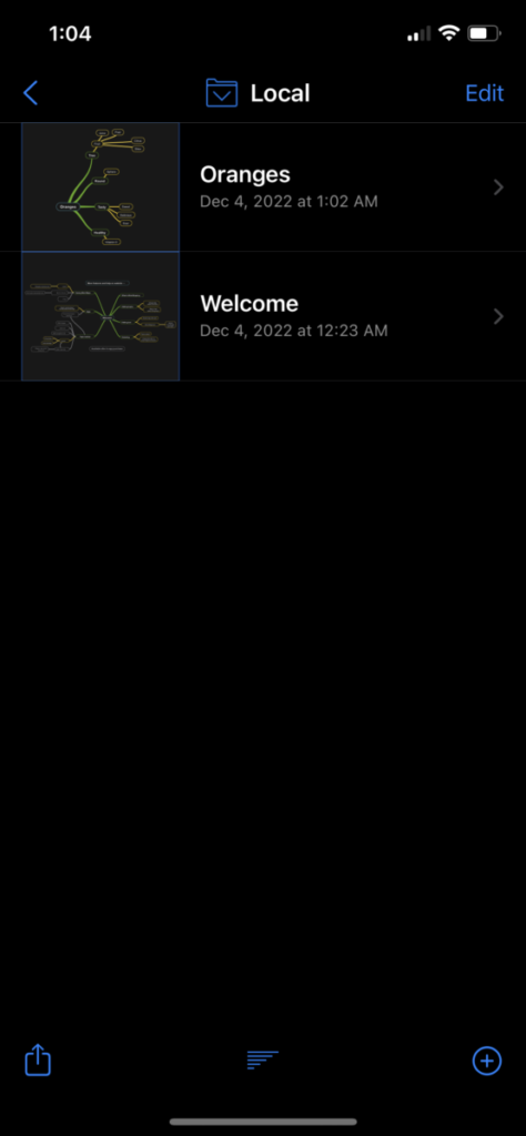
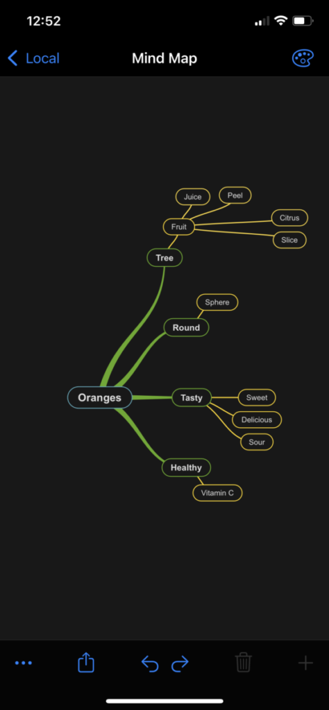
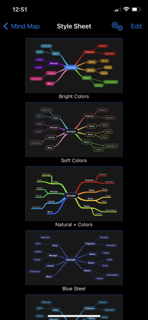
I believe the SimpleMind app can be very useful for people who normally create mind maps or needs a way to creatively put all of their ideas onto a diagram. This app was pretty easy for me to figure out. My only issue with the app is that it doesn’t have an easy way to export the mind maps and I don’t like that the tutorials take you out of the app onto a different web page. Otherwise, this is a great app to use for planners.
Internship Blog #10 Webinar
For Webinar week, I watched a Webinar from Vyond called “Storyboarding for Video: a Beginner’s Guide” by Prakriti Rai who is a video producer. I learned a lot from this Webinar, it taught me a lot of interesting facts about storyboarding, why storyboarding is useful and how to create a storyboard.
I learned that storyboarding is a visual representation of key scenes in different kinds of visual media like film or video. It can take different forms such as full-color illustrations or images to basic stick figures. Storyboarding was first developed during the 1930s in Walt Disney Studios by a Disney animator named Webb Smith. Storyboard artists are usually hired for Live-action movies or shows, commercials, video games, short-form videos, and interactive media like UX design.
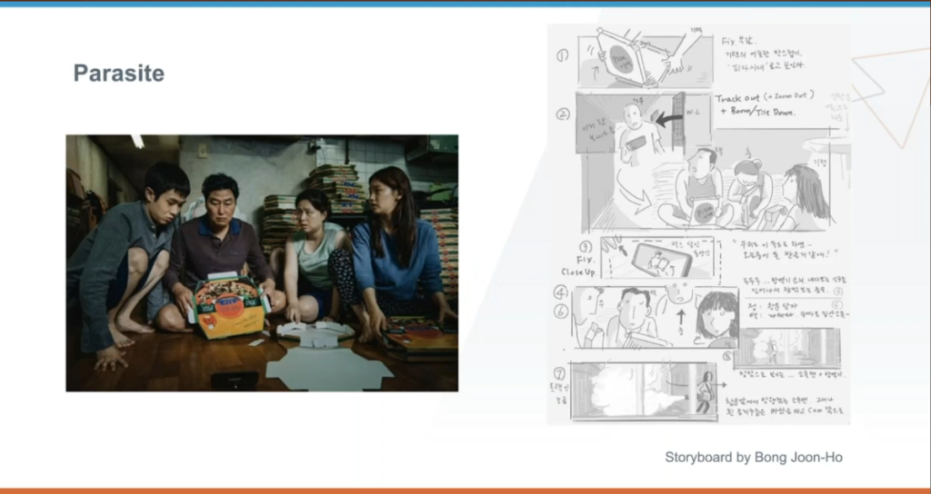
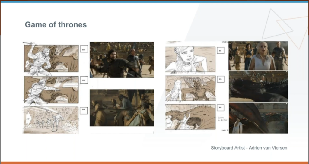
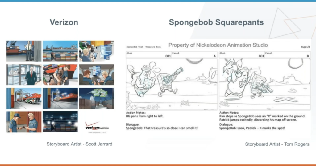
Rai shows off examples of when storyboards are being used. First, she uses the example of a storyboard used from the movie parasite. She said the director feels less anxiety when using storyboards during the film process. She shows off another storyboard from the game of thrones and the storyboard is used in greater detail. She gives two more examples from Verizon which uses detailed color and Spongebob Squarepants which has no color but includes dialogue. The storyboard process is useful because it helps you plan scenes visually and helps with communication with clients or coworkers.
When making a storyboard, you should decide your audience, objective, and theme of the project. Think of essential scenes or elements to include in the video. You can create storyboards with Pencil and Paper or using digital software. Also if you decide to use color, they should use a color palette. There are many options for people so they can create storyboards physically, they could draw their own template, download and print a storyboard template or use a storyboard notebook. For storyboard software, you can use storyboarder, Boords, Studiobinder, Canva, Storyboard That, and Vyond.
I personally really enjoyed this event. For a while, I had a great interest in the process of storyboarding so I’m happy I was able to learn more about it. The presenter used a lot of great visual examples and explained clearly what storyboarding is and how to do it. This is a great webinar.
Internship Blog #9
My supervisor and my co-worker Jonalyn gave me a task to create a graphic to teach kids how to make a bun. I started this task by doing research on how other people make tutorial graphics on Instagram. For a while, I was having trouble deciding what I wanted to do for the color scheme and I decided to go with yellow and green. I wanted to make this a fun carasoul for an instagram post and I started off drawing a girl for the post. On the next slide, I listed out the items people would need in order to figure out how to tie a bun and I wanted to create little illustrations next to the list. And for the next slide, I wanted to create steps that people can follow alongside illustrations.
I showed the process of my work to my supervisor and she really likes it so far. She told me to make sure to focus on diversity and different items of hair. I agreed with hair and made sure to do that to show her during the next meeting.
