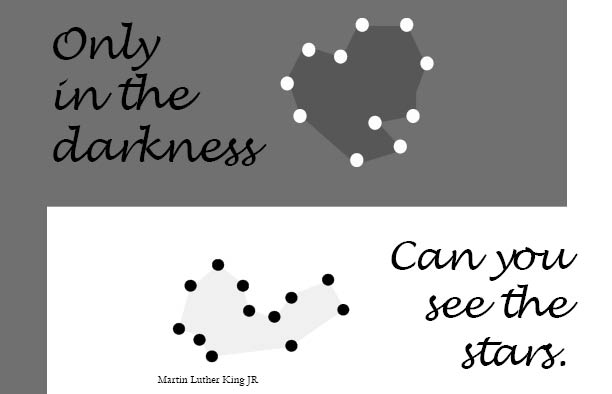
#1 I choose this quote because it reveals how every human has to go through the darkness, in order to see the meaning or beauty in life. This first design it was a rough idea that I had, it was about the star constellations but it didn’t come out as planned. However, the font (Lucida handwriting) I used gave balance to the design. Therefore, as you can see these are dark colors or tints of grey that help me communicate the quote a little better.
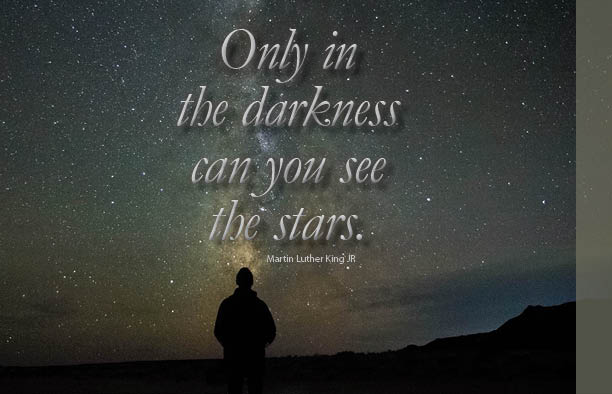
#2 This visual quote contains a photograph that gave a symbolic power to the meaning of the quote. Everybody knows that looking at the stars in the night sky is pleasant, romantic or relaxing. However, this photograph shows how the person on the ground enjoys the view above. As an interpretation of when we isolated, put ourselves first we start to see open doors to new life. Therefore, in this design, I decided to place the text glowing from the sky like the stars starting to form words to the world to communicate the quote I choose.
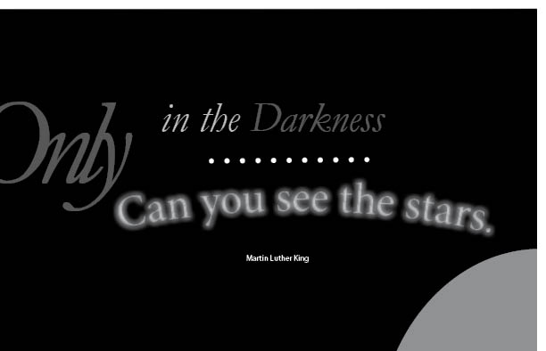
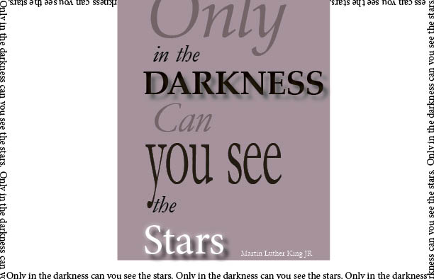
#3 In this design I decide to make the “ONLY” all caps but grey as my main focus and then let the viewer’s eyes get lost for a little. I like this design the most because of the style and the composition of my elements and is the only design that looks like a postcard. However, in terms of color palette, I didn’t use color instead I used tints of greys since it gives the design a better interpretation of the quote without exaggeration.
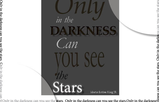
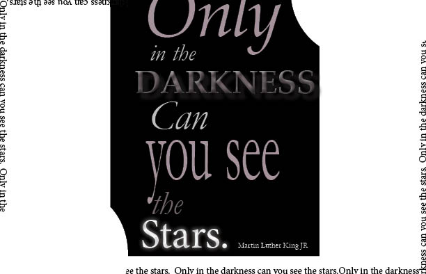
#4 This visual quote design I decided to have negative space around my compositions because it gives the design more value and balance. Also, I place the quote in a 12 point size font around the edge of the paper. Therefore, some of these choices help me to communicate the quote because the negative space around the shape interpret the meaning of when we focus on ourselves the air, around us become affordable to breathe.
1st quote sketch.
2nd sketch.
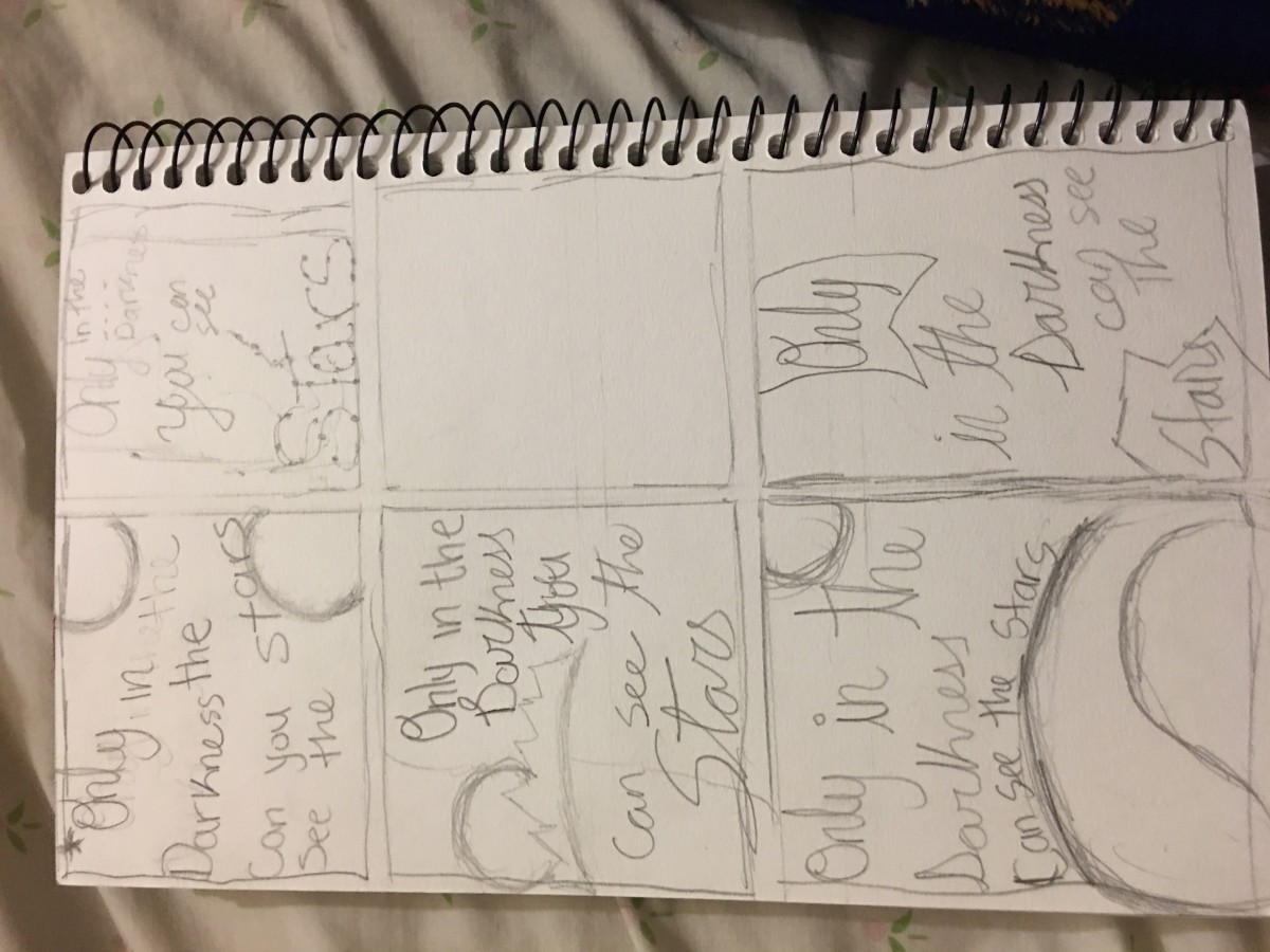
Different quote sketch.

