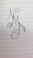
Idea #1: This design contains the initials of my name, middle and last name together, in a form of a elegant ligature. However, there were some challenges creating this design, because there’s a lot of distraction, for example the 3rd letter of the design is a J. I wanted to involved a a musical note within the letter, but some viewers may find it difficult to read. Furthermore, this design can work as my final logo but i need to make some changes.

idea#2: In this design there’s 2 types of ligature which include different type of elements such as a curving end and swirls. To add on, there were no challenges for this design because is really straight forward and there’s no confusion between the letters. Except the second design there’s slightly some confusion which can be fix right away. Unfortunate, this idea didn’t work for my final design because it was similar to the first one.
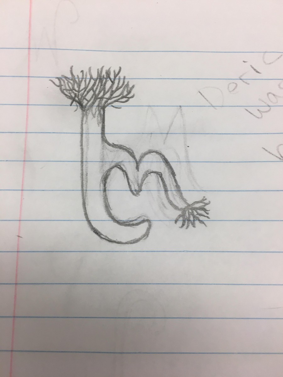
Idea #3: This design works really well with the ligature I choose because it shows my style in 2 letters. However, the only issue with this design is that I wanted it to be more legible to read. Therefore, I will make some changes with the letters and make them more delicate.
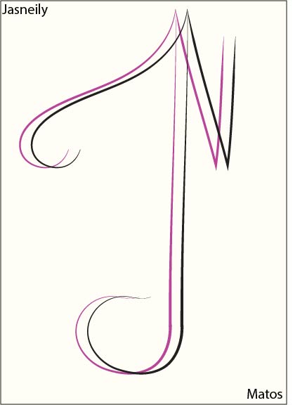
Final design: This design contains a specific Latin ligature because it shows how the letters are together without space in between but it is legible to read. I decided to choose this design because it worked the best showing my characteristic as a designer. It represents me as outstanding, humble, motivated with potential and slightly extra but simple at the same time.

