

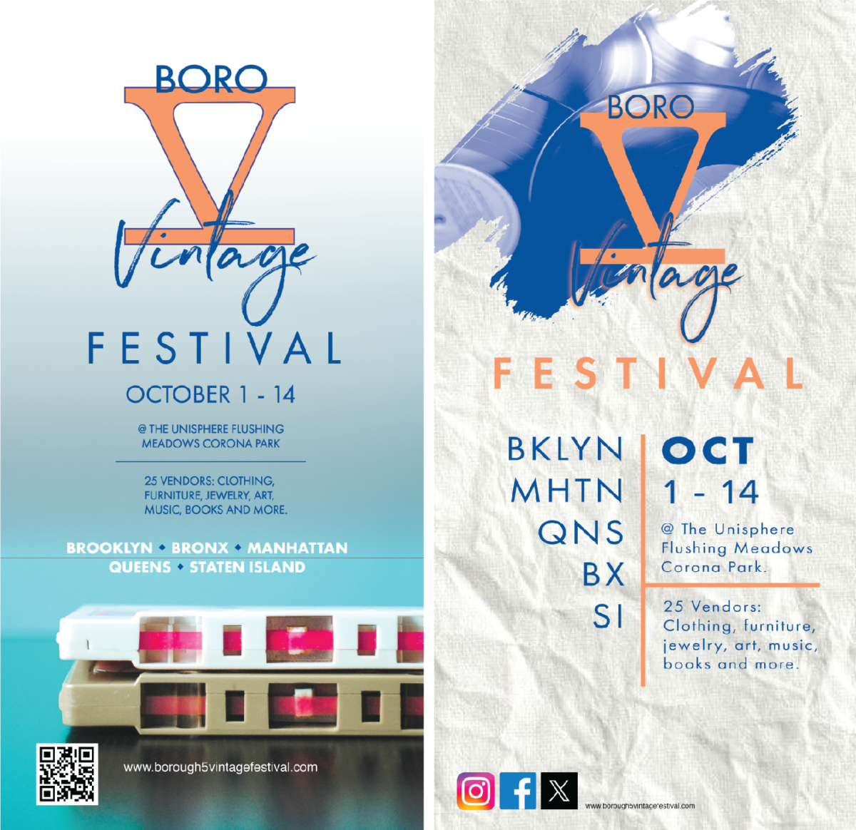
The posters pictured above were for The Boro 5 Vintage Festival Project that we worked on throughout Fall semester for Advanced Typography. They represent the same things but are very divergent in a number of different ways. I really enjoyed experimenting with new techniques for these posters. The poster below was for a project that we worked on in Digital Media Foundations. I actually started off with the idea that I would do a rough sketch of a frog, which then turned into an all out illustration of one. I decided it would look good as is, so I added it to the poster like so. I think this has sort of became my style, as I’ve done this in some of my other work as well.

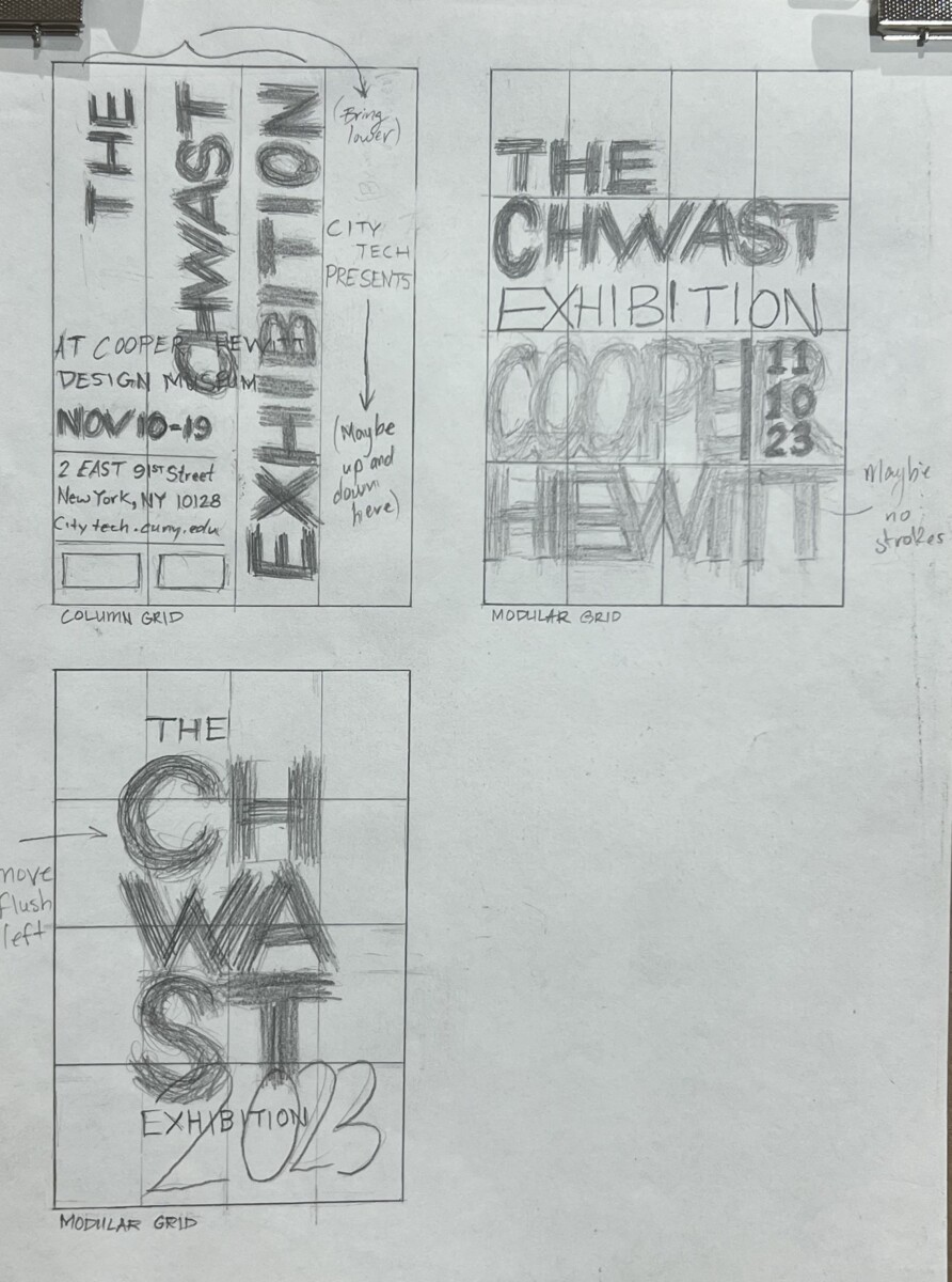
This is the process for a poster project in Graphic Design II. The overall aim of the project was to create posters using column, modular, and hierarchical grids. We were instructed to make the first drafts of the posters using just type only, no images. I started off with these rough sketches which I then digitized in Adobe illustrator.

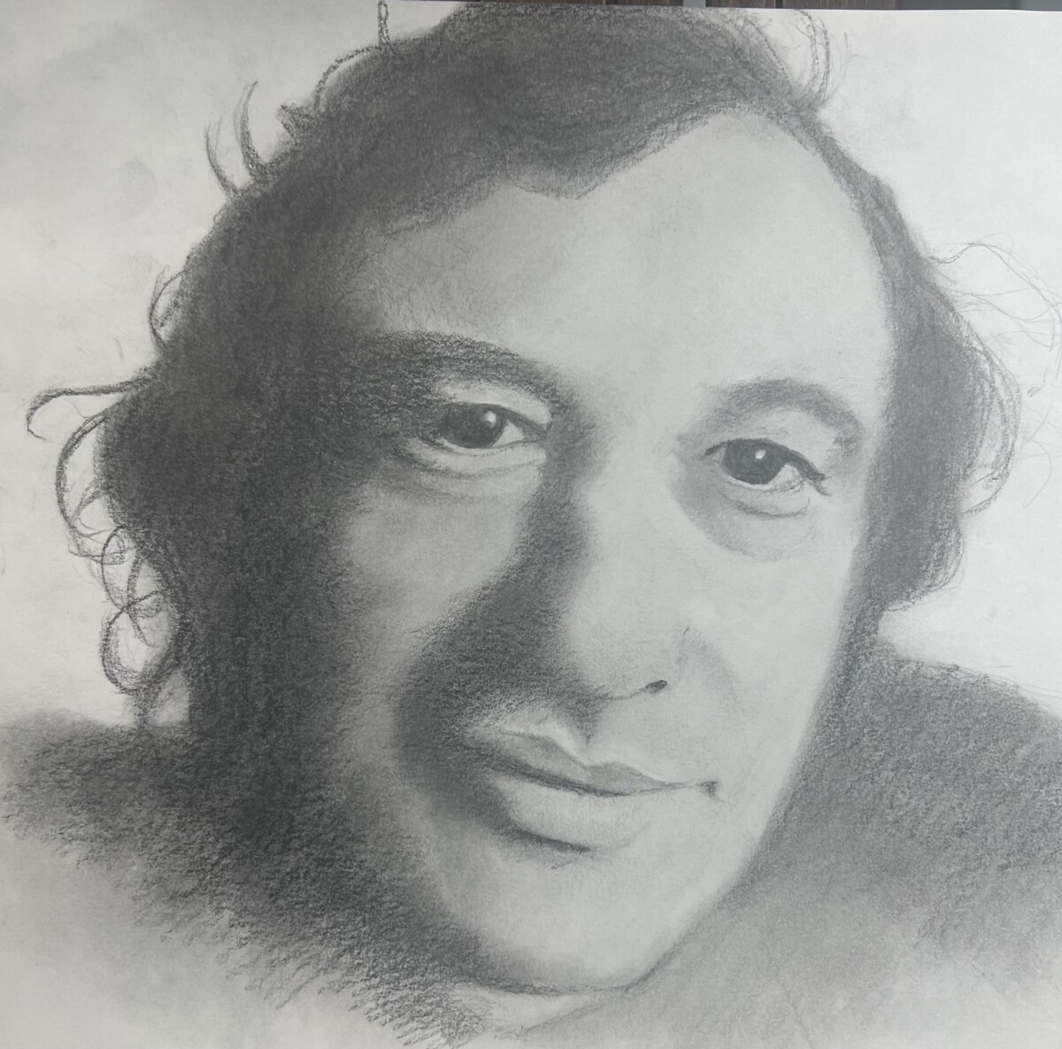
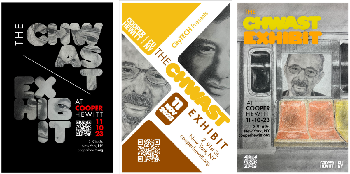
I drew these portraits of Seymour Chwast in graphite. Both from photo references. The one on the left is a more recent photo of him and the one on the right is a photo of him back in the 70’s. I drew these mainly because my professor required that we not use any found or stock images for this particular project. Whatever images we used had to be completely original and so I got a bit ambitious and really took the time to create something I’d be proud of. I think these drawings along with the following posters really serve to highlight my passion for art and design. I truly did have fun with this project.

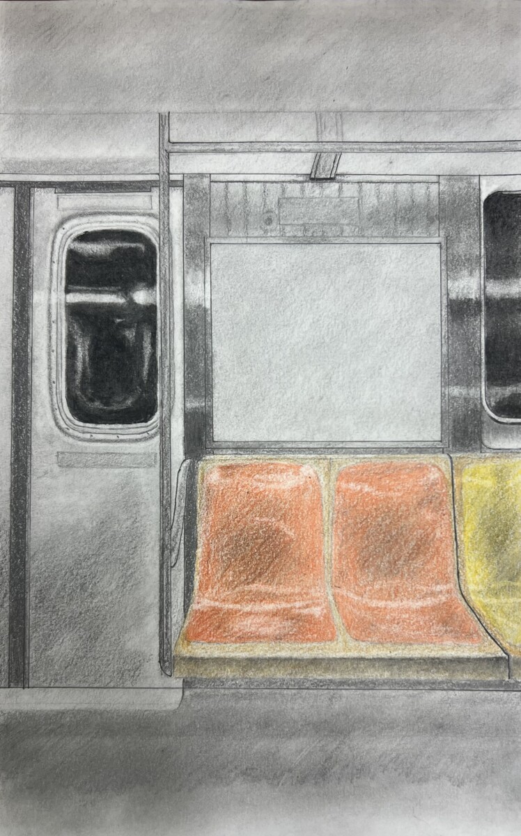
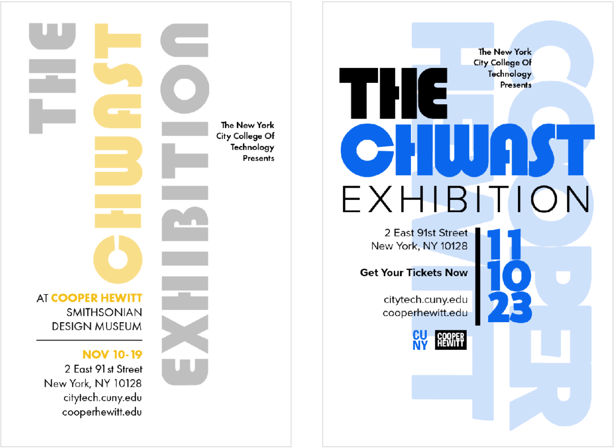
Below are my final posters after integrating the typographical elements together with my created images. The bubble type lettering that I used for the title “Chwast Exhibit” was actually a typeface created by Seymour Chwast back in 1970. The event was an exhibit I made up for purposes of the project.
Below are the Chwast posters on display in City Tech’s Namm building on the 11th floor.


